I’ve had reason recently to be doing custom position of things in SwiftUI, and figured I’d share something that I found a bit of a tricky distinction at first: position vs offset.
So, let’s set the scene:
struct DemoView: View {
	var body: some View {
		HStack {
			Rectangle().fill(.gray)
			Rectangle().fill(.blue)
			Rectangle().fill(.gray)
		}
	}
}
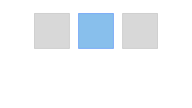
And now I’ll add some visuals, for ease of reading. (I made these in Sketch, so the graphics aren’t precisely what you’d get by running this code, but hey, artistic liberties.) Here’s our view:

Now let’s tinker!
struct DemoView: View {
	var body: some View {
		HStack {
			Rectangle().fill(.gray)
			Rectangle().fill(.blue)
				.offset(x: 150, y:150)
			Rectangle().fill(.gray)
		}
	}
}
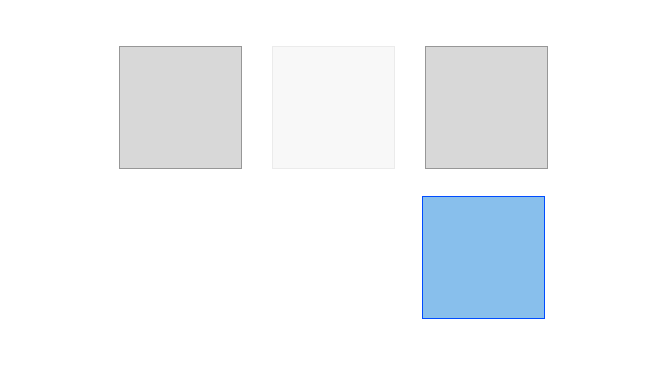
We’re offsetting the middle square. What does that look like?

I’ve left in a little ghost image to show where it was, because it’s an important distinction! As far as the HStack is concerned, that space is still occupied. Think of it like throwing your voice – you don’t move, just the perception of where you are.
Let’s try something else, now:
struct DemoView: View {
	var body: some View {
		HStack {
			Rectangle().fill(.gray)
			Rectangle().fill(.blue)
				.position(x: 150, y:150)
			Rectangle().fill(.gray)
		}
	}
}
Looks pretty similar in code, right? We’ve just swapped out ‘offset’ for ‘position’. What do we get on screen?

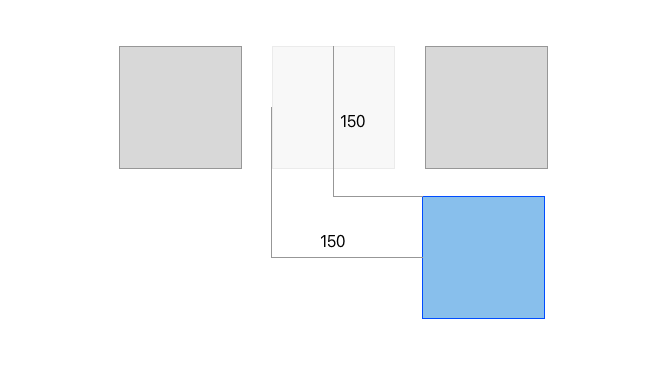
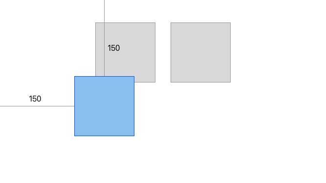
Ooh, very different! No more ghost, because now it’s actually in a different place – not holding that spot in the HStack. It’s also in a different spot than the previous one, what gives?
It’s in the name: ‘offset’ offsets the view from where it normally would’ve been. Our starting position was where the ghost stayed:

‘Position,’ on the other hand, skips the whole question of where it would go and instead just puts it in an exact spot, using the top left corner of the screen as the point (0,0):

The other approach that worked for my brain, coming from doing a lot of web dev, is to think about ‘offset’ as being CSS’ ‘position: relative’, while ‘position’ is equivalent to ‘position: absolute’.
Hopefully this helps the whole thing make sense!
One reply on “Position vs Offset”
Thank you! Just what I needed!
https://greypatterson.me/2021/05/position-vs-offset/