I mentioned in my post about the research we did that we were working on finalizing a couple deliverables, and that I would eventually post them here. Months later, I’ve finally got the time to do it.
And, before I go any further, credit where it’s due: this was a collaborative work by the whole team:
- Justin Lischak Earley, project manager
- Jana Abumeri, research lead
- Nick Straughn, researcher
- Emily Fan, design lead
- And myself, designer
So, what did we create?
Personas
One of the key tenets of design is you are not your user. Something of a parenthetical on that is that… nobody is The User. Someone is ‘a user,’ but there’s no definitive User out there.
But we’re human, and we need a way to think about the people we’re creating things for, so we develop personas. Create a character who embodies part of your user base – and note, you’re not just making someone up, you’re personifying data you’ve already gathered. (And be sure not to stereotype, while you’re at it!)
Journey Maps
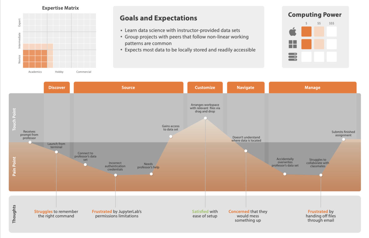
Journey maps fall more into the “UX” than “UI” field. The idea is to follow your user (or rather, one of your personas) through their process of interacting with your design. And, in fact, not just interacting with it, but potentially… not interacting with it. Discovering it for the first time, say, or using a competing product instead.
Once you’ve got the what figured out, get into how they feel as they’re doing it. Is the design meeting their every need and desire, leaving them shouting with joy? Is it completely failing to do something critical, leaving them wondering who in the world could’ve come up with something this terrible?
In short, it’s an expansion of the persona – another tool for getting in the collective head of your user base.
Seeing that linkage, we opted to combine these two deliverables. Take a look:
Mood Board
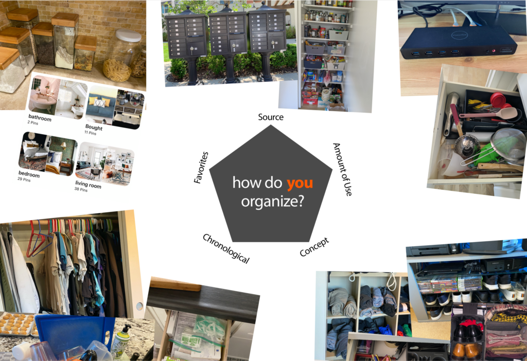
This… isn’t so rigorously researched a design artifact as personas and journey maps should be. In our case, we actually did back it up with some interesting research into the ways that people use and think about organization – I think the key reference would be the Five Hat Racks, although Justin pulled together a lot of research from the early years of computer science as a field, as well. To summarize, there are ~5.5 ways to organize digital files:
- Amount of use
- By provenance (source)
- Chronologically
- User self-selection/favorites
- By concept, or by Venn Diagram (thus, .5)
Regardless, the end result makes for a fun visual, so I thought I’d share it here:

