Part of the MHCID’s program requirements is that we give a presentation, detailing what we did during the internship. This year, gathering everyone together for a TEDx-style event… wasn’t in the cards. Instead, each group made a video presentation, filling approximately the same niche.
It’s been a while since I had a chance to do any video editing, and I had fun putting this together. As mentioned in my previous posts about this project, it was a group effort – we each recorded part of the audio, and split up the work of finding video clips, icons, and images to go with what we were saying.
It was fun to put together, and I’m pretty happy with the end result. Check it out:
Having done all that research during the spring, summer was about prototyping and iteration.
Low-Fidelity Prototype
The term “low-fidelity prototype” might sound a bit negative, but they’re a wonderful, wonderful thing. Low-fidelity prototypes are easy to make, which makes them easy to toss aside. In the same way that you use sketches and wireframes to go through a lot of ideas very quickly, a low-fidelity prototype lets you try things out without pouring a ton of resources into making something pixel-perfect.
We went through several iterations, developing clickable flows that highlighted the key points of the features we were designing. Those flows in hand, we went back to the users, and gathered more test data – did they understand what the new features were for? Did the terminology and usage make sense? Was it useful?
High-Fidelity Prototype
That user feedback in hand, we went back and created a high-fidelity prototype. One of the main goals we had in mind with this was to have it, if not ‘pixel-perfect,’ viable for handoff to the developers who would be creating it. Instead of mapping out every possible screen, we identified the key user flows, and created a guided tour of sorts, a limited clickstream that showed as many of the possible UI states, without requiring us to create hundreds or thousands of screens.
As part of this, I started to wonder what stateful prototyping tools would look like. Think about it – using current prototyping tools, if we want to have a collapsable sidebar, we need to make two of every screen, one with the sidebar open, one with it collapsed. Once you start getting more states – say, to use a non-random example, if you’ve got multiple collapsible elements in a sidebar, and some user-configurable data in the main area – the combinatorics make it entirely unfeasible to create a realistic prototype. This… is a thread I’d like to follow up on in the future.
Delivery
And with that, our portion of the project was over. We’d been working up to it for quite a while, yet it still felt very sudden. The last bit to do was handoff, which happened as a Zoom meeting with a couple of the design leaders at Project Jupyter, and a pull request to jupyterlab/design.
Not to be cliche, but this project has been an amazing experience. I’ve learned a lot in doing it, and I absolutely loved working with this team.
I mentioned in my post about the research we did that we were working on finalizing a couple deliverables, and that I would eventually post them here. Months later, I’ve finally got the time to do it.
And, before I go any further, credit where it’s due: this was a collaborative work by the whole team:
One of the key tenets of design is you are not your user. Something of a parenthetical on that is that… nobody is The User. Someone is ‘a user,’ but there’s no definitive User out there.
But we’re human, and we need a way to think about the people we’re creating things for, so we develop personas. Create a character who embodies part of your user base – and note, you’re not just making someone up, you’re personifying data you’ve already gathered. (And be sure not to stereotype, while you’re at it!)
Journey Maps
Journey maps fall more into the “UX” than “UI” field. The idea is to follow your user (or rather, one of your personas) through their process of interacting with your design. And, in fact, not just interacting with it, but potentially… not interacting with it. Discovering it for the first time, say, or using a competing product instead.
Once you’ve got the what figured out, get into how they feel as they’re doing it. Is the design meeting their every need and desire, leaving them shouting with joy? Is it completely failing to do something critical, leaving them wondering who in the world could’ve come up with something this terrible?
In short, it’s an expansion of the persona – another tool for getting in the collective head of your user base.
Seeing that linkage, we opted to combine these two deliverables. Take a look:
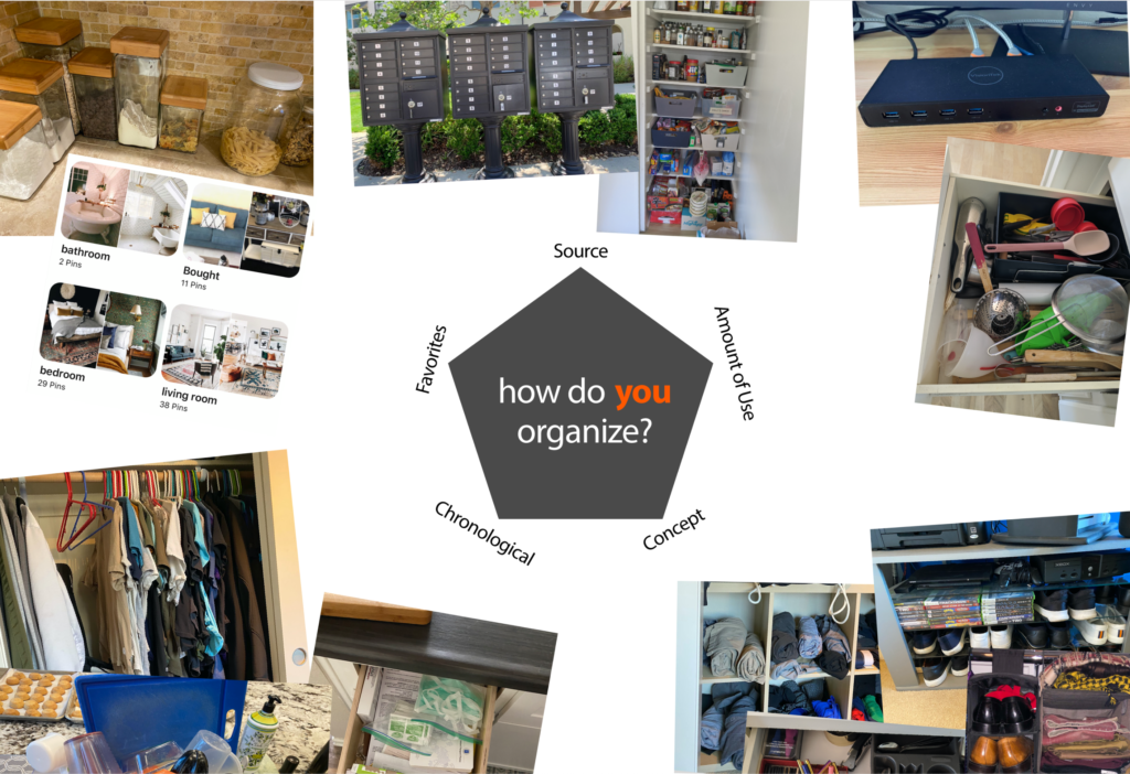
This… isn’t so rigorously researched a design artifact as personas and journey maps should be. In our case, we actually did back it up with some interesting research into the ways that people use and think about organization – I think the key reference would be the Five Hat Racks, although Justin pulled together a lot of research from the early years of computer science as a field, as well. To summarize, there are ~5.5 ways to organize digital files:
Amount of use
By provenance (source)
Chronologically
User self-selection/favorites
By concept, or by Venn Diagram (thus, .5)
Regardless, the end result makes for a fun visual, so I thought I’d share it here:
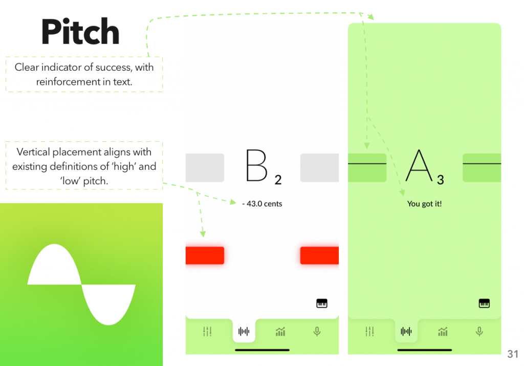
For form design, cognitive load theory can be boiled down to the idea that people only have so much space in their brain, so don’t overfill it. The exact amount varies depending on context: is the information auditory or visual?1 What stage of processing are you going through? (Gwizdka 3)
Techniques for Reducing Cognitive Load
Produce less cognitive load. Intrinsic cognitive load is necessary to what the user is trying to do; extrinsic is work because the design surrounding the goal is bad (Hollender et al. 1279; Feinberg & Murphy 345).
Use multiple modalities. Mixing visual with auditory, for example, allows users to distribute the cognitive load across multiple cognitive subsystems (Oviatt 4).
Do the work for them. Pre-filling known fields (i.e., a user’s name and address when they’re already signed in) moves the cognitive load from the user to the computer, saving the user the effort (Gupta et al. 45; Winckler et al. 195).
Cognitive Load in Human-Computer Interaction
Under heavy cognitive load, users work slower, and may commit more errors (Rukzio et al. 3). From a young age, humans are goal-oriented; slowing them down as they work towards these goals, unless explicitly a design goal, can only cause frustration (Klossek et al.). Reducing cognitive load leads to happier users.
Applying Cognitive Load Theory to Form Design
Cognitive load theory gives us several key takeaways:
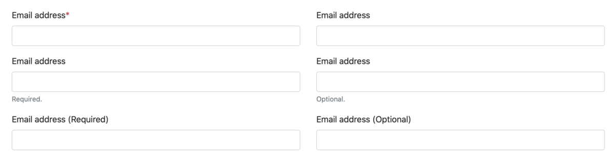
Indicate which fields are required. Provide a clear indicator of what is required so your users don’t have to guess (Bargas-Avila, Javier A., et al., 20 Guidelines 5).2
Pre-fill data when possible. Use available sources—an existing account, or on-device sensors—to save the user the effort. However, if that data might not be accurate, don’t guess; leave the field blank to prompt the user to enter the correct data (Rukzio et al. 3-4).
Don’t interrupt the user by validating data. Real-time validation is fine, as long as it doesn’t force the user to switch from ‘completion mode’ to ‘revision mode’ (Bargas-Avila, Javier A., et al., Useable error messages 5).3
There has not been any research into the combined effects of marking required fields and pre-filling fields; however, we can extend the conclusions in the first two points, above, as such: a required field, even if pre-filled, remains required, and should be marked as such.
Bibliography
Baddeley, Alan D., and Graham Hitch. “Working memory.” Psychology of learning and motivation. Vol. 8. Academic press, 1974. 47-89. Bargas-Avila, Javier A., et al. “Simple but crucial user interfaces in the World Wide Web: introducing 20 guidelines for usable web form design, user interfaces.” (2010). Bargas-Avila, Javier A., et al. “Usable error message presentation in the World Wide Web: Do not show errors right away.” Interacting with Computers 19.3 (2007): 330-341. Budiu, Raluca. Marking Required Fields in Forms. 16 June 2019, www.nngroup.com/articles/required-fields/. Feinberg, Susan, and Margaret Murphy. “Applying cognitive load theory to the design of web-based instruction.” 18th Annual Conference on Computer Documentation. ipcc sigdoc 2000. Technology and Teamwork. Proceedings. IEEE Professional Communication Society International Professional Communication Conference an. IEEE, 2000. Gupta, Abhishek, et al. “Simplifying and improving mobile based data collection.” Proceedings of the Sixth International Conference on Information and Communications Technologies and Development: Notes-Volume 2. 2013. Gwizdka, Jacek. “Distribution of cognitive load in web search.” Journal of the American Society for Information Science and Technology 61.11 (2010): 2167-2187. Harper, Simon, Eleni Michailidou, and Robert Stevens. “Toward a definition of visual complexity as an implicit measure of cognitive load.” ACM Transactions on Applied Perception (TAP) 6.2 (2009): 1-18. Hollender, Nina, et al. “Integrating cognitive load theory and concepts of human–computer interaction.” Computers in human behavior 26.6 (2010): 1278-1288. Klossek, U. M. H., J. Russell, and Anthony Dickinson. “The control of instrumental action following outcome devaluation in young children aged between 1 and 4 years.” Journal of Experimental Psychology: General 137.1 (2008): 39. Oviatt, Sharon. “Human-centered design meets cognitive load theory: designing interfaces that help people think.” Proceedings of the 14th ACM international conference on Multimedia. 2006. Pauwels, Stefan L., et al. “Error prevention in online forms: Use color instead of asterisks to mark required-fields.” Interacting with Computers 21.4 (2009): 257-262. Rukzio, Enrico, et al. “Visualization of uncertainty in context aware mobile applications.” Proceedings of the 8th conference on Human-computer interaction with mobile devices and services. 2006. Stockman, Tony, and Oussama Metatla. “The influence of screen-readers on web cognition.” Proceeding of Accessible design in the digital world conference (ADDW 2008), York, UK. 2008. Tullis, Thomas S., and Ana Pons. “Designating required vs. optional input fields.” CHI’97 Extended Abstracts on Human Factors in Computing Systems (1997): 259-260. Winckler, Marco, et al. “An approach and tool support for assisting users to fill-in web forms with personal information.” Proceedings of the 29th ACM international conference on Design of communication. 2011.
The foremost theory splits it into three: the phonological loop (sound), the episodic buffer, and the visuospatial scratchpad, all controlled by a central executive (Baddeley & Hitch; the episodic buffer was added by Baddeley in a later revision than that cited here). ↩
There is some dispute over what makes the best indicator; the general consensus in industry is to use asterisks to mark required fields (Budiu). Studies have shown, however, that using a background color in the field to highlight required fields performs better (Pauwels et al.), which in turn is outperformed by physically separating the required fields from the optional ones (Tullis & Pons). All, however, agree that it is preferable to mark the required fields, rather than the optional. ↩
Non-interruptive real-time validation, say by adding error messages beneath invalid fields, works well for sighted users. Be aware, however, that screen reader software struggles with dynamically-updating pages (Stockman & Metatla); avert this accessibility problem by providing both real-time and on-demand validation, presenting errors in a modal fashion when the user attempts to submit the form with invalid data. ↩
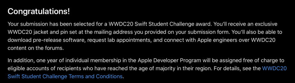
A few days ago, Apple announced the winners of their Swift Student Challenge. I had applied and used my “taking a test” tactic, which was to hit ‘submit’ and then promptly erase the whole thing from my brain. (What’s done is done, and I feel silly worrying about something I have no control over.)
So when I got the email that “my status was updated” it was a bit of a surprise.
And when I clicked through the link (because, of course, they can’t just say in the email, you have to sign in) I was in for more of a surprise.
My submission had been accepted. I’m one of 350 students around the world whose work sufficiently impressed the judges at Apple.
Neat!
Now, throughout the whole process of applying, I was my usual secretive self. I think two people knew that I was applying at all, much less what I was working on. Since it’s over with, though, it’s time for the unveiling.
What I made
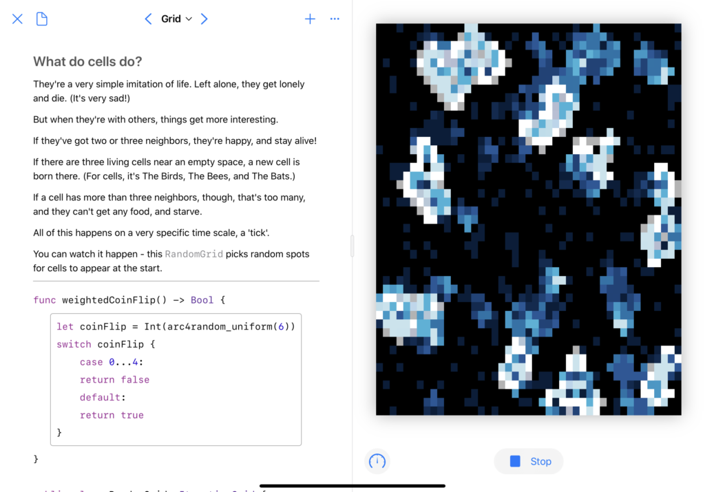
I wanted to bring back a concept I’ve played with before: cellular automata. A few days before the competition was announced, I’d seen a video that really caught my interest.
Well hey, I thought, I’ve got some code for running cellular automata. I want to learn Swift Playgrounds. And I’ve been having fun with SwiftUI. Let’s combine those things, shall we?
The first big change was a visual history; when a cell dies, I don’t want it to just go out, I want it to fade slowly, leaving behind a trail of where the automata have spread.
The second was rewriting all the visuals in SwiftUI, which was a fun project. Animation timings took me a bit to get right, as did figuring out how to do an automated ‘update n times a second’ in Combine. The biggest issue I had, actually, was performance – I had to do some fun little tricks to get it to run smoothly. (Note the .drawingGroup()here – that made a big difference.)
And third, I didn’t want it to just be “here’s some code, look how pretty,” I wanted to actually use the Playground format to show some cool stuff. This turned out to be the most frustrating part of the whole thing – the Swift Playgrounds app doesn’t actually support creating a PlaygroundBook, and the Xcode template wasn’t supported in the then-current version of Xcode.
But the end result? Oh, I’m quite happy with it. PlaygroundBooks are cool once you get past how un-documented they are. You can, to borrow a Jupyter turn of phrase, mix code and prose in a lovely, interactive way.
Don’t worry, the real version (and some videos) are below.
Doing the actual writing was pretty fun. This is a concept I’ve spent a lot of time learning about, just because it captured my interest, and I wanted to share that in a fun way.
We’re currently wrapping up the spring quarter, and this seemed like an opportune moment to pause, catch my breath, and go back over some of the work that we’ve done so far.
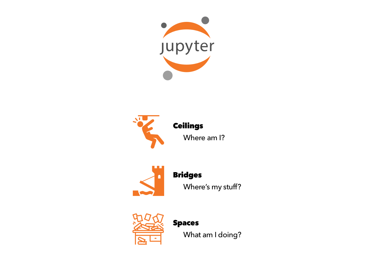
And I will, first, pause to say that my use of ‘we’ there is very deliberate. I am part of a wonderful team of designers and researchers, working on the file system in JupyterLab:
After years of being a developer, my first serious involvement in the world of open-source is as a designer. How about that?
So, what have we done so far?
Heuristic Evaluation
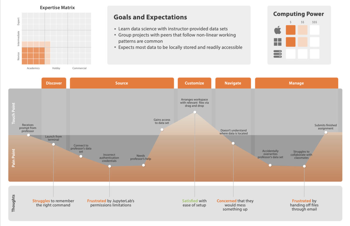
We began with a heuristic evaluation of JupyterLab, going through the process of setting up and using the file browser, and identifying key pain points.
We used Nielsen’s ten heuristics, and assigned a severity rating, from low to high, to problems. And, not to be all negative, we also highlighted some key strengths.
A heuristic evaluation is a great starting point. It’s a low-cost way to go through an entire interface and identify usability problems, and it’s quick, too.
Working asynchronously, have each of your panel members — and, in this case, the panel consisted of the five of us on the design team — individually go through the interface, making a note of any usability issues they see. Once everyone is done, combine the lists, merging similar/identical items.
Research shows that this technique works, even if the people doing the evaluation aren’t subject matter experts.
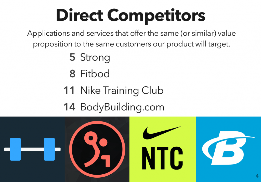
Competitive Analysis
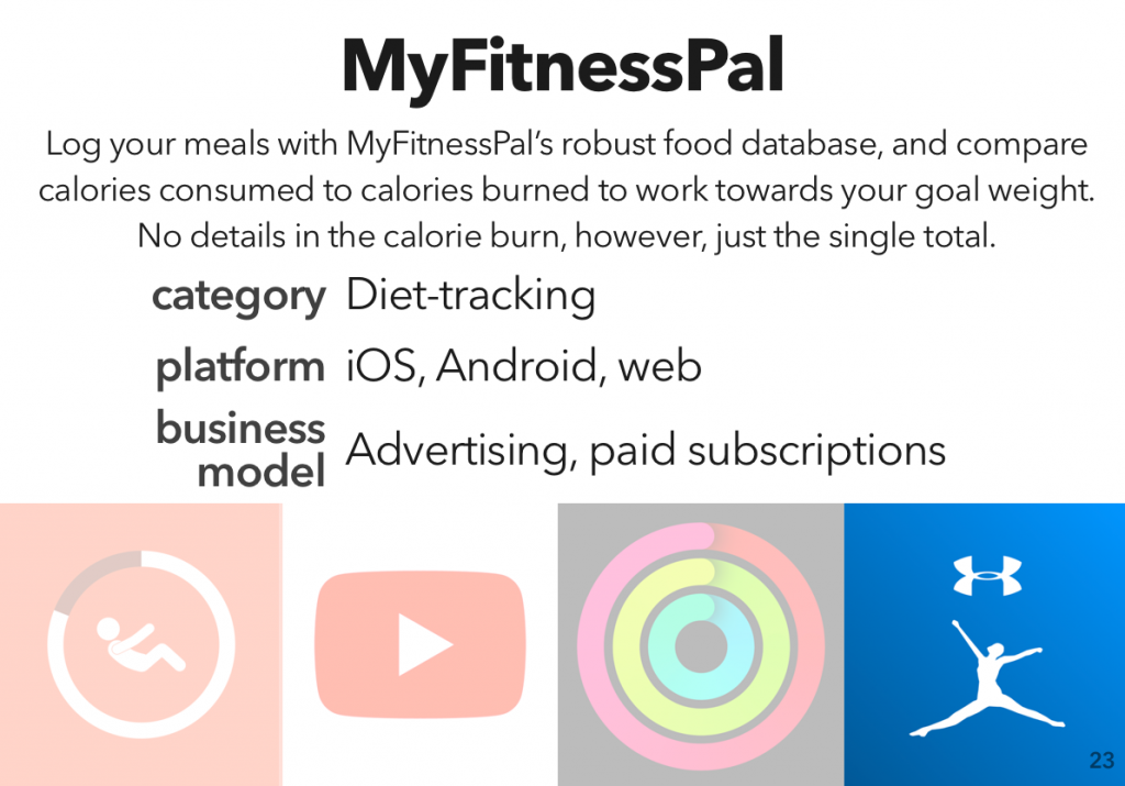
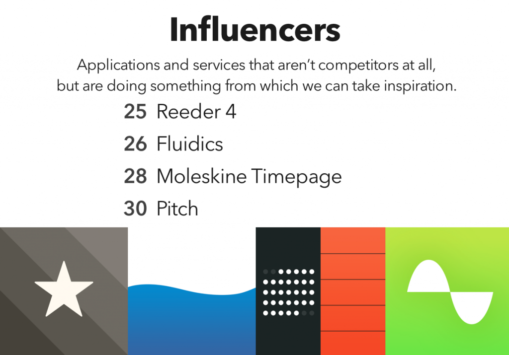
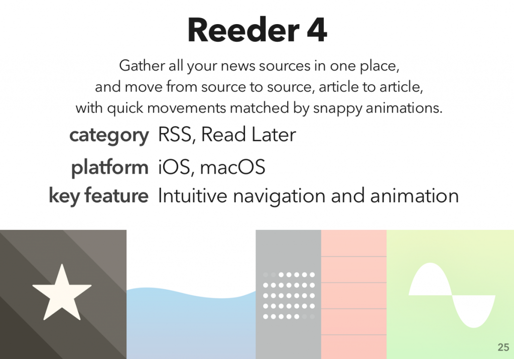
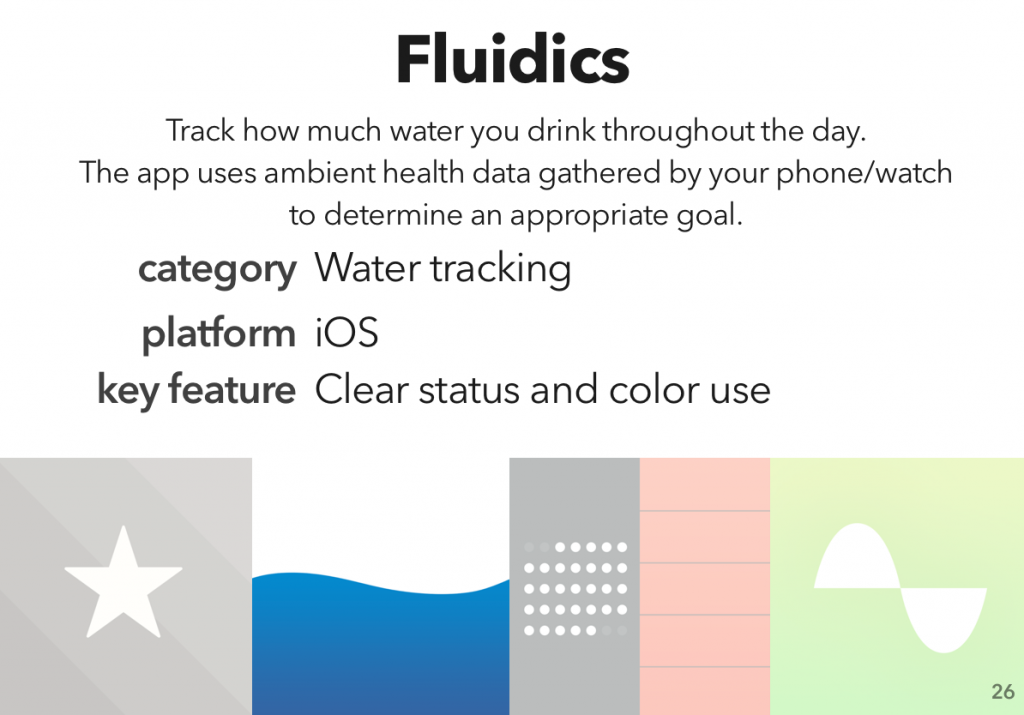
Next, we identified several competitors to JupyterLab, direct and indirect, and some influencers — products that aren’t competing with JupyterLab, but could offer some design inspiration.
In short, because it’s really helpful to know what your competition is up to. Are there features they have that your users need? That’s a problem. Do you have something cool that your competitors don’t come close to? That’s a marketing opportunity.
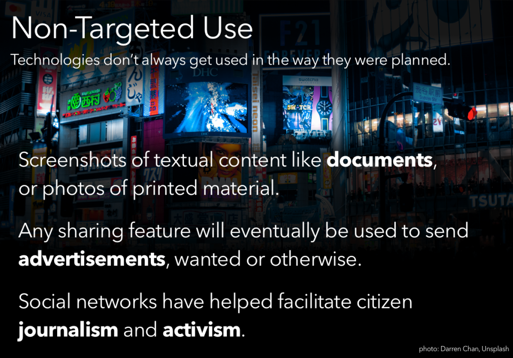
It’s a chance to see what the state of the art is, and what market niches are un-filled. (Like, for example, the lack of good sharing features I highlighted in my last competitive analysis.)
Sketches & Wireframes
While the research team continues with interviews and surveys, Emily and I started in on sketches and wireframes of the new file browser.
Design is an iterative process: research feeds design feeds research feeds design. The initial research gave us our starting point; now, we make sketches, wireframes, and low-fidelity prototypes. The research team will take those and test them. What they learn will feed the next set of prototypes, and the cycle continues.
Especially early on in the process, you want to go low-fidelity; not only because it’s easier, but because it looks easier. If you make something pixel-perfect and beautiful, it looks like a finished project; the people testing it feel bad for pointing out what’s wrong with it, and stay silent, and those flaws work their way into the final product. Nobody’s happy.
What’s next?
We’ve got some more research deliverables that we’re in the process of wrapping up, which I will (eventually) post about here. And then, prototyping and testing!
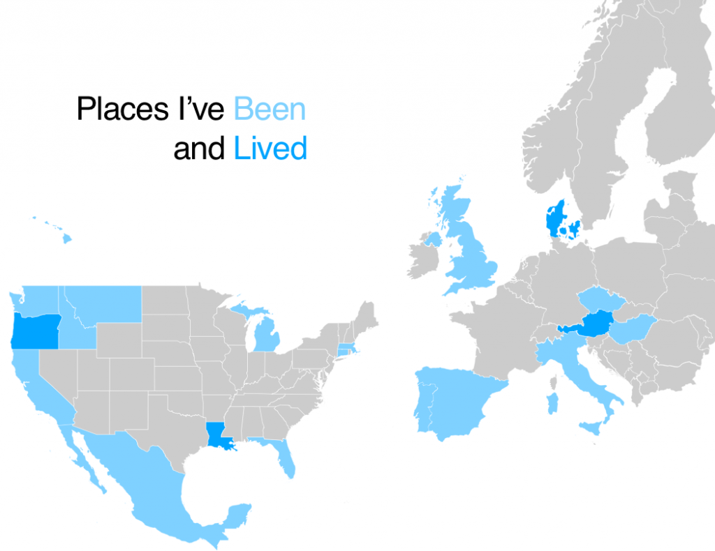
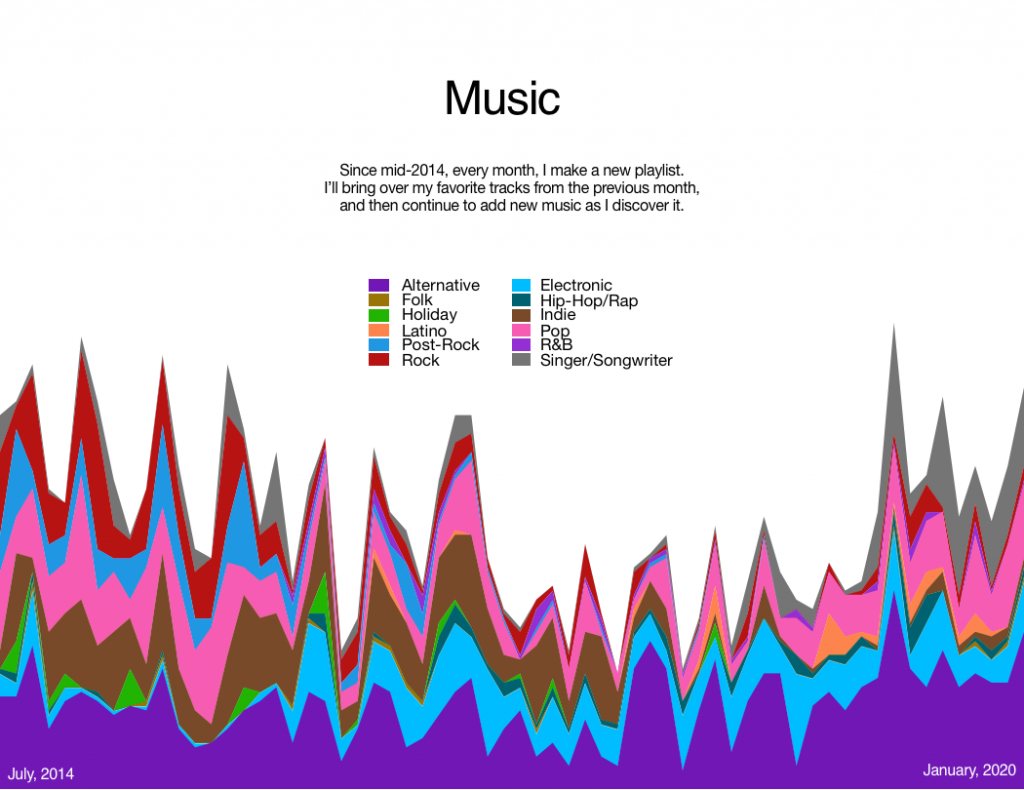
A quick post of a class assignment we did a while back – tinkering with data visualization. I went with my travels and my playlists as the data sources.
(Obviously it’s low-resolution data, for the most part, but you try showing more granular data on a map of the world.)This was compiled through a lot of tinkering in Numbers. I’d try to write a script to do it, but given that I am, presumably, the only person on the planet who could actually make use of it, I’m going to not.
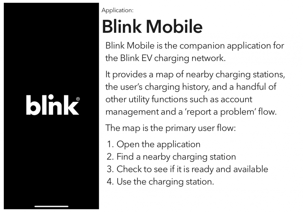
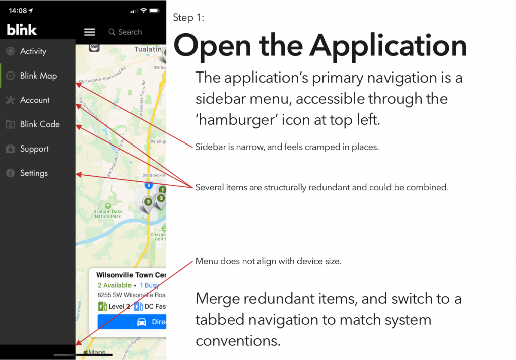
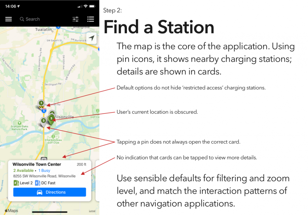
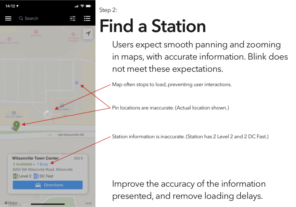
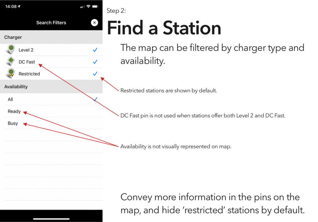
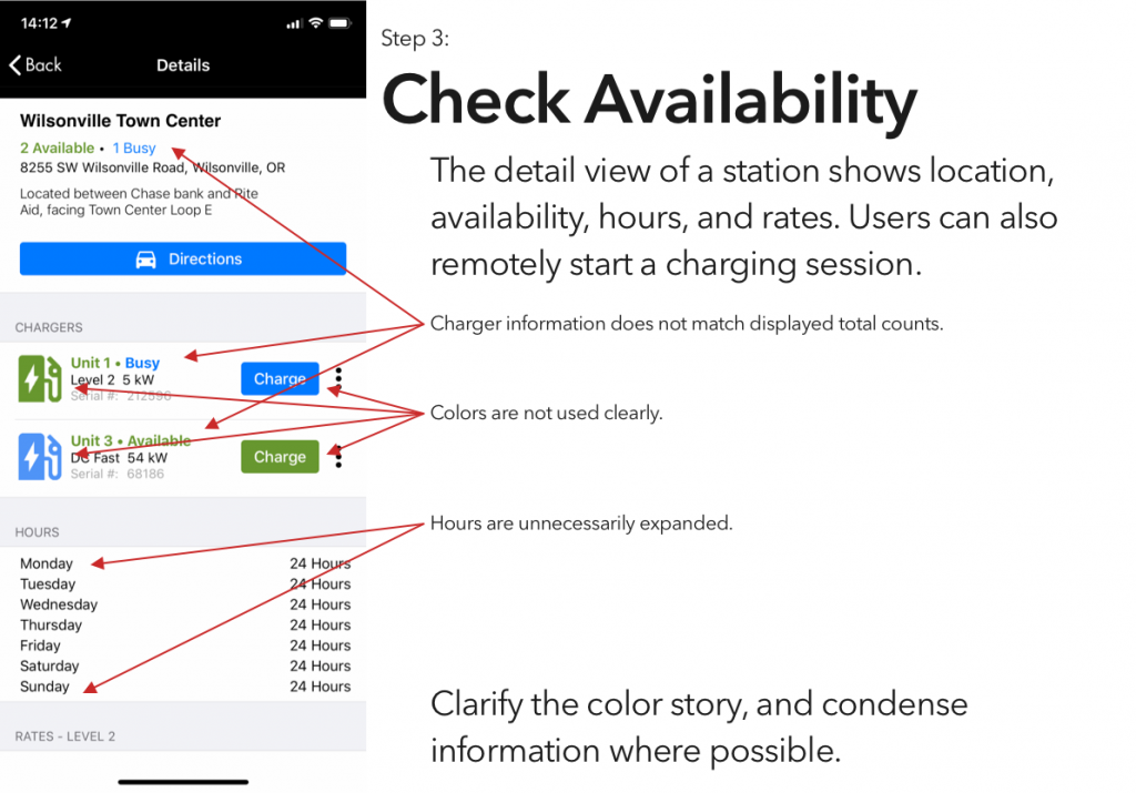
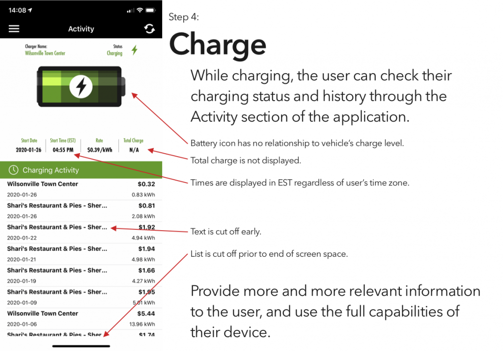
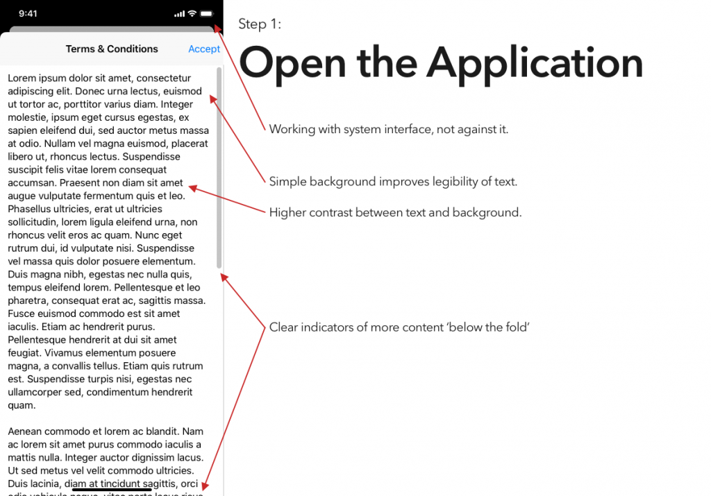
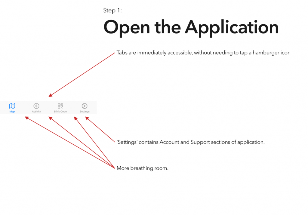
It’s been interesting to watch electric vehicles grow in popularity, a trend that I expect to continue unless someone decides to pour marketing money on hydrogen. That said, aside from Tesla’s Supercharger network, EVs are seriously lacking an answer to the refueling infrastructure of gasoline vehicles.
I’ve tried a couple of the different commercial offerings, and have so far found them all to be a horrible user experience. (Current winner? The charging stations at the public library, which were installed recently enough that they haven’t been activated. There’s no sign to indicate that, no information on the stations’ display screens, and if you call their support to ask “what’s the deal?” they’ll tell you that “those stations were decommissioned.”)
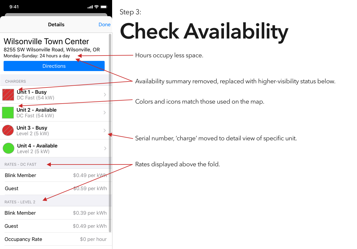
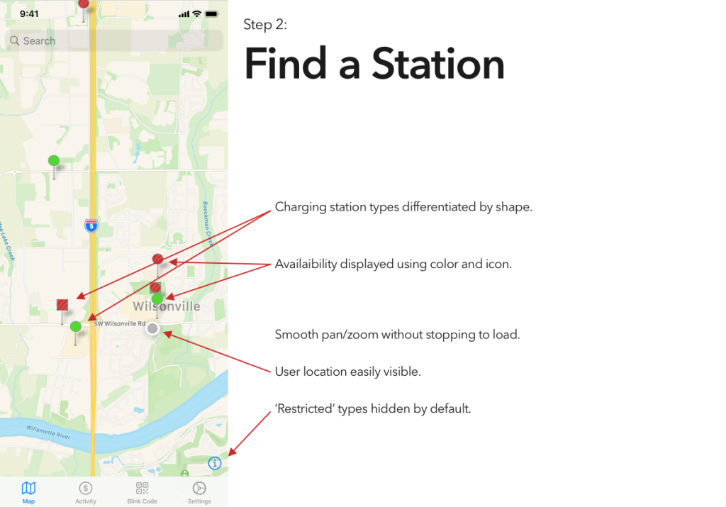
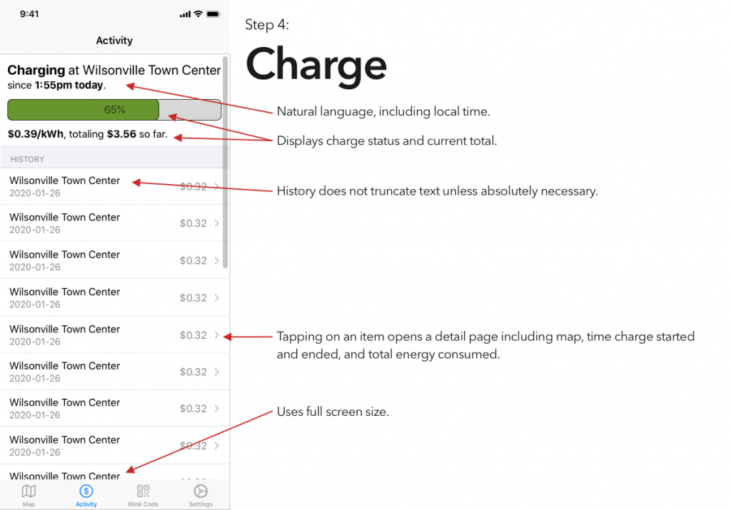
Blink is, at least in my area, the most robust charging network, and thus is the only one whose app I’ve bothered to try. And it is… not great.
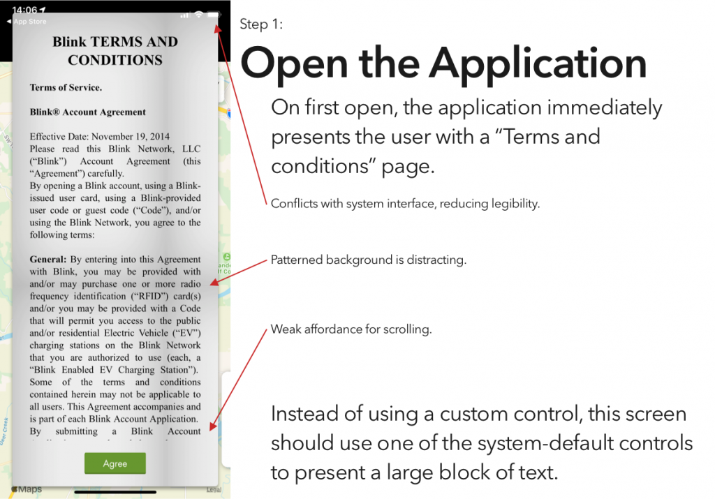
So, continuing on in the proud Design Student tradition of uninvited redesigns, here’s my takedown and redesign of Blink’s app. (And hey, if someone from Blink is reading this – send me an email, I’d be happy to flesh this out a bit more. Or write some of the code.)
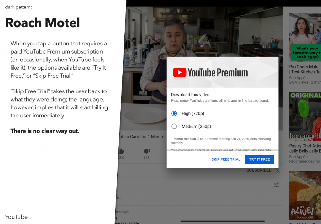
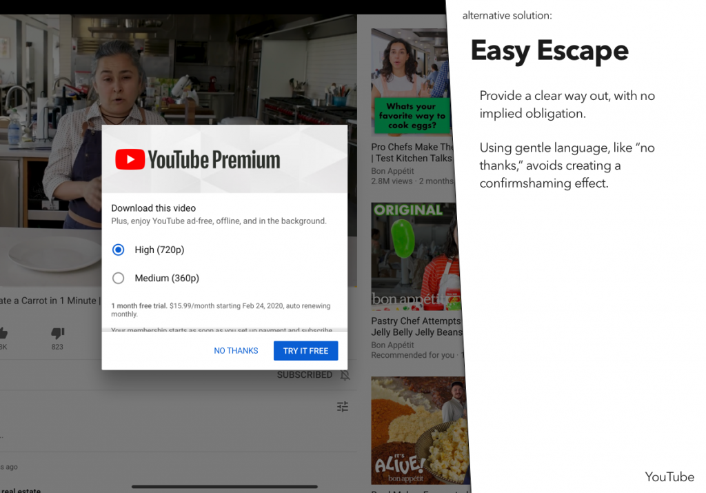
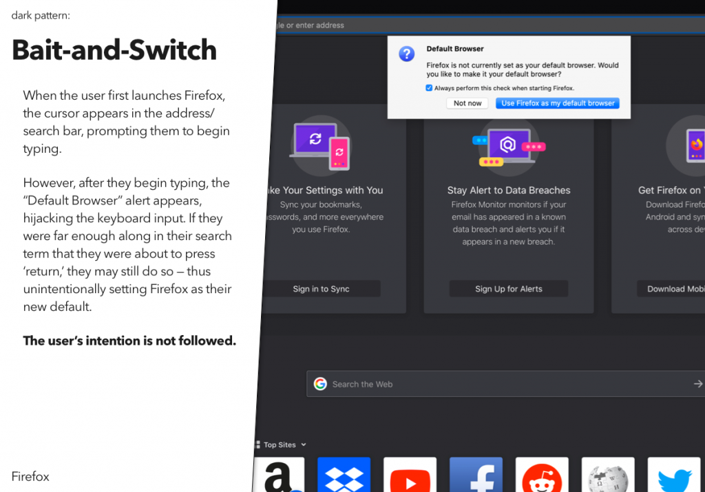
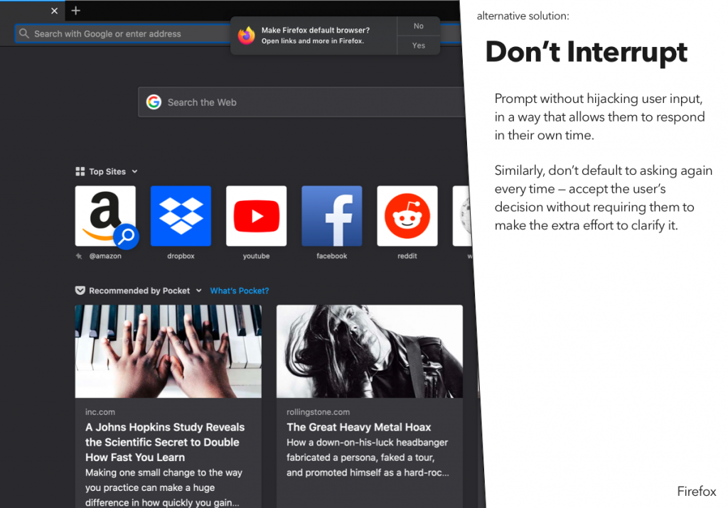
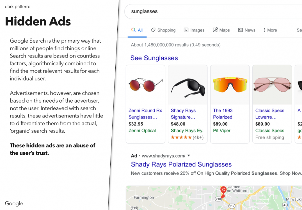
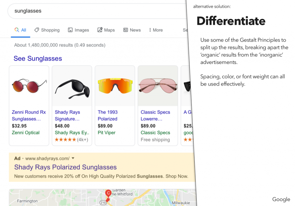
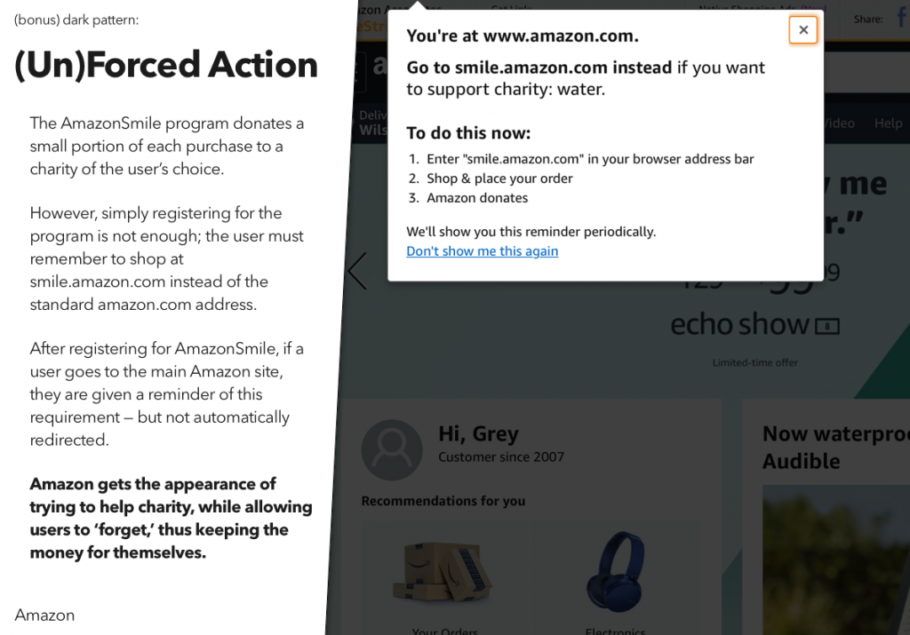
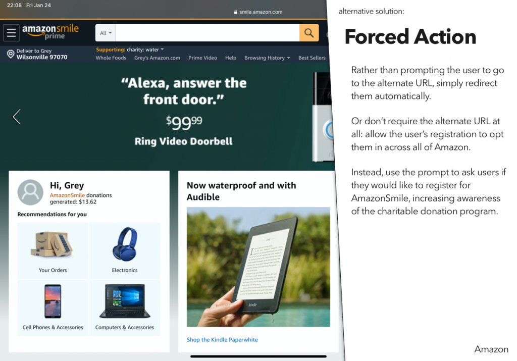
For a recent class assignment, we had to choose three dark patterns, find a site or service using each one, and then propose an alternative version that didn’t use that dark pattern.
You may notice that I’ve actually done four here – the last one was an interesting variant on some of the example dark patterns, and I wanted to explore that a bit.
You can also download a PDF of the presentation – it will work better in screen readers:
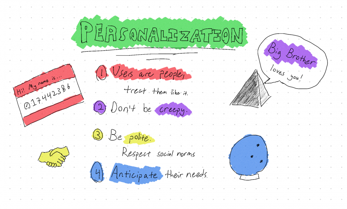
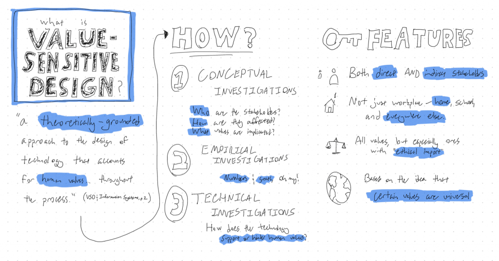
The first unit in our course on Advanced Design and Prototyping focused on Value-Sensitive Design, and a couple of the assignments we did as part of it were pretty fun.
The first was to do a sketchnote on the concept itself. I’ll admit, I was a bit skeptical of the concept of sketchnoting – I thought it would be fun, but I didn’t think it would actually be all that useful. In doing it, however, I found that it helped me to coalesce my thoughts a bit – though, admittedly, that may have more to do with the fact that it forced me to go through my typed notes again than the sketchnoting itself. Still, it was a fun way to do that bit of studying, so I think I’ll try to add it to my workflow in the future.
Presented with apologies for my terrible handwriting.
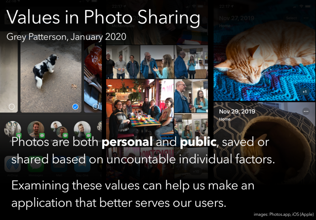
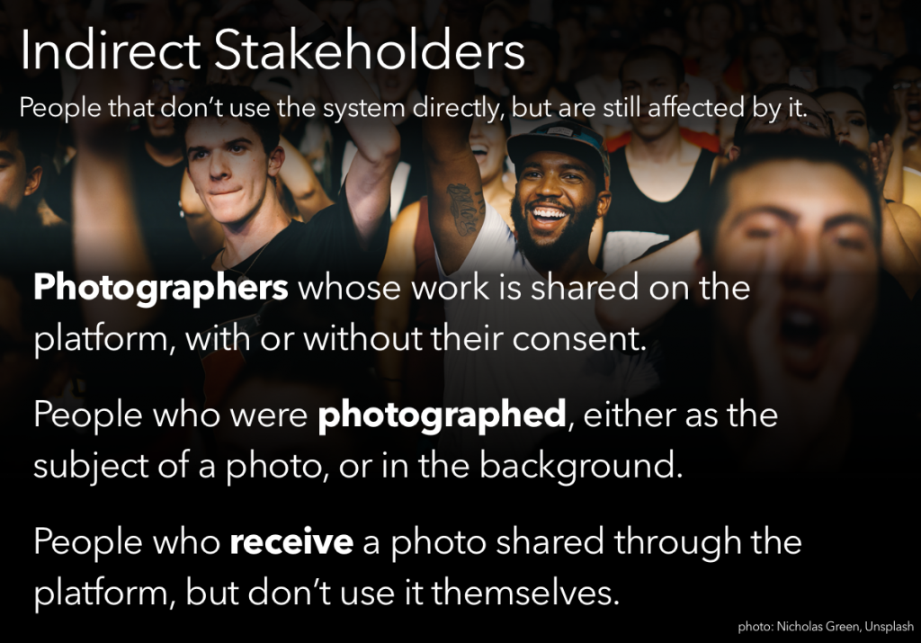
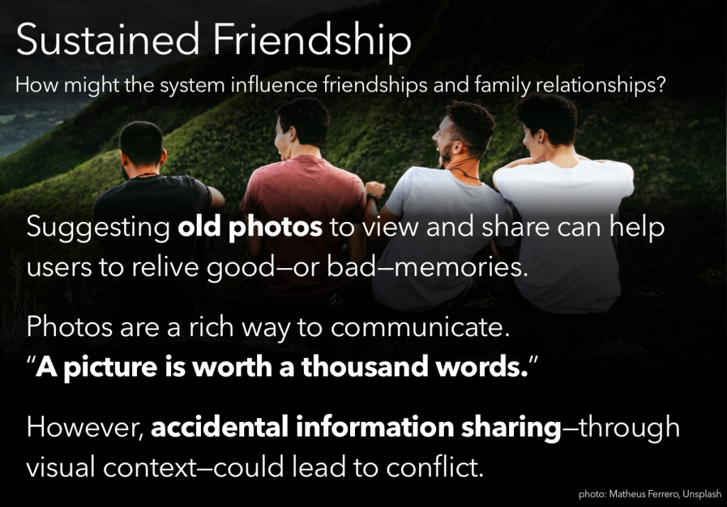
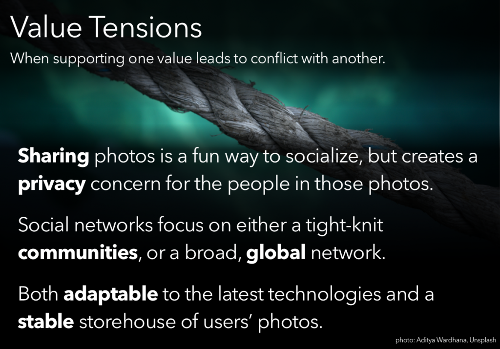
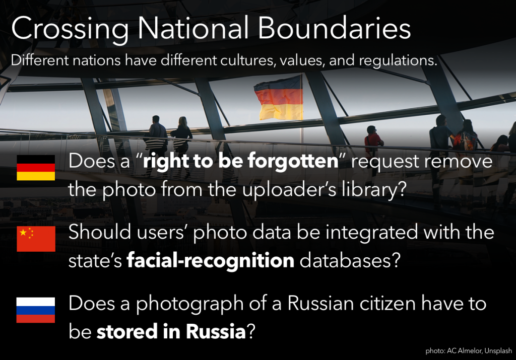
Another activity was to put together a presentation, going through some value-sensitive design processes and presenting our ‘findings.’ Of the available prompts, I chose the one that boiled down to “your team has just been hired to design a photo-sharing application; you’re in charge of the VSD portion. Go.”
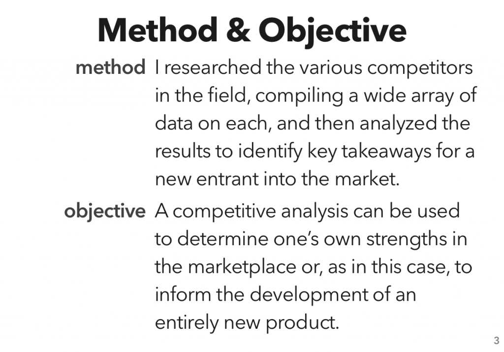
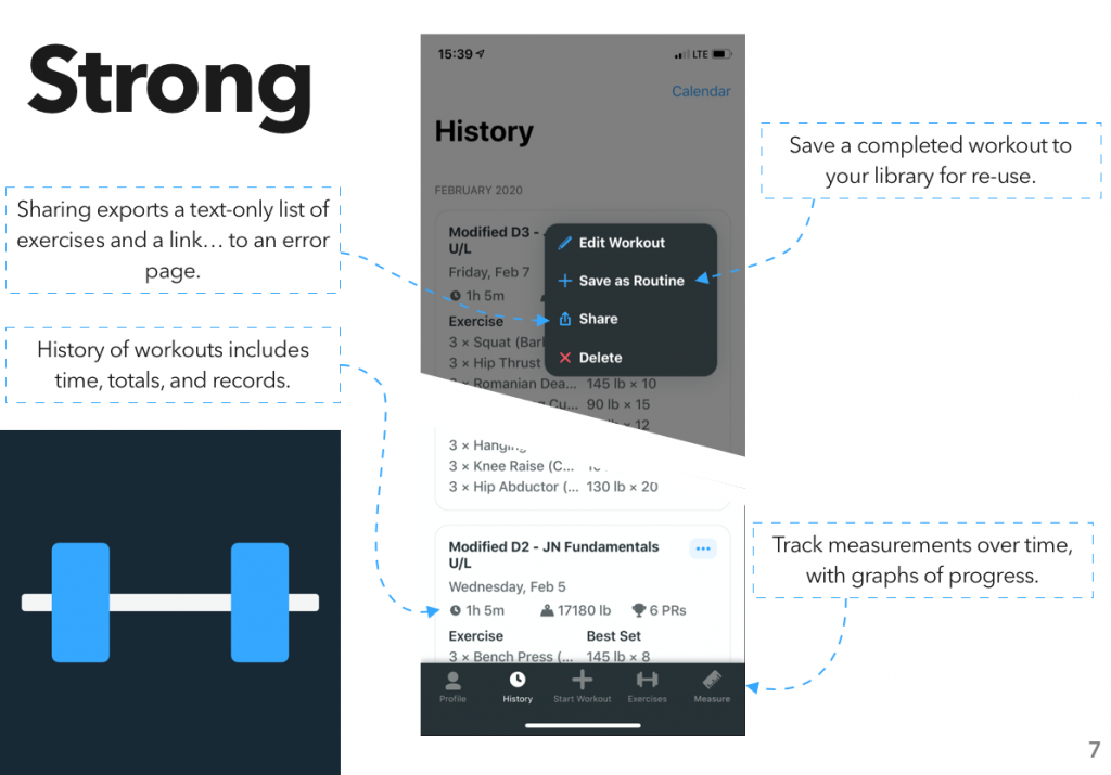
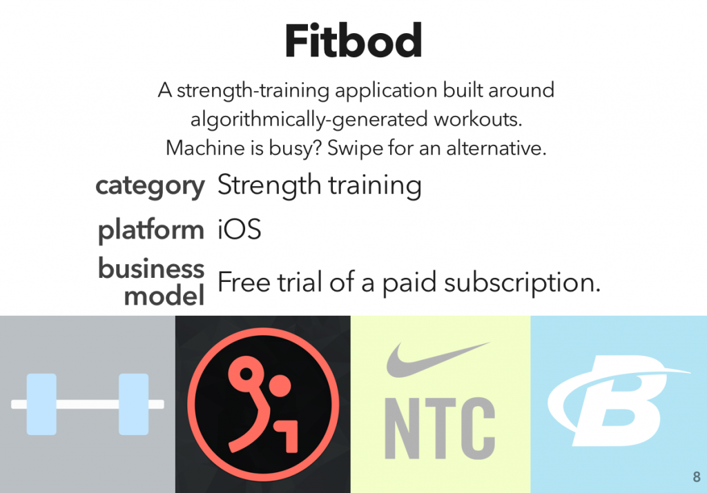
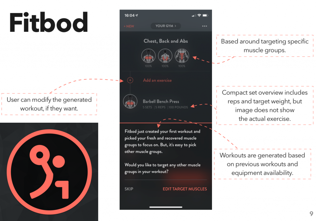
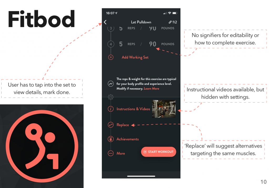
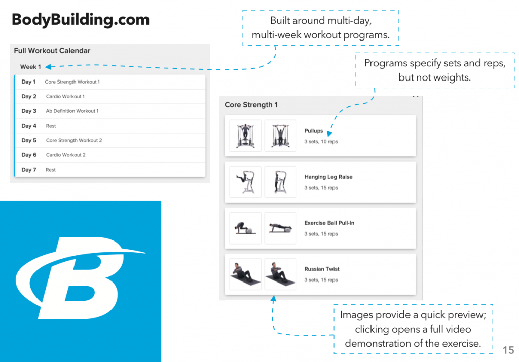
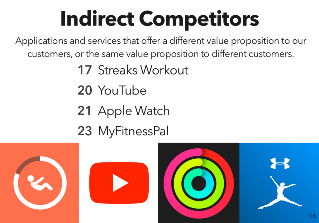
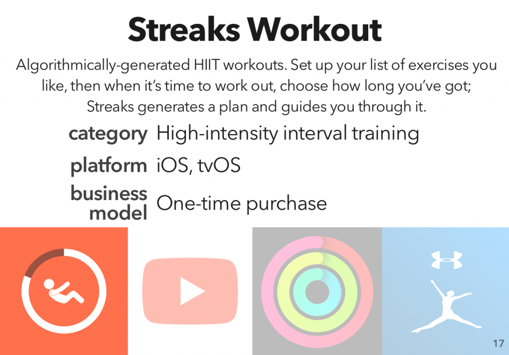
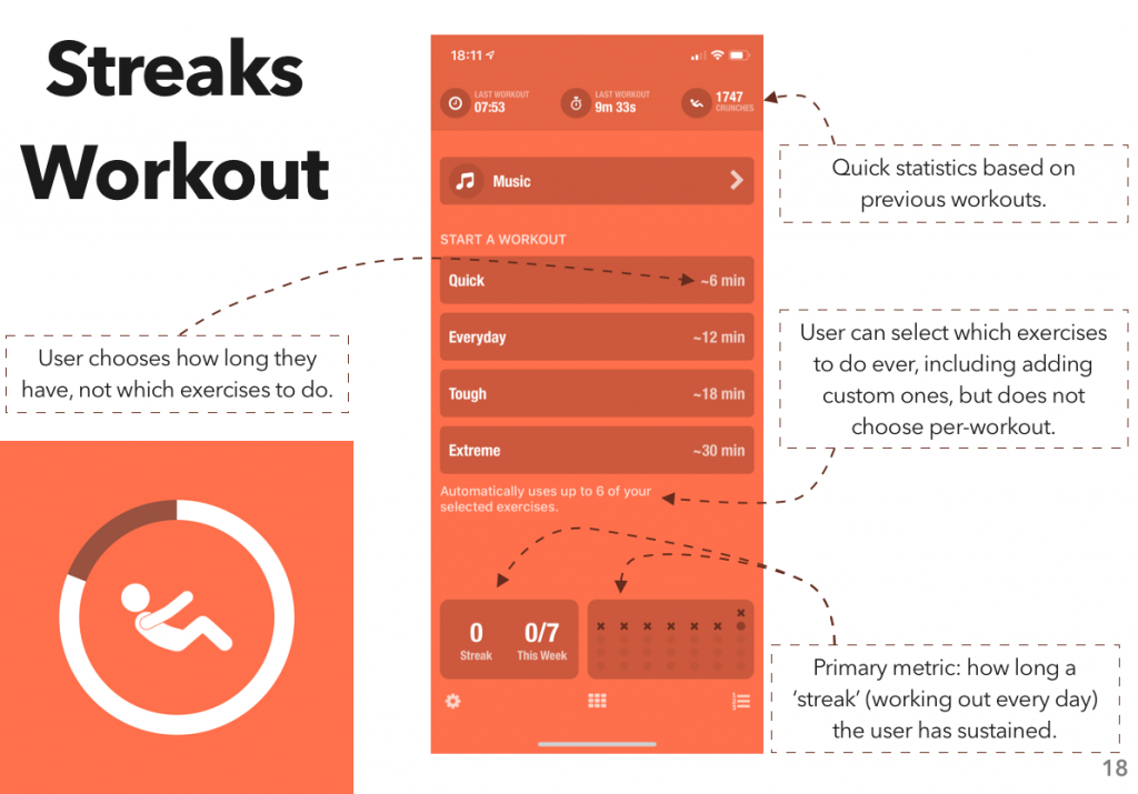
The second unit in my course on User Experience and Evaluation was on competitive analysis — looking over the competitive landscape in a given marketplace, and using that data to figure out both the low-level design and high-level strategy you should use to effectively compete.
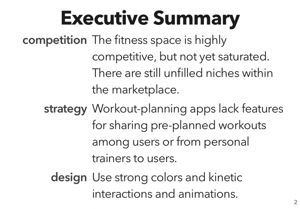
While I considered doing an analysis of the productivity management/to-do-list marketplace (an area on which I havemanyopinions), I realized that the end result of that analysis would be “the marketplace is saturated, and the ‘table stakes’ level of functionality is prohibitively expensive to achieve.” Not the most exciting result.
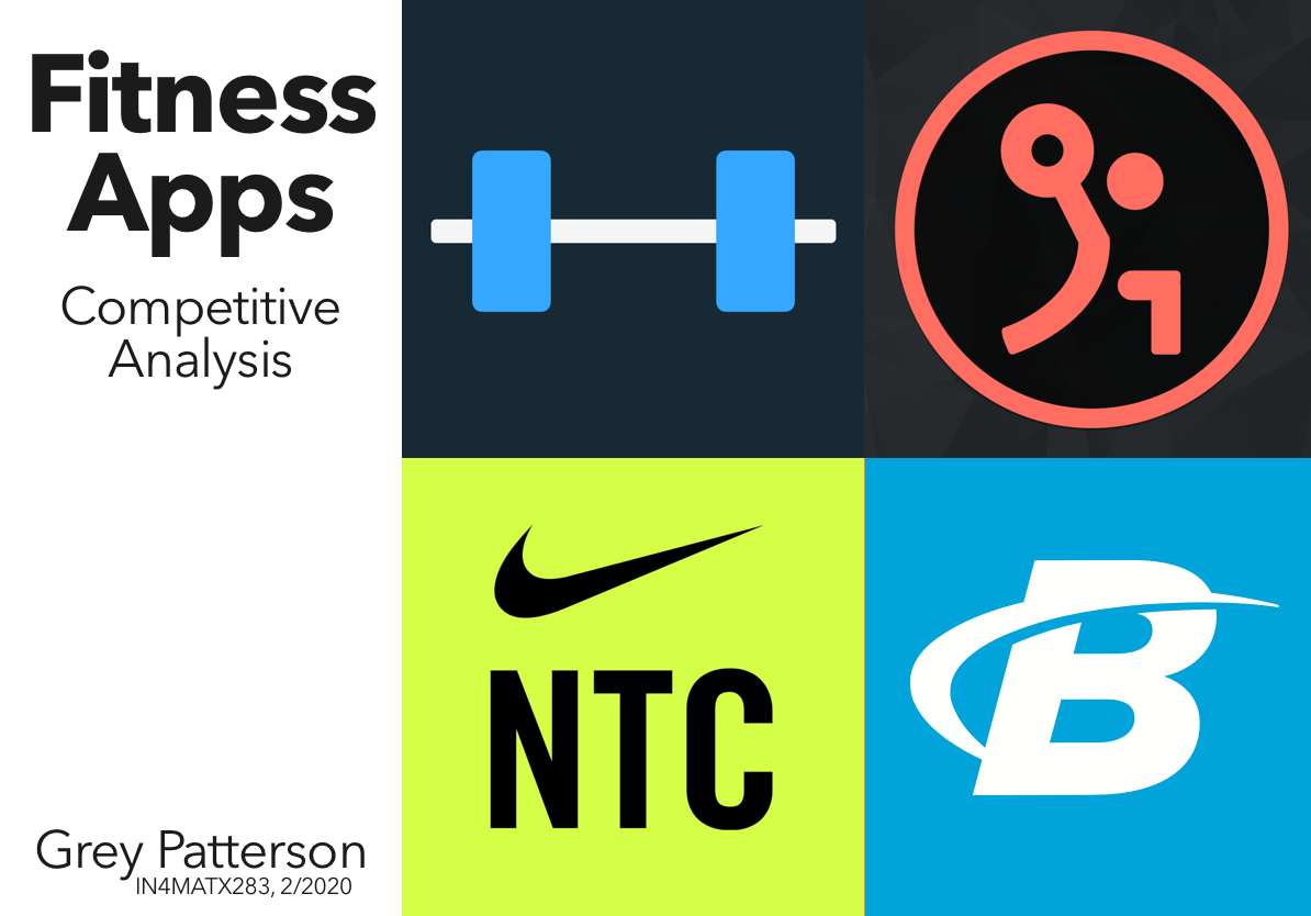
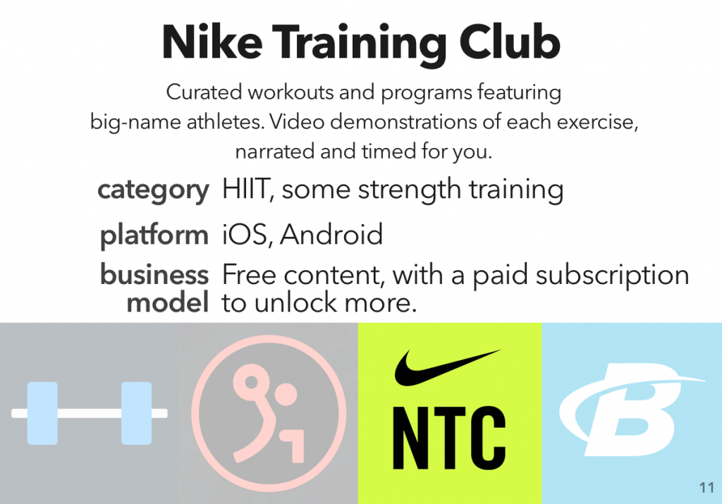
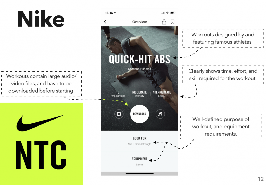
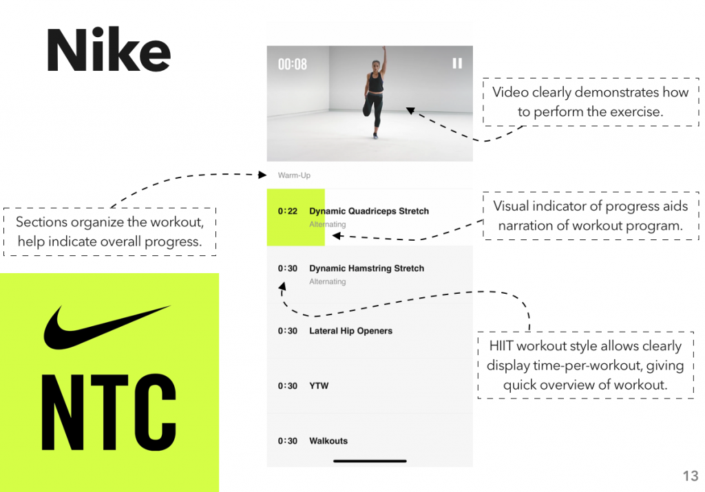
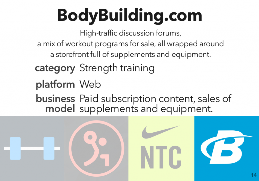
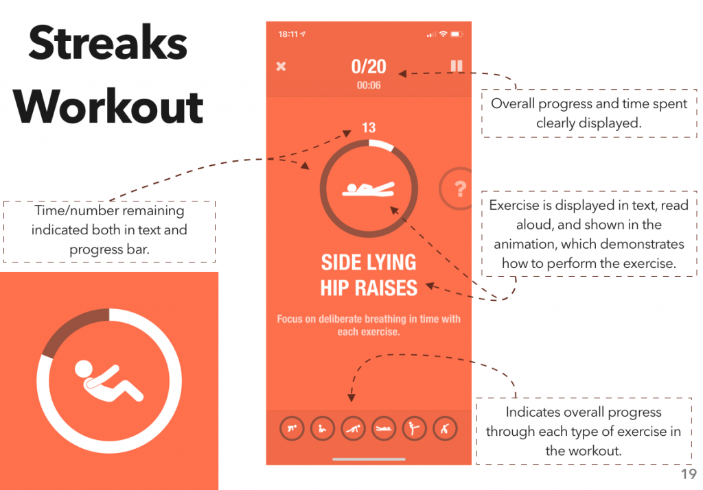
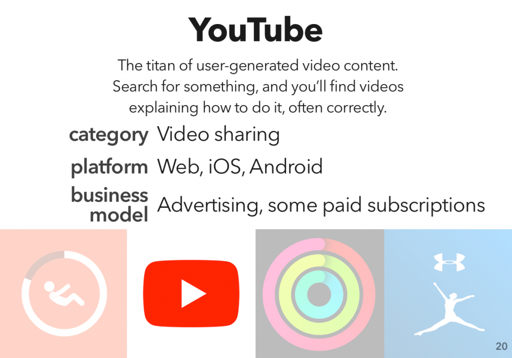
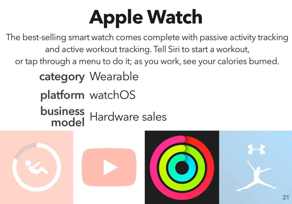
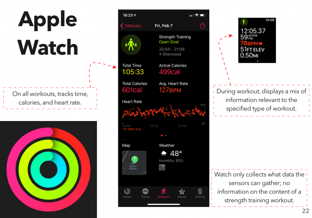
Instead, I looked at another area where I’ve gone through a surprising number of apps: fitness tracking. Specifically, workout planning and tracking – I did a previous assignment on how people use the gym, and one of my findings was “hoo boy are there a lot of different systems for planning and tracking a workout.”
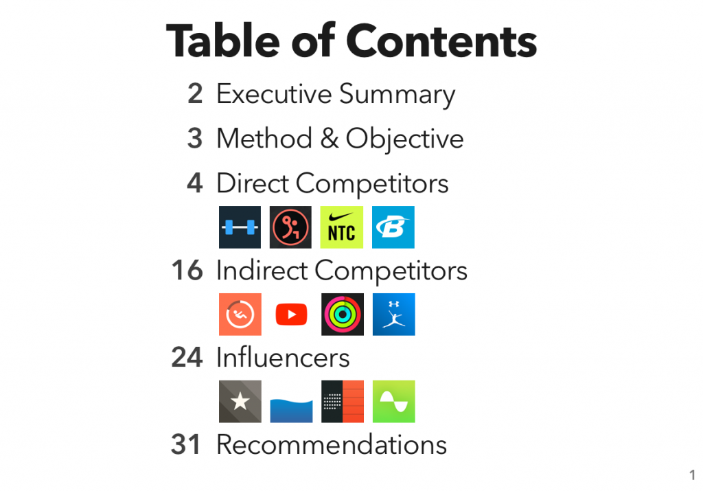
After downloading quite a few apps and compiling a rather monstrous spreadsheet, I put together the results into a report, which I’m now posting here.
(Will I be using these findings to develop an app? … No comment.)
For those using screen readers, or who prefer their own reading environment, you can download the full presentation PDF here:
As a recent assignment for one of my design classes, we were told to find a website whose design we didn’t like, build a moodboard for a new version of the site, and then create a high-fidelity prototype of the new version of the page we’d called out.
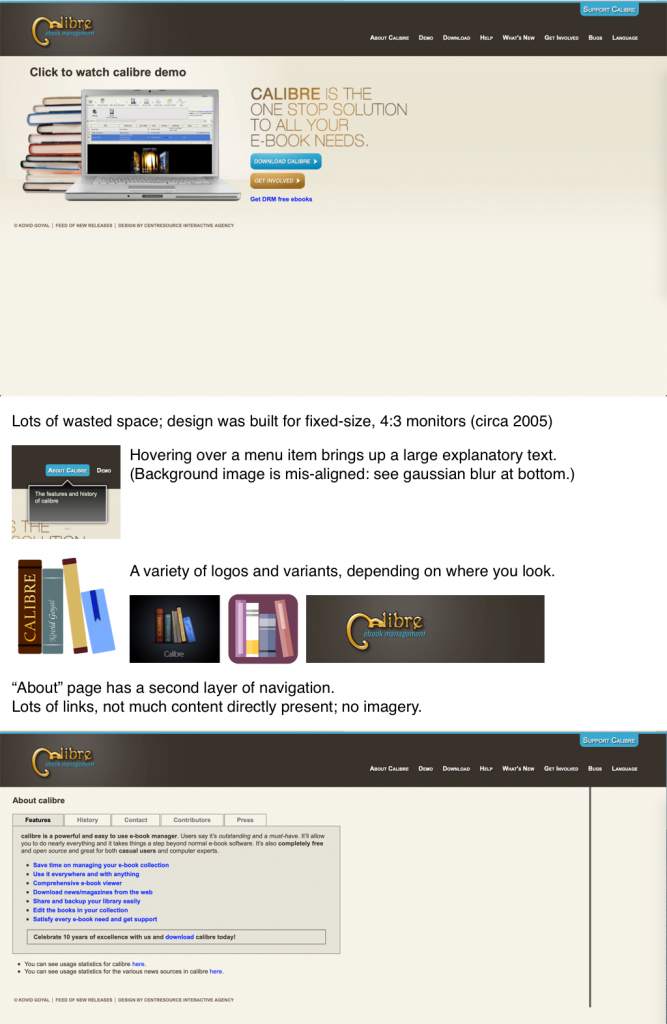
For my uninvited redesign, I selected Calibre’s homepage; I love what Calibre stands for, but I haven’t used it in years, because… well, I’ll just drop in my analysis portion here:
It could use some love, is the short form of it. (After I built that and submitted, I realized I’d forgotten to turn off my content blockers for the screenshot; the unaltered version of the site looks the same, but also features ads along the side, which explains that awkward hanging line in the latter screenshot.)
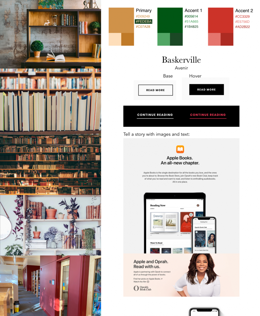
Next up, build a mood board. This was pretty fun to do – I basically just wandered around, not only the internet, but a nearby library, and my own bookshelves, looking for inspiration. Here’s the result:
I couldn’t not pick Baskerville, c’mon.
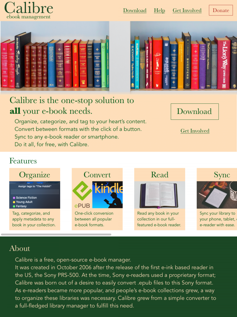
The final part of the assignment was to put together our own redesign, using what we’d put together in the mood board. I almost sat down with Sublime and coded it in HTML, because that’s what I do in my day job, and it’d be easy, but made myself use Sketch instead – what better way to learn than by practicing?
That’s the end, right?
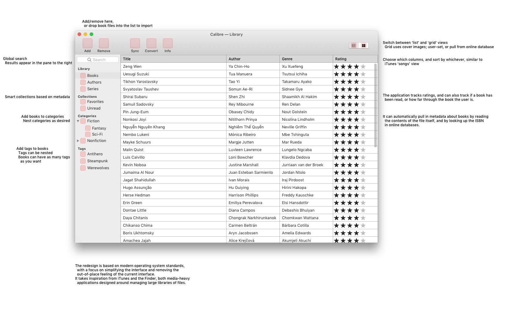
Well, no, if you looked at the featured image on this post, you already know I did a bit more. The extra credit portion of the assignment was to do a redesign of a different part of the brand; I opted to do a quick take on “Calibre, if it was designed for macOS”. (For reference, Calibre was designed for/using Qt, which means it looks somewhat out of place… basically everywhere.)
(I would like to clarify – I’m throwing a lot of shade at Calibre here, but I really do respect what it is, does, and stands for. DRM-free ebooks are a very good thing. Support your authors.)
This last bit was, in no small part, just an excuse to play around with the Sketch resources that Apple provides. They’re neat!
As I’m sure I’ve mentioned, I’m currently working on a master’s in design. (I’m not sorry for talking about it a lot, I’m excited!)
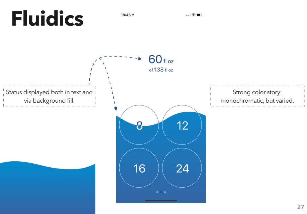
In the first week, we spent a lot of time sketching. Which is… not something I’ve done a whole lot of, in the past; a bit here and there, especially while I was planning out Fluidics, and I do some at work on occasion, but never as much as we did in that first class.
One of the things that our professors mentioned was that it’s something that takes practice. Which, duh, except I hadn’t really thought about it like that. I’d done the thing that so annoys me when people do it with music: "oh, I’m just not talented at that."
That’s wrong. It’s not that I’m not talented; it’s that I’ve never practiced. So I made a resolution of sorts: I’m doing a degree in design, sketching is an important skill in design, so I’m going to practice this skill. I added it to my habit tracker, and off I went.
Since then, I’ve been trying to do a sketch every day. Mostly sticking with pencils (or rather, ‘pencils’; most of these were done in Moleskine Flow – it’s a pretty good app for this, and I’m quite enjoying the Apple Pencil), a bit of pen here and there. And sketching whatever catches my eye – there’s a good deal of the random items around my house, and a small collection of light fixtures in the various Starbucks’ I’ve found myself in over the past month or so.
It’s been fun. And, looking back over my sketches to put this post together, I think I’m improving. So, hey, practice: it works!
In my Design and Prototyping class, we recently did an assignment called "Add a Feature". We were supposed to take an app or site we frequently use, find a competitor or two, and identify a feature that the competitor has. We would then sketch our take on that feature, if it were added to the original app, and wireframe it in Sketch.
As my original app, I chose Things. I’ve been a user, and fan, for years. I have also, however, tried OmniFocus, and know there’s a feature there that I would love to have in Things: sequential tasks.
The basic idea of sequential tasks is that you can set a project, or a group of tasks, to operate in parallel – the normal way, where you can see all the incomplete tasks – or in sequence. When they’re in sequence, you can only see the next incomplete task, not all of them.
Which would be very helpful to me, at the moment – I’m taking classes, and a lot of what’s going into Things at the moment is "do this reading, watch these lectures, then do this assignment." Except, of that sentence fragment, things doesn’t support the word ‘then’, so I see the whole list all at once. I’d rather only see the reading, then only see the lectures, then only see the assignment. Perfect candidate for the assignment.
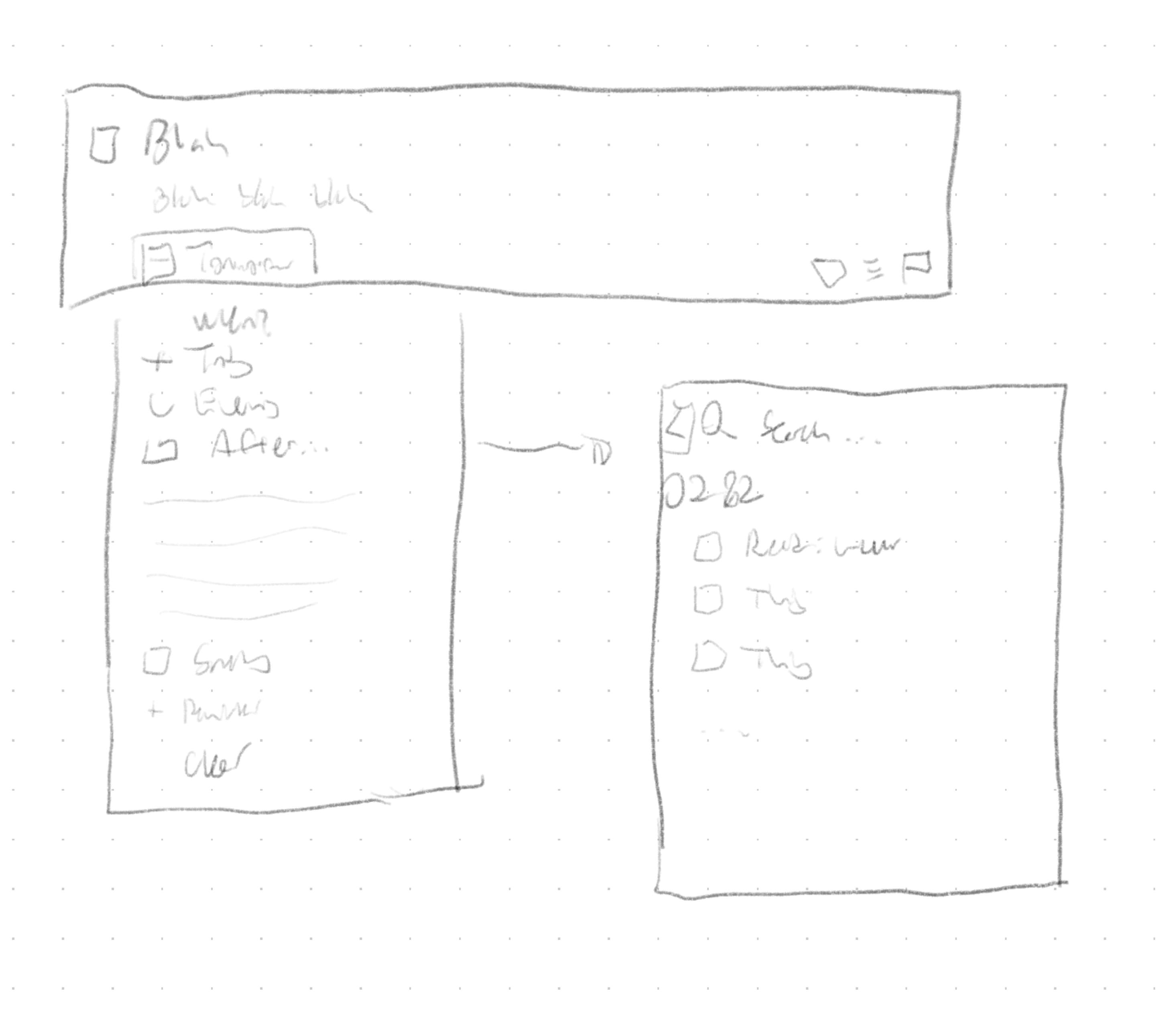
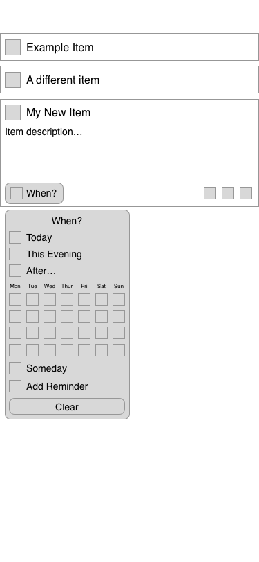
So, first thing’s first: sketch it.
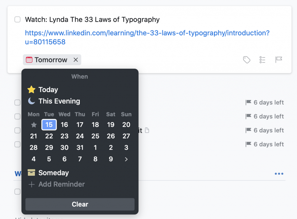
I kicked around a couple different ideas, but pretty quickly arrived at the conclusion that it should be integrated into Things’ ‘When’ menu.
The ‘When’ menu in Things. After opening it, you can either click to select an item, or begin typing, and use their natural language parser to choose a date.
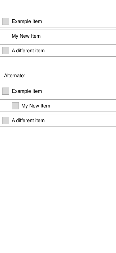
The other question was how to display these in the list. The point, of course, was that sequential items wouldn’t show up in the ‘Anytime’ list, but they do still need to be visible in some circumstances – namely, when you click through to the project itself, future items still show up.
In the ‘Anytime’ list, that third item wouldn’t appear; you could find it either in ‘Upcoming,’ which is sorted by date, or within the containing project – which is where I took this screenshot.
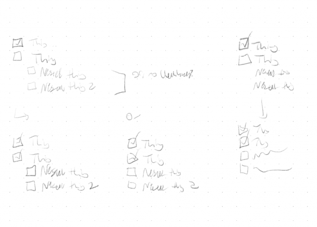
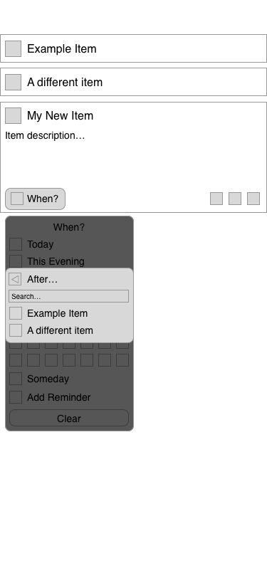
I actually tried a couple variations – it’s at this point that, were I working for Cultured Code, I’d say “we should build both versions and do some testing to see which is better.” I’m not, though, so I just wireframed them both and turned in the result.
I’m fairly happy with the way I integrated it. Clicking, tapping, or typing “After” pulls up a second menu, where you can search for the item you want to attach to. Instead of thinking about it in terms of the project, the mental model is just “after x, I’ll do y.”
All told, I really enjoyed this exercise – it was the first wireframing I’ve ever done in Sketch, and it was neat to think about integrating a feature into something I use all the time. (And, hey, Cultured Code, if you’re reading this: feel free to use this idea, because I’d love to have the feature.)