Categories
Portfolio

Uninvited Redesign: Blink

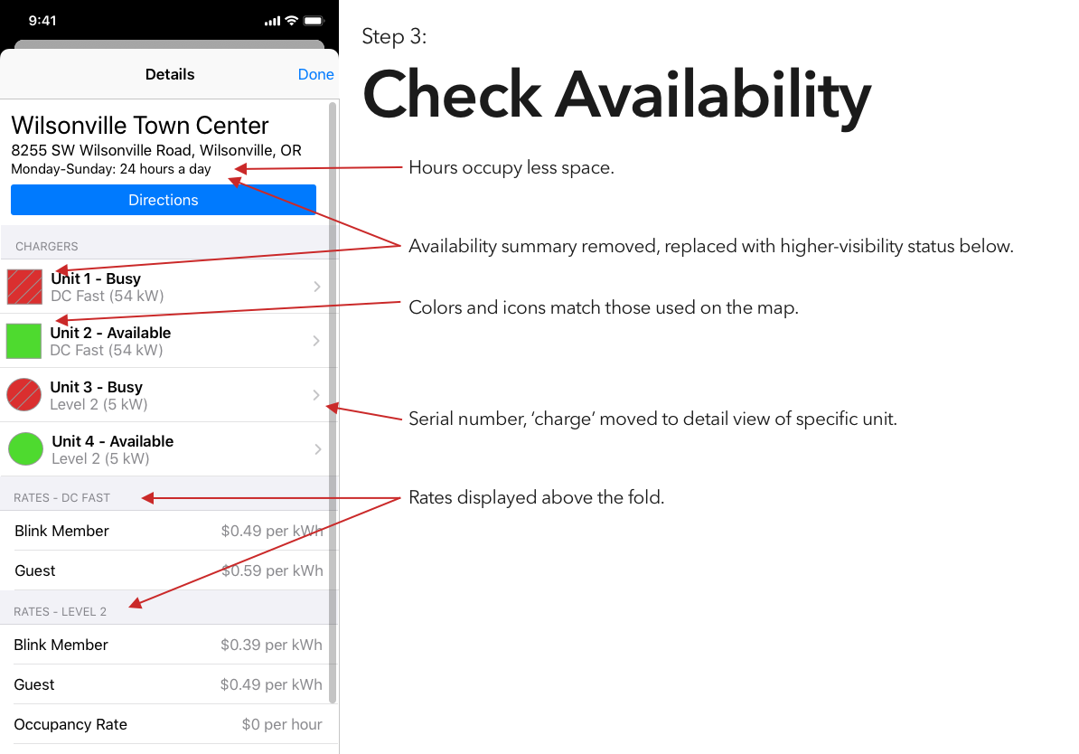
It’s been interesting to watch electric vehicles grow in popularity, a trend that I expect to continue unless someone decides to pour marketing money on hydrogen. That said, aside from Tesla’s Supercharger network, EVs are seriously lacking an answer to the refueling infrastructure of gasoline vehicles.

I’ve tried a couple of the different commercial offerings, and have so far found them all to be a horrible user experience. (Current winner? The charging stations at the public library, which were installed recently enough that they haven’t been activated. There’s no sign to indicate that, no information on the stations’ display screens, and if you call their support to ask “what’s the deal?” they’ll tell you that “those stations were decommissioned.”)

Blink is, at least in my area, the most robust charging network, and thus is the only one whose app I’ve bothered to try. And it is… not great.

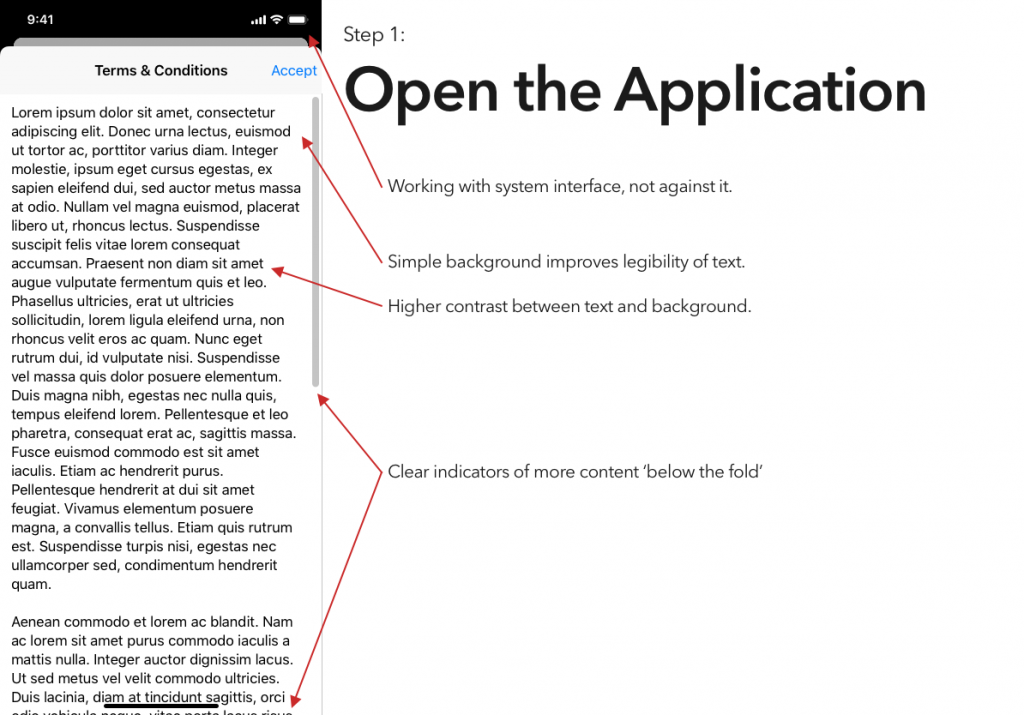
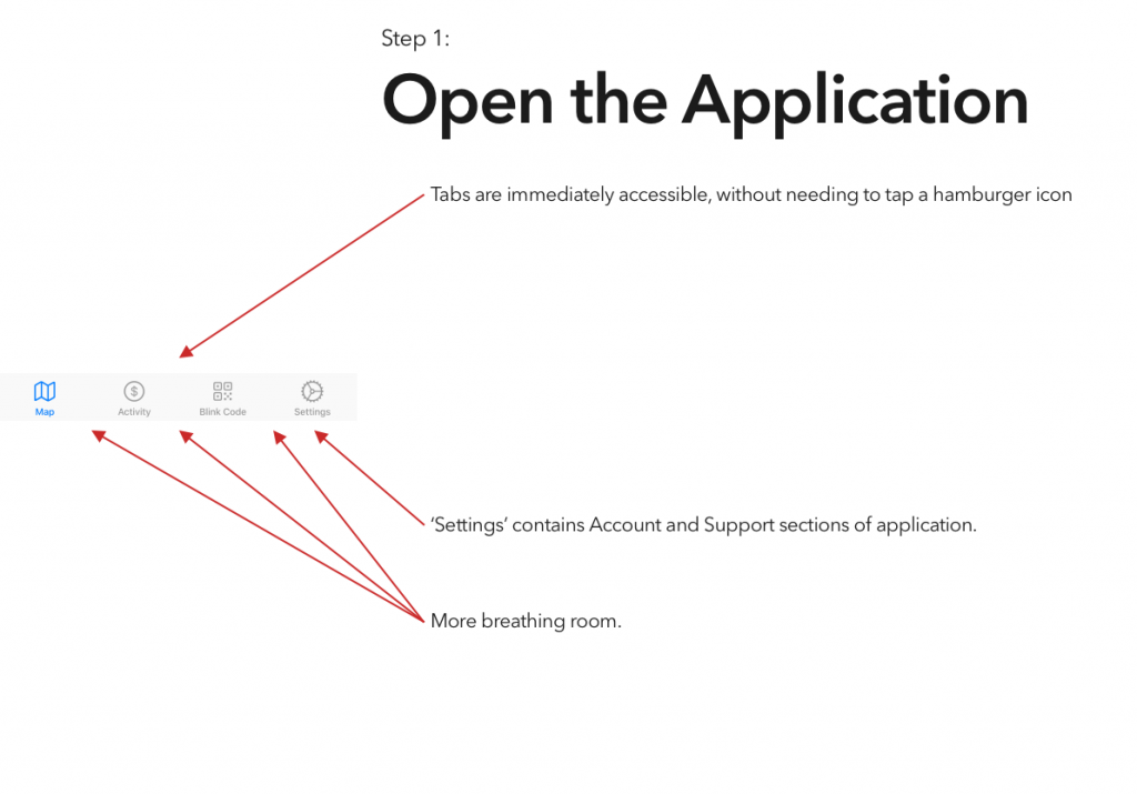
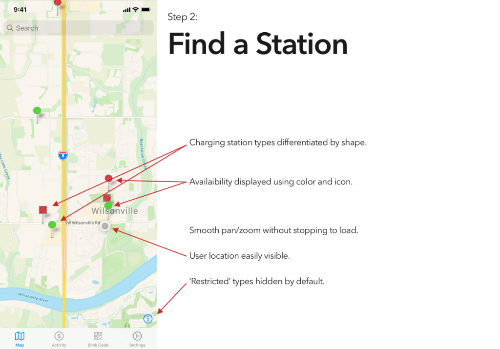
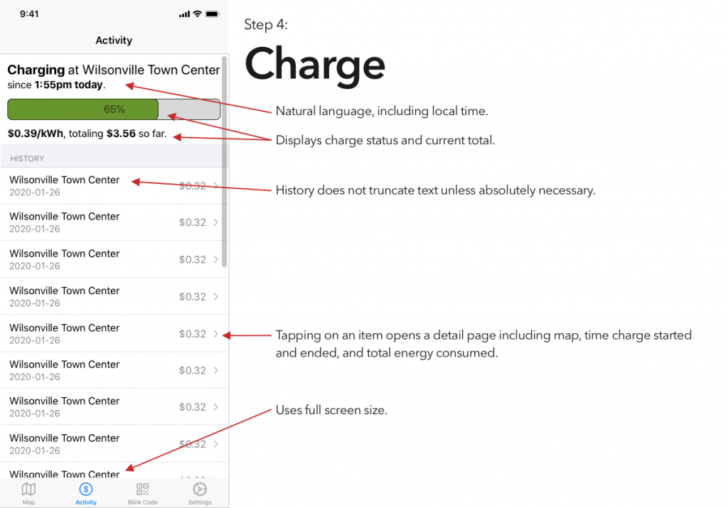
So, continuing on in the proud Design Student tradition of uninvited redesigns, here’s my takedown and redesign of Blink’s app. (And hey, if someone from Blink is reading this – send me an email, I’d be happy to flesh this out a bit more. Or write some of the code.)

Also available as a PDF, if that’s your jam:

Categories
Portfolio

Uninvited Redesign: Calibre

As a recent assignment for one of my design classes, we were told to find a website whose design we didn’t like, build a moodboard for a new version of the site, and then create a high-fidelity prototype of the new version of the page we’d called out.

For my uninvited redesign, I selected Calibre’s homepage; I love what Calibre stands for, but I haven’t used it in years, because… well, I’ll just drop in my analysis portion here:

It could use some love, is the short form of it. (After I built that and submitted, I realized I’d forgotten to turn off my content blockers for the screenshot; the unaltered version of the site looks the same, but also features ads along the side, which explains that awkward hanging line in the latter screenshot.)

Next up, build a mood board. This was pretty fun to do – I basically just wandered around, not only the internet, but a nearby library, and my own bookshelves, looking for inspiration. Here’s the result:

I couldn’t not pick Baskerville, c’mon.

The final part of the assignment was to put together our own redesign, using what we’d put together in the mood board. I almost sat down with Sublime and coded it in HTML, because that’s what I do in my day job, and it’d be easy, but made myself use Sketch instead – what better way to learn than by practicing?

That’s the end, right?

Well, no, if you looked at the featured image on this post, you already know I did a bit more. The extra credit portion of the assignment was to do a redesign of a different part of the brand; I opted to do a quick take on “Calibre, if it was designed for macOS”. (For reference, Calibre was designed for/using Qt, which means it looks somewhat out of place… basically everywhere.)

(I would like to clarify – I’m throwing a lot of shade at Calibre here, but I really do respect what it is, does, and stands for. DRM-free ebooks are a very good thing. Support your authors.)

This last bit was, in no small part, just an excuse to play around with the Sketch resources that Apple provides. They’re neat!