Categories
Portfolio

Collecting Clippings

I recently started a Master’s in Human-Computer Interaction and Design. While the main goal of the program is, obviously, learning, one of the side goals is to build a portfolio; as such, I’m going to be making an effort to post some of what we’re working on in class here.

One of our assignments was to start collecting images and clippings, and doing some annotations of them. The idea is to build up a library; something like Quiver, but for design instead of development. It was actually very fun; a lot of my classmates did it handmade, and I considered it, but I’ve also been meaning to try Adobe XD and figured, why not?

Source: Paprika

It’s a pretty neat tool, it made it very quick to put these all together. Much more focused than my other digital go-to, PhotoShop, where I probably could’ve accomplished the same thing, but would’ve spent more time digging around in the ‘draw a line’ settings and whatnot.

Source: Windows Task Manager (Windows 10)

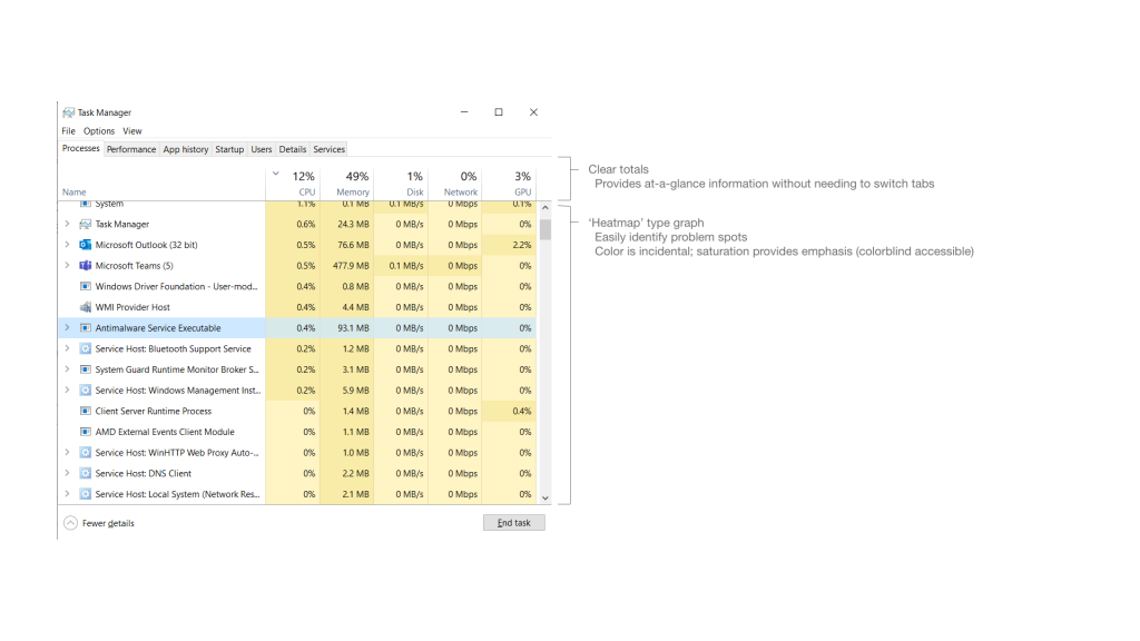
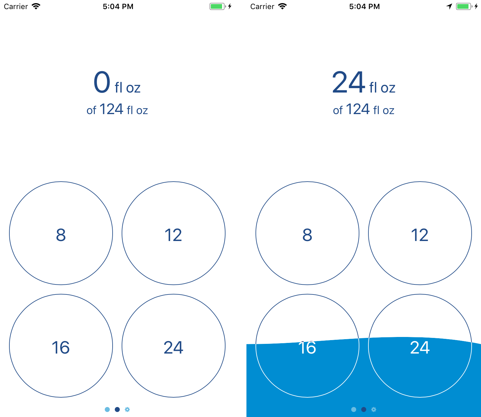
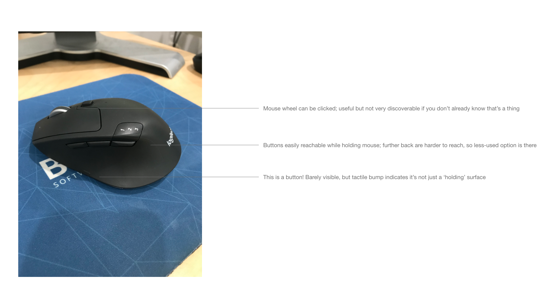
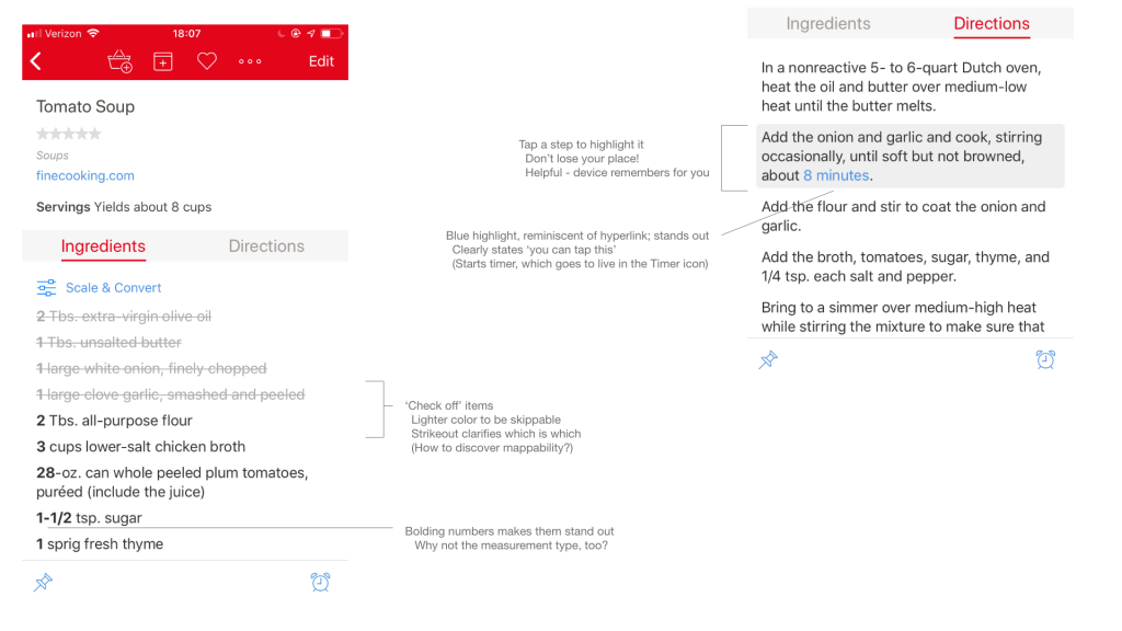
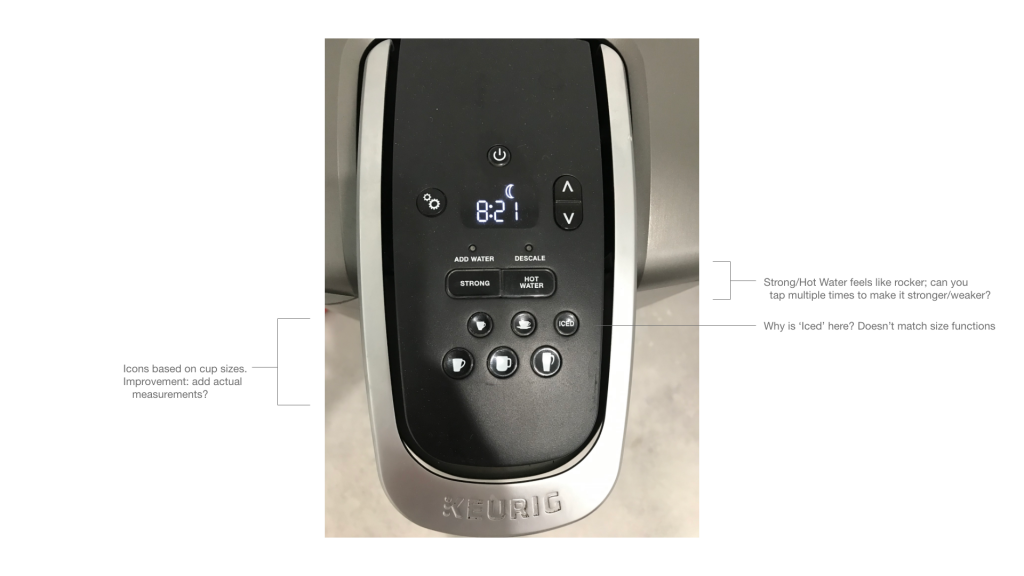
A lot of what I did for mine were mobile apps – that is, after all, my main area of interest – but I also made an effort to branch out to other operating systems and even (gasp) physical devices.

Source: the office Keurig. No, I don’t know how to work it.

A big part of the assignment was giving feedback to our classmates on what they’d collected. The goal wasn’t “hey, that’s a cool interface you were looking at,” but “oh, that’s a good point about the interface.” The exercise, after all, was about the act of collecting and annotating.

Source: Overcast

It was interesting to see how everybody did theirs – most of the people I talked with had done them by hand, although somebody did a lovely blended style one by collecting screenshots and photos and then annotating them with an iPad and Apple Pencil.

Source: Hazel

I’m not sharing all of what I’ve collected here – I’m proud of my annotations of the to-do list app I use, but I don’t actually want to share the contents of my to-do list. And while I had fun marking up Dark Sky, I don’t feel the need to share my home address with the internet.

Source: Calory

I’ve got some pieces from my sketchbook that I might post sometime soon, and I’ll hopefully continue to have interesting things to share as the program goes on!

Categories
App Portfolio Technology

Fluidics 1.1: The Animation Update

The first major update to Fluidics is now available on the App Store!1 In all honesty, it was largely a ‘bug fixes and performance improvements’ update, but I’ve always hated when app updates list that, so I made sure to include a couple user-facing features so there’d be something fun to talk about, at least.
In this case, those features were animations. The most notable is the background – rather than being drawn once, the ‘water’ in the background is now animated, which I think makes the visual effect much nicer overall. Swiping between the three main pages of the app is also much smoother now; instead of a single ‘swipe’ animation being triggered by any swipe, it directly responds to your swipe, so you can change your mind about which direction to swipe halfway through, and it feels more like you’re moving things around, rather than switching pages.2
The big changes, though, are largely invisible; a whole lot of work on the internals to allow for future features I’m planning.3 The gist of it is that a lot of the internals of the app are now a separate library, which means I can share code between the widget and the main app without needing to copy-and-paste all the changes I make in one place to the other.
Past that, there were a couple little tweaks — the algorithm that calculates the water goal is a bit less aggressive with the way it handles workout time, and there’s now a little “this isn’t a doctor” disclaimer in the Settings page that I put there because the lawyer I don’t have advised that I do that.
And, the bit that turned into more of a project than I thought: VoiceOver support. VoiceOver, for those that don’t know, is one of the core accessibility features of iOS; when enabled, it basically reads the contents of the screen to the user, making it possible for visually-impaired people to use iOS. By default, any app built on UIKit has some support for VoiceOver, but the further you go from the default controls, the more broken that’ll get. The way Fluidics works, it was super broken; technically useable, but downright painful to do. After a day or two of vigorous swearing and arguing with the Accessibility framework, I’m proud to say that Fluidics is now VoiceOver-compatible.
If you’ve already got Fluidics on your phone, it’s a free update from the App Store.4 If not, the whole app is a free download from the App Store, and I’m hoping that you’ll enjoy using it. Leave a review or whatever; I’m trying not to be pushy about that.
Oh, and I’m in the process of updating the app’s website; I got such a good URL for it that I want it to look good to match.


  1. There was a bugfix update earlier, version 1.0.1, but that’s not at all exciting, so I didn’t bother writing anything about it. 
  2. If you’re curious, this involved rebuilding the entire interface, from three separate pages that’re transitioned between to a single page that’s embedded in a scroll view. 
  3. And no, I won’t be telling anybody what those are just yet; I don’t want to promise anything before I know for sure it’ll be possible. 
  4. In fact, it may have already been automatically updated — the easiest way to tell is to open the app and see if the water is moving or not. 
Categories
App Portfolio Technology

Open-sourcing Variations

Now that the whole concert is over, and I’ve finished going through approximately all of the WWDC sessions, I’ve decided that Variations won’t be receiving any further development — it wasn’t going to be enough of a priority for me to do it any justice, and I’d hate to half-ass it.1 The app will remain on the App Store, for now, though if it breaks in future iOS versions, I’ll probably pull it entirely. Instead, I’m releasing the source code, as-is; if you’d like to look through it, it’s right here.
I had fun building it, and I like to think that it does some interesting things with the implementations under the hood, so hopefully somebody can find some use from it.


  1. This is, hopefully, a hint about some of my other projects that are a higher priority; announcements of those will, of course, show up on this here blog. 
Categories
App Portfolio

Variations on the Theme of Life

Tap here to download the app on the App Store!
I have always been fascinated by the emergent properties of mathematics: simple rules create complex structures. When you get down to it, this is how all of our modern technology works. Variations is based on that concept and was composed for performance through an application written for the iOS® operating system.
At the core of the application are cellular automata based on Conway’s Game of Life (1970), which is a grid where each square is either ‘on’ or ‘off’ and follows a strict set of rules. A square that is off (‘dead’) can become alive (be ‘born’) if it has the right number of living neighbors. A square that is alive can die if it has too few (loneliness) or too many (starvation) living neighbors. The rules are simple, yet they can create astonishingly complex patterns; there is an entire field of mathematics devoted to studying these patterns, Automata Theory.
Variations allows these patterns to play out both visually and aurally. Tap the screen to allow the grid to move through another cycle of living and dying, or just listen to the music created by a single frozen moment. No two people will ever hear the same set of sounds: the starting point for the patterns, as well as their evolution, are uniquely generated every time the Variations application is run.

Categories
App Portfolio Technology

Fluidics

I made an app! I’m quite excited about it; this is, after all, the sort of thing I want to spend my career doing.

The app is called Fluidics, and it’s for tracking the amount of water you drink. As I mentioned a while back, I like to do a lot of tracking of what I’m eating and how much I’m drinking. That first part wasn’t too hard; there’s a variety of apps on the App Store for logging food, and after a while I was able to find one that wasn’t too bad.1 For water, though, nothing quite worked – Workflow came closest, but using it to do the sort of goal calculations I wanted was on the line between clunky and painful, and it’s such a general-purpose app that it felt visually lacking.
Eventually I remembered that I’m a computer science major, and why am I sitting around complaining about the dearth of options when I’ve basically got a degree in making the dang thing. Months of sketching, programming, swearing, and repeating the whole thing eventually lead to this: what I hope is the easiest water-tracking app on the App Store to use.
It’s been a fascinating process. (Here, by the way, is where I’m going to take advantage of the fact that this is my blog for rambling and start talking about what it was like making it; if you’d like to get more information on the app, I’ve put together a rudimentary website, or you can skip straight to the ‘it’s free on the App Store’ part and give it a whirl.) As it turns out, there’s a whole lot of work involved in making an app; my original sketch was the widget and two screens. Those came together pretty quickly, but I realized that probably nobody would feel comfortable using an app if the first time they opened it it just threw up a message saying “trust me!” and then asked for a bunch of health information, so I wrote up a privacy policy and started building an onboarding flow. Which then ballooned in complexity; looking at the design files, more than half of the app is screens for dealing with something having gone wrong.2
One of the most interesting debates I had with myself during the whole process was deciding what business model to use.3 The App Store has had an unfortunate tendency to be a race to the bottom; while there’s a bit of a market for pro apps, a minimalistic water-tracking app doesn’t fit into that category. There’s also no argument to be made for a subscription, so I’d narrowed it down to ‘free, because I’m turning it in as the capstone project for my computer science major’, ‘free with ads’, or ‘paid up-front’. The first one was the one I was most comfortable with; sure, ‘paid up-front’ would be nice, but I’d also get approximately zero people to download it what with all the free competitors out there. ‘Free with ads’ feels deeply gross, both because I hate online advertising in general, and because I’m doing a lot with health data, and I really don’t want to have any chance of that getting stolen. For a while, I thought it was going to be ‘free forever’, and I’d be justifying it as ‘building a portfolio’.
That wasn’t what I actually settled on, however; instead, I’m going with ‘free with in-app purchase.’ Instead of building in a paywall and locking some features behind it, though, I decided I’d go simpler; the app and all of its features are free. Starting in version 1.1, there’ll be a button in the Settings; a little tip jar.4 I probably won’t make much, but I’ll feel better about it overall, and what’s the harm?
Beyond that debate, most of the challenge of the project as a whole was just building it. I knew going in what I wanted it to look like; what I didn’t know was how to go about doing that. The way the background overlaps the text? That alone took a week of trying different things to get working right.5 A few things I wanted to include in the first version didn’t make it – the widget was originally going to be entirely different, but the way Apple has done the security on health data makes the original design significantly more difficult to do, so I switched it to the current design.6
It was definitely a learning experience, too – I’d done some iOS application design for classes before, but never gone all-in on making something that would be both functional and enjoyable for the end user. If you’re releasing something on the App Store, you can’t just include a note that says “on first run, it’ll ask for a bunch of permissions; just say yes” because nobody will read that. And getting something uploaded to the App Store is itself a whole process – the App Store page doesn’t fill itself out, after all, and copywriting definitely isn’t my strongest suit.7
But it’s done; I’ve made an app and released it to the world. 8 By the time you’re reading this, it should be available on the App Store; as I mentioned, it’s free to download, and I’d love it if you’d give it a try.


  1. That said, I’m also doing some design sketches for my own entry into the field; don’t get your hopes up, I make no promises. 
  2. I’m not talking “my code is full of bugs and something crashed” went wrong, either; it’s all “the user originally gave permission to do something, but then changed their mind and used the Health app to take it away” and other such nonsense. Computers may be finite-state machines, but “eleventy hojillion” is still a finite number. 
  3. I also talked about this a lot with my friend Chase, without whom I would’ve long ago given up on technology and disappeared into the woods to be a Bigfoot impersonator.. 
  4. Yes, I know, I’m just now releasing version 1.0, and I’m already mentioning plans for 1.1. Don’t worry, I’ve got versions 1.2 and 1.3 mapped out, feature-wise, as well, and have some rough ideas for 1.4. 
  5. For a while I thought I was going to have to write code to draw the numbers ‘by hand’; fortunately, I was able to get the drawing to work by taking advantage of layer masks, but good lord are the Interface Builder files a mess as a result. Behind The Scenes, everybody! 
  6. I do still want to get the original design working, probably as an option in the Settings page of the app; a future version is going to add watchOS support, and I believe that a lot of the work I’ll have to do for that will also apply to making the widget work like I intended, so those two will either be the same or subsequent updates. 
  7. Another shoutout to Chase, who wrote the App Store description and turned my pile of 100 disjointed screenshots into the four that’re currently on display. 
  8. Well, “done”; it’s functional and available to the public, but software, as the saying goes, is never finished, only abandoned. I’ve no plans to abandon this project anytime soon; I use it myself several times a day, so I’m pretty invested in keeping it working and making it better. 
Categories
Portfolio

CQP Posters

This month I’m working with the Castleman Quartet Program as their intern and liaison to Linfield College. Part of what they’ve got me doing is publicity, including designing posters to advertise their upcoming concerts.

Which, as it turns out, was a bit of a fun challenge, as we don’t have a color printer, so the design had to be in grayscale only. We’ve also got two concert series – one of chamber music, and one of solo music – and while I wanted the two posters to be clearly related, I didn’t want them to be identical, because that would lead to people glossing over one or the other, assuming it was just another copy of whichever one they’d seen first.

Here’s the result:

Oh and, of course, the concerts are open to the public, free of charge, so if you’re in the area, feel free to come by!