Swift 5.5 with the new async/await features is going to be released quite soon, and I’m very excited. And while all the new async APIs in UIKit and SwiftUI are neat, they don’t actually catch my eye all that much. As of now, async/await will only be available on the fall-2021 Apple OS releases, and following the general pattern of “current iOS minus one” that means async/await will be available starting… fall of 2022.
However, that’s not the only place I use Swift! I also dabble in server-side Swift when I can, and over there, it’s ready-ish to use now.1
And hey, would you look at that, Vapor’s already got a PR open for adding async variants of the core APIs. Neat! Let’s see how this is implemented.
And, hey, it’s… pretty simple, really! All it takes is getting into the (pre-release!) _NIOConcurrency module, and suddenly any EventLoopFuture has a new function: public func get() async throws -> T. The implementation of that is also lovely and simple, thanks to Swift’s withUnsafeThrowingContinuation and the way SwiftNIO already works.
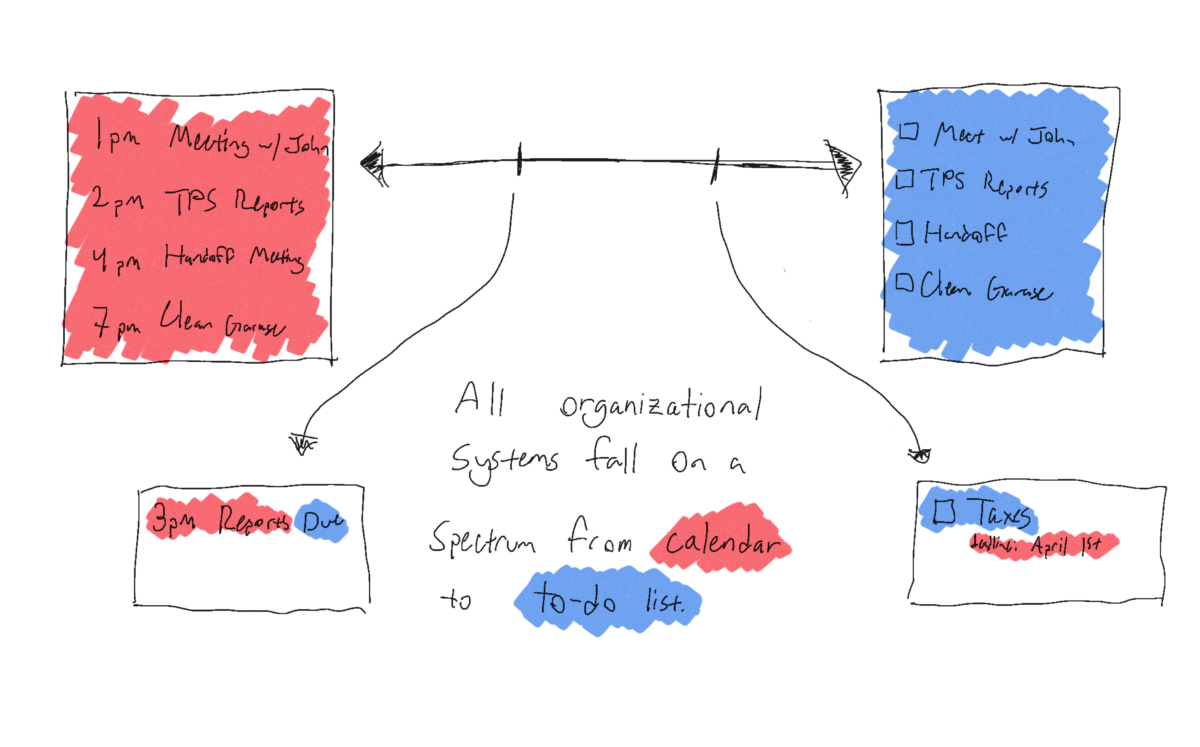
Now, where I’m more excited about this than Vapor is in Fluent — a lot of the server-side work I do is in C#, using the excellent Entity Framework Core. Database requests are straightforward: MyModel model = await db.MyModels.FirstOrDefaultAsync(m => m.id == id);
With the non-async version of Vapor and Fluent, this is… a bit more difficult to work with. MyModel.find(id, on: req.db).flatMap { model in ... }
At first glance it doesn’t look too bad, but notice the flatMap — we can’t just continue writing our code, we have to move into a new scope. Hello, pyramid of doom.
But now?2 Now, we can await things. Fluent looks more like Entity Framework all of a sudden: let model = try await MyModel.find(id, on: req.db)
That’s already a much nicer API to work with, and it delivers on the promise of async/await: much simpler flow of code. I’m excited to untangle some of my more complex flatMap pyramids.
What I’m still curious about, and will need to do some testing with, is to see how well it does with concurrency. It’s a known issue in Entity Framework that you can’t run multiple requests against a single DbContext; what I’m wondering is if Fluent has this same limitation, or if I can safely do something like:
async let model1 = try MyModel.find(id1, on: req.db)
async let model2 = try MyModel.find(id2, on: req.db)
let result = MyResult(model1: await model1, model2: await model2)
That, I don’t yet know! I’ll have to do some experimenting and try it — which may be a future blog post. Still, even if I have to immediately await everything, the improvements to my code’s legibility will be worth it.
Disclaimer: Swift 5.5 is, as of this writing, pre-release; similarly, the versions of Swift-NIO and Vapor that provide async APIs are pre-release. Don’t use these in production. ↩
I’m writing this a bit after WWDC has ended, and publishing it a bit further after that, so pardon the tardiness as I share my thoughts, in no particular order:
As a user, I am quite excited by the new functionality in FaceTime, and the new Focus system for managing notifications. The system of tiered notifications looks great, and I’m excited for the, oh, 15 minutes most people will have between ‘installing iOS 15’ and ‘an app first abusing the notification level to send them spam.’1 In iOS 16, can we get a “report notification as spam” button that immediately flags the app for App Review to yell at?
As both a developer and user, I was immensely excited to see the ManagedSettings and ManagedSettingsUI frameworks – I really like the concept of Screen Time for externalized self-control, and being able to use custom implementations or build my own seemed like a dream.2 Unfortunately, all those dreams were immediately crushed by the reveal that this all requires FamilyControls, so not only can I not do anything interesting with it as a developer, I can’t even use it myself. Because, as we all know, the only use case for “my phone won’t let me use it to waste time” is “parents managing their children.”
Swift’s implementation of async/await looks great, and the stuff Apple’s doing with @MainActor seems to have met the goal of “the language eliminates an entire class of error” that initially gave us optionals, so I’m quite happy about that. I hope Vapor updates to async/await soon, I’d love to untangle some of my flatMap chains.
I am incredibly excited about the virtual KVM thing coming to macOS and iPadOS – my desk setup features two monitors for macOS, and an iPad perpetually on the side, and the idea of being able to control the iPad without taking my hands off the main keyboard and mouse is very exciting.3
Safari on iOS got support for web extensions, which is neat. I also like that they’re pulling things down toward the bottom of the screen, should be more reachable.
Safari on macOS might finally do something that Mozilla never managed to do: convince me to switch to Firefox. I sincerely hope this is the peak of “aesthetics over functionality” in Apple’s design, and that it gets better from here, because this is a mess: lower contrast text, the core UI element moves around all the time so you can’t have any muscle memory, and they’ve buried every single button behind a ‘more’ menu.
SwiftUI got lots of little updates, but the thing that I may be most excited about is the simple quality of life improvements as a result of SE-299 – .listStyle(.insetGrouped) is much easier to type than .listStyle(InsetGroupedListStyle()), especially considering that Xcode can actually suggest .insetGrouped.
In my case, it’ll probably be a couple days, and then Apple Music will punch through a Focus mode to notify me that Billie Eilish has a new single or something. ↩
I already have a name for the app I want to build using these API. My first feature would just be “the existing Screen Time system, but it actually knows how time works.” Something like 90% of the time that I hit ‘one more minute’ I’m instead given a couple seconds. Apple, I know that time is hard, but it isn’t that hard. ↩
Why the iPad? Because iPadOS is sandboxed, which limits the sort of bugs that Teams can introduce and evil that Zoom can. Sure, they both have macOS apps – but you shouldn’t install either of them. ↩
While the QueryBuilder interface is pretty neat, it’s still missing some things. Recently, I needed a GROUP BY clause in something, and was rather unsurprised to find that Fluent doesn’t support it.1
Fortunately, it’s still possible to write custom SQL and read in the results. Make yourself a convenience struct to unpack the results:
struct MyQueryResult: Codable {
	let parentID: Parent.IDValue
	let sum: Double
}
(Strictly speaking, it can be Decodable instead of Codable, but as long as the Parent.IDValue (generated for free by making Parent conform to Model, I believe) is Codable, Swift generates the conformance for us.)
Now, in your controller, import SQLKit, and then get your database instance as an SQL database instance:
guard let sqlDatabase = req.db as? SQLDatabase else {
	// throw or return something here
}
After that, write your request:
let requestString = "SELECT ParentID, SUM(Value) FROM child GROUP BY ParentID"
Note – your syntax may vary; I found that, using Postgres, you need to wrap column names in quotes, so I used a neat Swift feature to make that less painful:
let requestString = #"SELECT "ParentID", SUM("Value") FROM child GROUP BY "ParentID""#
If you want to use string interpolation, swap out \() for \#().
Entity Framework Core, which is an incredibly robust, full-featured ORM, only barely supports GROUP BY, so seeing this rather young ORM not support it isn’t all that shocking. ↩
In my experience, dynamically generating a file, serving it immediately, and not persisting it on the server is a pretty common use case. In general, this is one of two things – either a PDF download, or a CSV. While my Vapor tinkering hasn’t yet given me an opportunity to generate PDFs on the server, I have had an occasion to create a CSV, and wrote up a little helper for doing so.
import Vapor

struct TextFileResponse {
    enum ResponseType {
        case inline, attachment(filename: String)
    }

    var body: String
    var type: ResponseType
    var contentType: String
}

extension TextFileResponse: ResponseEncodable {
    public func encodeResponse(for request: Request) -> EventLoopFuture<Response> {
        var headers = HTTPHeaders()
        headers.add(name: .contentType, value: contentType)
        switch type {
        case .inline:
            headers.add(name: .contentDisposition, value: "inline")
        case .attachment(let filename):
            headers.add(name: .contentDisposition, value: "attachment; filename=\"\(filename)\"")
        }
        return request.eventLoop.makeSucceededFuture(.init(status: .ok, headers: headers, body: .init(string: body)))
    }
}
That’ll work for any file you can assemble as text; CSV just struck me as being the most useful example. Use ResponseType.inline for a file you want displayed in a browser tab, and .attachment if it’s for downloading.
And if you’re doing a lot of CSVs, give yourself a nice little helper:
My recent tinkering has been with Vapor, and while I mostly like their Fluent ORM, it has some rough edges and semi-undocumented behavior. At some point, I’ll feel confident enough in what I’ve learned through trial and error (combined with reading the source code – open source!) to actually make some contributions to the documentation, but for now, I’m going to throw some of the things I struggled with up here.
If you’re using a migration to add a column, and specifically want it to be non-null, you’ll need a default value. My first approach was to do a three-step migration, adding the column as nullable, then filling the default value on all rows, and then setting the column to be non-null, but that didn’t feel right. Eventually, though, I figured out how to express a DEFAULT constraint in Fluent:
let defaultValueConstraint = SQLColumnConstraintAlgorithm.default(/* your default value here */)
Then, in your actual schema builder call:
.field("column_name", /* your type */, .sql(defaultValueConstraint), .required)
Note that SQLColumnConstraintAlgorithm isn’t available from the Fluent module, you’ll need to import SQLKit first.
(For context, I’m in the habit of having a static var schema: String { "demo_model" } and a struct FieldKeys { static var hasBeenTouched: FieldKey { "has_been_touched" } } within each of my Fluent models – it keeps everything nice and organized, and avoids having stringly-typed issues all over the place.)
I suppose I’m making this a tradition, now, writing up what I have on my phone and what’s changed since last year. And why not? It’s fun, and it helps me a bit with the fact that I’ve let my blog post queue get very near empty.
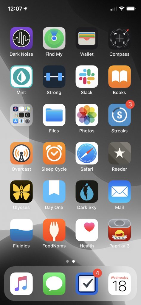
This year saw the release of iOS 14, and with it, the ability to put widgets directly on your home screen, and to banish apps from your home screen to the App Library. Both of which I have pretty thoroughly taken advantage of – though I’ve only got the one page of apps, I almost certainly have more apps installed this year than I did last year.
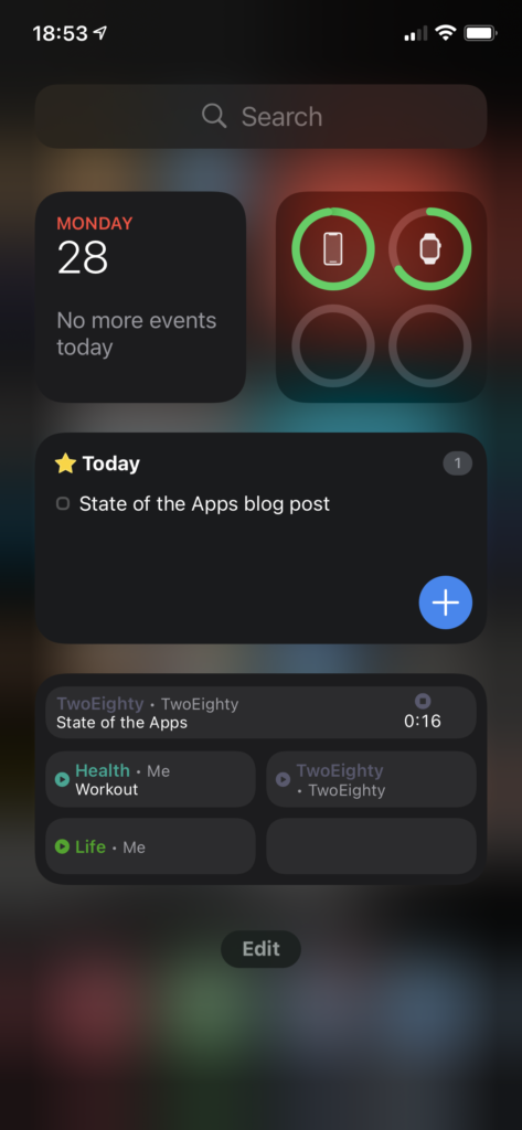
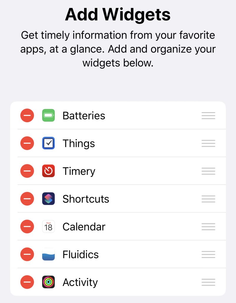
Widgets
Let’s do a quick look at my ‘widgets’ screen. I believe the official name is ‘Today View,’ but that’s a piece of information that I’m going to estimate seven people outside of Apple know off the top of their head, so we’ll move right along.
The upper half is a dashboard; at top left, we have a Smart Stack, showing Calendar above, and beneath it are a pair of Timery widgets that show me totals I want to keep an eye on throughout the day.
Top right, batteries; I used to think the idea of the bigger battery widget was ridiculous, but if I do everything precisely wrong, I can overwhelm it – think, phone, watch, AirPods with distinct battery levels, and the AirPods case, to boot. Still, I like that at-a-glance view, and I actually like that it doesn’t show percentages, it feels a lot lighter as a result.
Below that, I’ve got another Stack with a pair of Things widgets, showing my Today and Upcoming lists. I originally had a couple of my Areas displaying, as well, but found I wasn’t really using them.
Finally, I’ve got another Stack, this time a pair of the larger-form Timery widgets. The one you’re seeing is my “my projects” collection – including a deliberately-blank bottom-right, so that with a timer running I’ve still got a way to tap into the app without starting or stopping a timer. 1 The other one, which I won’t be showing for “NDA” reasons, is stuff for work.
Home
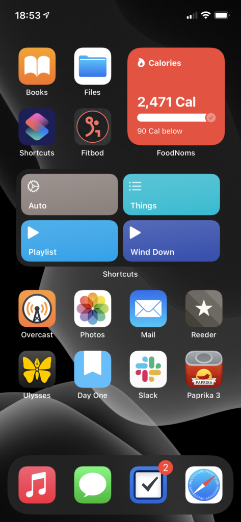
Now the home screen, which my mental model has in five segments.
The four apps at top left are the “aspirational” section – Books, as I’m trying to train myself to reach for a book rather than searching the web for Content to keep myself entertained; fitbod, as part of my ongoing fitness routine/goals; Shortcuts, because I want to be free to automate tasks with ease; and Files… doesn’t particularly fit the theme, but I use it often enough for it to have earned that spot.2
Top right is the ‘health’ pile. It is, you guessed it, yet another Smart Stack.3 Topmost is FoodNoms, which I still heartily recommend to anyone who wants to start calorie counting.4 Below FoodNoms we have Streaks, which I’m using less than I did last year, but I still find it helpful. Despite the fact that I’ve been taking the same meds every morning for several years now, I still forget at least once a week, and Streaks is what reminds me. Finally, at the bottom, is Activity, which I think you could call one of the canonical widgets of the new style – a glanceable bit of information, always there.
Below these two we have… an unnamed section.5 It is, once again, a Smart Stack. On top we’ve got my main-use Shortcuts – the bottom two for playing music, ‘Things’ gives me a menu of various Things items/projects that I use semi-often, and ‘Auto’ is a lovely piece of work that does what Siri Suggestions was advertised as doing.6
Below Shortcuts is Weather. Apple’s Weather app still feels a little lacking in accuracy compared to Dark Sky, but I’m hoping they’ll rectify that (and get their display of “amount of rain” lining up with my actual expectations for what it means, a la Dark Sky) before they disappear Dark Sky entirely. The widget, though, makes me want to write a chapter for a UI textbook about how well it contextually displays information.
The final item in this stack is Fluidics. It’s not just shameless self-promotion, it’s also dogfooding! (And I really do think the widget is a beautiful piece of design, if I do say so myself.)
The bottom section is Regular Ol’ Apps.
Overcast is holding steady as my podcast app. I’ve finally gotten below 5 gigs of podcasts downloaded to listen to, so in the next month or so I expect Chase to finish convincing me I need to download the entire back archive of Roderick On The Line.
Photos has actually grown in how much I’m using it – I decided to go all-in on it this year, and spent some time loading a bunch of the photos from my DSLR archives in, and some more time labeling faces so the ‘people’ album would work. I’ve had mixed results.7
Mail. What do you want me to say? It’s Mail, and I wanted the most boring of email apps.
Reeder I’ve updated to version 4, and am continuing to drive the actual RSS sync off of TT-RSS/Fever on my Synology. The one addition is RSS-Bridge, which I’m using to scrape a few Twitter feeds into RSS as well. I’ve also finally moved wholesale into Reeder’s Read Later service, leaving Instapaper behind.8
Ulysses still fulfills the same use case for me. I’ve found it to be a… reasonable editor for GitLab Wiki articles, and a much better viewer for them than GitLab itself.9
Day One has continued to expand the list of things I use it for. I think the most interesting is a pair of journals I’ve got – “Inbox” and “Archive.” “Inbox” is in as dark a theme as I can make it, and is the default journal on my phone; any time I’ve got a midnight idea, I jot it down in there, and once a week or so I’ll go through, processing things from “Inbox” into “Archive.” It’s a nice little workflow.
Slack made its way onto my home screen courtesy of MHCID, and remains there because it’s the main way I communicate with some of the friends I made through the program. It’s a much better UI than Teams.10
Paprika might belong in the ‘aspirational’ category in place of Files. I’ve got more than a thousand recipes in here, and I’ve made, like, twenty of them. One day…
Finally, we have the dock, which is only a visual distinction given that I’ve only got the one page.
Music remains a very important thing to me, and I’m in and out of it all day. Every time I use it, I miss when Apple allowed you to customize the tabs – they have five tabs in there, and I literally never use three of them. Let me have playlists as a top-level tab, Apple, please. Stop trying to make Radio happen.
Messages is the only social network I’ve got, these days. It’s nice to see Apple putting effort into it – I am a heavy user of threads and tapbacks.
Things is a stalwart as my task management app. Outside of drawing apps, it’s the only iPadOS app that does handwriting recognition correctly – you just start writing, anywhere on screen, and it reads it in.11
Safari, because what would an iPhone be without the internet communicator? Admittedly, my Safari is a very different Safari than most peoples’, because I’ve got a mountain of content blocker rules via 1Blocker, and on top of that I have JavaScript disabled.12
You may have noticed that the Timery app icon isn’t present on my home screen – I like this way of getting to it. ↩
I suppose you could call it part of the Automation subcategory, considering that I’ve got a lot of iCloud Drive -> Hazel stuff going on… ↩
I absolutely love the stack mechanic; my only complaint is the little bit of animation-delay between when I finish swiping and when I can tap to interact. Yes, Apple, the little ‘settling into place’ animation is lovely… but I’m trying to do things, so get it out of my way and let me do them. ↩
It’s a beautiful, and very iOS-y piece of work. The food database isn’t as full as MyFitnessPal’s, but that’s honestly a good thing – MFP’s database is full of trash data. FoodNoms starts with the FDA’s database, and has a ‘community-sourced’ database on top of that, where every entry has been manually validated, so it’s solid. If something isn’t in there, tap a button and scan the nutrition label, and the app reads the whole thing in – and then, once you’re done, asks you if you want to submit the resulting data to the community database. It’s an incredibly slick interaction, and I adore it. ↩
I wasn’t really planning on the naming at all when I started writing this, so it makes sense that I’d run out eventually. ↩
The tl;dr version is “it checks the time and some other contextual information and automatically picks from a list of other shortcuts to run based on that.” My morning routine is a series of single taps on that button, and it feels downright magical. ↩
It can identify my grandmother with ease, regardless of if the photo is from this year or a scan of one of her wedding photos; my grandpa, on the other hand, it can’t spot if I give it two of the same photo and manually tag him in one. ↩
I’ve still got Instapaper connected to Reeder, on the off chance that I have to use the Windows machine my work provided, but I’m something like 99.5% on macOS these days, so that’s exceedingly rare. ↩
We’ve got a wiki monorepo kind of thing at work, where we’ve got articles on anything that may be useful. GitLab’s wiki can show something like 15 pages at a time in the list, and makes it rather difficult to find that list at all; they really didn’t expect anyone to use it like this. However, you can sync the whole thing, like any other repo, at which point you’ve got a regular ol’ folder full of Markdown files, and Ulysses handles that pretty well. It does have a bad habit of escaping escape characters, and I know I’ve got at least one file somewhere that opens with something like 30 backslashes before a single tilde. Whoops. ↩
Teams, which we use at work, isn’t on my phone at all. Maintain that work-life balance, folks. While I’m talking about Teams: the UI, across the board, feels like exactly as many little “oh, nobody thought about how this interaction would go” and “oh, nobody tested this” moments as I expect from any Microsoft product. Unfortunately for my distaste for Microsoft products, it has one notable advantage over Slack – calling support. Slack’s iOS app still doesn’t support video calls, so for actual workplace purposes it’s effectively useless. (And yes, I am hoping someone at Slack will cite this as evidence to give the iOS app the resources it needs to get that feature.) ↩
This has been a subtweet at Messages, whose support for handwriting recognition consists of “you may write up to two words, and you’ll probably drop the iPad trying to do it.” If iPadOS 15 doesn’t make the entire thread pane a valid handwriting recognition target, I’m going to have to write Tim Cook some very unhappy emails. ↩
And this is a subtweet at every news site that either entirely fails to render without JavaScript, or doesn’t load images without JavaScript. You are weak, and I scoff at you. ↩
Every time I go to file a bug report Feedback with Apple, I have to remember how to gather a sysdiagnose; on macOS, the whole diagnostic process is automatic in the Feedback app, and if you have Feedback installed on iOS, it is there too. I, however, make things difficult on myself, and use Feedback on macOS to submit my iOS bugs.
A sysdiagnose, for those wondering, is a big bundle of diagnostic information that Apple (or the developer of an iOS app) can use to figure out what exactly went wrong when something didn’t work right on your device.
Since Apple’s documentation on how to gather a sysdiagnose leaves out a few key steps (FB8739343, if anyone at Apple is paying attention to this), I figured I’d write up the process for myself for future reference.
Without further ado, here’s how to gather a sysdiagnose on an iPhone X-class device. (Read: ‘no home button’)
Press the volume up, volume down, and lock buttons all at once, and hold them for ~1 second. You’ll feel a little haptic buzz; your phone might also take a screenshot.
Wait. Apple recommends about 10 minutes for iOS to gather everything.
Open Settings and go to Privacy > Analytics & Improvements > Analytics Data
Scroll through the list until you see a file whose name starts with “sysdiagnose_” and then the current date. (Protip: this list is super long, so once you’ve started scrolling, you can tap and drag on the little scroll blob on the right side of the screen to zoom through hit much faster.)
Tap on the file, hit share, and AirDrop it to your Mac. (Or save it to iCloud, but I heartily do not recommend trying to email or send it via iMessage – it’s probably like a quarter of a gigabyte.)
Hopefully this helps you, and as someone who has to try to figure out why software isn’t working right, thank you for taking the time to get all the diagnostic information – it’s very helpful.
Following my recent post on form design, I thought it might be interesting to take a look at what is, in the US, one of the most universal forms: the ballot.
This sits at the intersection of my interests in design and civic engagement. It’s also a much more controversial topic than I’d normally touch with a ten-foot pole, but here I am.
(‘Pole/poll’ pun? Absolutely intended.)
And first, an admission: that image up top, of people at a polling station? That’s an utterly alien concept to me. I’ve never been to a polling station; I live in Oregon, a state that finished moving to universal vote-by-mail when I was in elementary school.
Now, vote-by-mail is a very controversial topic these days, but as someone who grew up with it, I thought it would be interesting to do a case study of how it works in Oregon.
Vote by Mail: A Case Study
Overall, the user experience of voting in an election in Oregon is, to my eye, already a ways ahead of most of the rest of the country. There’s still room for improvement, though.
So, what is Oregon doing right, and what are we doing wrong?
In doing the research for this article, I found out that “register when you get your driver’s license” went from “… if you fill out this extra piece of paper while you’re at the DMV” to being an automatic process, thanks to the amusingly-titled “Motor-Voter Law.”
Ease of Information
While I can’t say we don’t have our share of crappy political ads, the state has a standard way of providing information on everyone running: the voting pamphlet, sent to every household prior to the election. (They are also available online.)
(Image credit: Statesman Journal)
These pamphlets, nice as they are, aren’t perfect. The actual process for putting information in them is a touch convoluted, and surprisingly unregulated. While each entry mentions where the information comes from, and plagiarism or misquoting are banned, there is nothing enshrined in law (or policy) to prevent misleading entries.
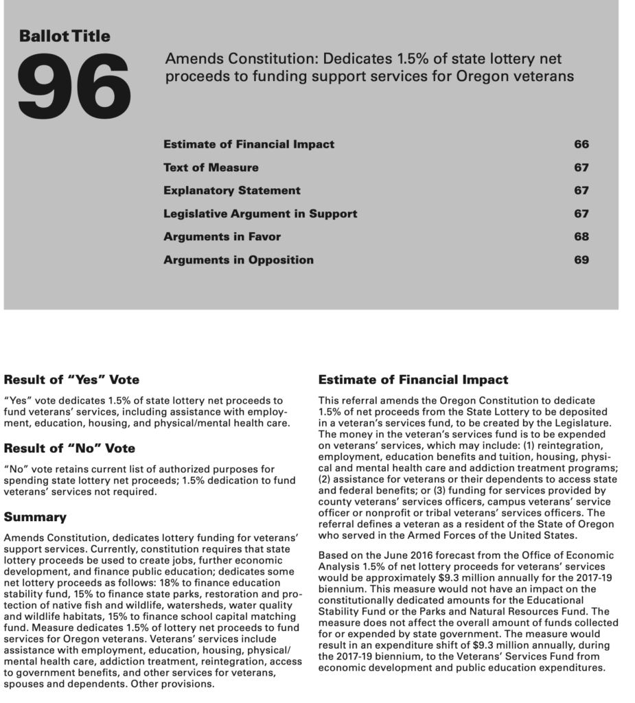
Let’s take a look at the information architecture of the section on a single ballot measure.
At the top, the easily-memorable measure number takes precedence, followed by the shortest-form summary, the title.
Each measure has a very clear summary section, as well as the “Result of ‘Yes’ Vote” and “Result of ‘No’ Vote” area, which state, very explicitly, what each bubble on the accompanying ballot will do.
The estimate of financial impact is prepared by an eminently qualified committee; the text of the measure is resolute in itself.
But then things break down, with “Arguments in Favor” and “Arguments in Opposition.” This is an official state document; everything about this measure, so far, has been as factual and rigorous as one could hope. These arguments, though, are unregulated beyond “no plagiarism, no misquoting people.” If you want to write a 350 words of “why you should vote against this,” pay the fee to have it entered in, and file it as an “Argument in Favor” there’s nothing to stop you.
And that’s a problem. This is an official state document; it’s got the seal on the cover, and a lot of very solid information in it, giving it credence. Unverified information in the Arguments gains legitimacy by association.
For comparison, let’s take a look at a different state.
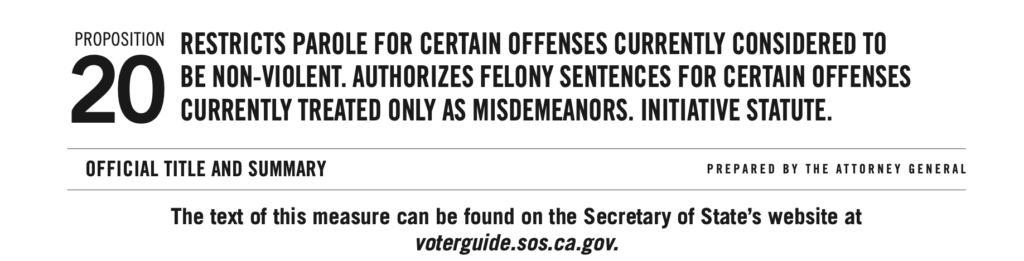
California’s voter pamphlets are laid out very differently. The first thing that caught my eye – and made assembling this comparison in a visually-pleasing way rather difficult – was that the ballot measure doesn’t have a table of contents.
I’ll give California this, though: they’ve lined up “Proposition” with “20” much better than Oregon did “Ballot Title” and “96.” The all-caps feels a bit “Newspaper Headline”, though, and what is going on with the kerning in “Prepared by the Attorney General”?
To save you a great deal of scrolling, I’ve pulled together the section headings from the 2020 Voter’s Pamphlet, Proposition 20, and summarizing somewhat:
Official Title and Summary
Summary of Legislative Analyst’s Estimate of Net State and Local Government Fiscal Impact
Analysis by the Legislative Analyst
Overview
(Specific Proposal Title)
Background
Proposal
Fiscal Effects
Argument in Favor of Proposition
Rebuttal to Argument in Favor of Proposition
Argument Against Proposition
Rebuttal to Argument Against Proposition
Distinctly more words to it, but notice some key differences:
There’s an actual analysis of the legislation, expanding beyond the fiscal impact to the actual outcomes of the bill. This is provided by the Legislative Analyst’s Office, who are explicitly nonpartisan.
Arguments in favor and against are paired with rebuttals, allowing for more of a dialog between sides.
Note, however, that there’s still no legal requirement for an “argument in favor” to actually be in favor. There is a strong precedent for judicial intervention, which is something of an improvement, at least. And the typography makes a statement, too.
On the left, the Analysis by the Legislative Analyst. It’s rich text – there’s use of bold to highlight key points, and various levels of headings to organize it. On the right, the Arguments, sans formatting. They’re also in a smaller font size, and have their own unique style of heading. In short, the Arguments look different, providing a subtle reminder that this section is not the product of the nonpartisan election officers.
And now, back to the other aspects of the election. But first, a reminder to find other sources of information on the candidates and ballot measures. As a good starting point, I recommend Vote411, from the League of Women Voters, and Ballotpedia.
Ease of Voting
A few weeks before the election, the Oregon Department of State mails out ballots to all registered voters. The package includes the ballot, a return envelope, and a second ‘privacy’ envelope that you can use if you’re worried somebody might be able to see the contents of your ballot through the outer envelope.
One of the inspirations for this post was the American Institute for Graphic Arts’ “Design for Democracy” program. They did a larger-scale version of my research on form design, investigating and determining best practices for ballot design.
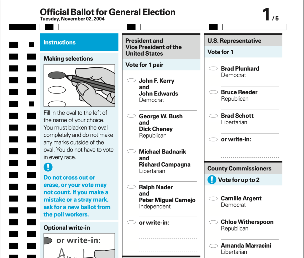
Let’s take a look at a (reasonably) representative sample of an Oregon ballot. This comes from the 2020 primaries, courtesy of Lincoln County:
It’s actually pretty good. The visual design follows most of the guidelines, although the “Write-in” lines and text need a bit more space. The main issue I see is the instructions – they’re fairly clearly written, but they are written. Pairing them with a visual explanation – the cartoons, in AIGA’s example – makes them even easier to follow.
The UX of Elections
Elections in the US, being controlled at the state level, rather than federally designed, are something of an ongoing A/B test. We can see different electoral systems in use across the country, and use opinion polls after the fact to judge how well-represented people feel by the results.
Were I polled right now, I’d feel fairly happy with how my state handles things.
So, what are the key action items for, say, another state, looking to implement some of Oregon’s best practices?
Reduce the friction of voting. Make it easy to register, easy to get your ballot, easy to fill out your ballot, and easy to turn it in.
That’s it, that’s the list, the whole idea. Make it easier to vote, by whatever means possible. I’m an advocate for doing so by enabling universal mail-in-voting, thanks to some of the inherent benefits:
No standing in line, or going into cramped polling places – an excellent benefit during a pandemic!
Voting on your own time, rather than needing to take half a day off to wait in line. (‘On your own time’ within reasonable limits – there’s still a deadline to get it turned in on time.)
But, of course, I’m not done. I have some recommendations for Oregon, as well:
Validate the voting pamphlet materials. Don’t just trust what people submit, make sure it’s actually espousing the viewpoint it claims. Do some fact checking, while you’re at it.
Visually distinguish public submissions. Use some gestalt principles – things that are close together, and look similar, look like they’re part of a group. Move the public submissions a little further away, and make them look different, to remind people that they aren’t from the same source as the rest of the material.
Demonstrate how to fill out the ballot. The instructions are fairly well-written, but “comfortable reading English” should not be a requirement to vote.
Image credit: Elliott Stallion, Unsplash.
Postscript: while I’m advocating for improving voting, I am absolutely not advocating digital voting. No.No, no, no.
For form design, cognitive load theory can be boiled down to the idea that people only have so much space in their brain, so don’t overfill it. The exact amount varies depending on context: is the information auditory or visual?1 What stage of processing are you going through? (Gwizdka 3)
Techniques for Reducing Cognitive Load
Produce less cognitive load. Intrinsic cognitive load is necessary to what the user is trying to do; extrinsic is work because the design surrounding the goal is bad (Hollender et al. 1279; Feinberg & Murphy 345).
Use multiple modalities. Mixing visual with auditory, for example, allows users to distribute the cognitive load across multiple cognitive subsystems (Oviatt 4).
Do the work for them. Pre-filling known fields (i.e., a user’s name and address when they’re already signed in) moves the cognitive load from the user to the computer, saving the user the effort (Gupta et al. 45; Winckler et al. 195).
Cognitive Load in Human-Computer Interaction
Under heavy cognitive load, users work slower, and may commit more errors (Rukzio et al. 3). From a young age, humans are goal-oriented; slowing them down as they work towards these goals, unless explicitly a design goal, can only cause frustration (Klossek et al.). Reducing cognitive load leads to happier users.
Applying Cognitive Load Theory to Form Design
Cognitive load theory gives us several key takeaways:
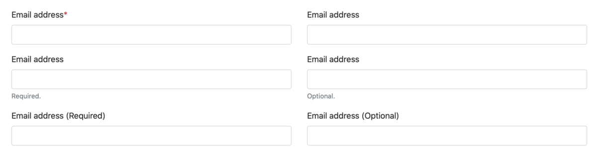
Indicate which fields are required. Provide a clear indicator of what is required so your users don’t have to guess (Bargas-Avila, Javier A., et al., 20 Guidelines 5).2
Pre-fill data when possible. Use available sources—an existing account, or on-device sensors—to save the user the effort. However, if that data might not be accurate, don’t guess; leave the field blank to prompt the user to enter the correct data (Rukzio et al. 3-4).
Don’t interrupt the user by validating data. Real-time validation is fine, as long as it doesn’t force the user to switch from ‘completion mode’ to ‘revision mode’ (Bargas-Avila, Javier A., et al., Useable error messages 5).3
There has not been any research into the combined effects of marking required fields and pre-filling fields; however, we can extend the conclusions in the first two points, above, as such: a required field, even if pre-filled, remains required, and should be marked as such.
Bibliography
Baddeley, Alan D., and Graham Hitch. “Working memory.” Psychology of learning and motivation. Vol. 8. Academic press, 1974. 47-89. Bargas-Avila, Javier A., et al. “Simple but crucial user interfaces in the World Wide Web: introducing 20 guidelines for usable web form design, user interfaces.” (2010). Bargas-Avila, Javier A., et al. “Usable error message presentation in the World Wide Web: Do not show errors right away.” Interacting with Computers 19.3 (2007): 330-341. Budiu, Raluca. Marking Required Fields in Forms. 16 June 2019, www.nngroup.com/articles/required-fields/. Feinberg, Susan, and Margaret Murphy. “Applying cognitive load theory to the design of web-based instruction.” 18th Annual Conference on Computer Documentation. ipcc sigdoc 2000. Technology and Teamwork. Proceedings. IEEE Professional Communication Society International Professional Communication Conference an. IEEE, 2000. Gupta, Abhishek, et al. “Simplifying and improving mobile based data collection.” Proceedings of the Sixth International Conference on Information and Communications Technologies and Development: Notes-Volume 2. 2013. Gwizdka, Jacek. “Distribution of cognitive load in web search.” Journal of the American Society for Information Science and Technology 61.11 (2010): 2167-2187. Harper, Simon, Eleni Michailidou, and Robert Stevens. “Toward a definition of visual complexity as an implicit measure of cognitive load.” ACM Transactions on Applied Perception (TAP) 6.2 (2009): 1-18. Hollender, Nina, et al. “Integrating cognitive load theory and concepts of human–computer interaction.” Computers in human behavior 26.6 (2010): 1278-1288. Klossek, U. M. H., J. Russell, and Anthony Dickinson. “The control of instrumental action following outcome devaluation in young children aged between 1 and 4 years.” Journal of Experimental Psychology: General 137.1 (2008): 39. Oviatt, Sharon. “Human-centered design meets cognitive load theory: designing interfaces that help people think.” Proceedings of the 14th ACM international conference on Multimedia. 2006. Pauwels, Stefan L., et al. “Error prevention in online forms: Use color instead of asterisks to mark required-fields.” Interacting with Computers 21.4 (2009): 257-262. Rukzio, Enrico, et al. “Visualization of uncertainty in context aware mobile applications.” Proceedings of the 8th conference on Human-computer interaction with mobile devices and services. 2006. Stockman, Tony, and Oussama Metatla. “The influence of screen-readers on web cognition.” Proceeding of Accessible design in the digital world conference (ADDW 2008), York, UK. 2008. Tullis, Thomas S., and Ana Pons. “Designating required vs. optional input fields.” CHI’97 Extended Abstracts on Human Factors in Computing Systems (1997): 259-260. Winckler, Marco, et al. “An approach and tool support for assisting users to fill-in web forms with personal information.” Proceedings of the 29th ACM international conference on Design of communication. 2011.
The foremost theory splits it into three: the phonological loop (sound), the episodic buffer, and the visuospatial scratchpad, all controlled by a central executive (Baddeley & Hitch; the episodic buffer was added by Baddeley in a later revision than that cited here). ↩
There is some dispute over what makes the best indicator; the general consensus in industry is to use asterisks to mark required fields (Budiu). Studies have shown, however, that using a background color in the field to highlight required fields performs better (Pauwels et al.), which in turn is outperformed by physically separating the required fields from the optional ones (Tullis & Pons). All, however, agree that it is preferable to mark the required fields, rather than the optional. ↩
Non-interruptive real-time validation, say by adding error messages beneath invalid fields, works well for sighted users. Be aware, however, that screen reader software struggles with dynamically-updating pages (Stockman & Metatla); avert this accessibility problem by providing both real-time and on-demand validation, presenting errors in a modal fashion when the user attempts to submit the form with invalid data. ↩
A few days ago, Apple announced the winners of their Swift Student Challenge. I had applied and used my “taking a test” tactic, which was to hit ‘submit’ and then promptly erase the whole thing from my brain. (What’s done is done, and I feel silly worrying about something I have no control over.)
So when I got the email that “my status was updated” it was a bit of a surprise.
And when I clicked through the link (because, of course, they can’t just say in the email, you have to sign in) I was in for more of a surprise.
My submission had been accepted. I’m one of 350 students around the world whose work sufficiently impressed the judges at Apple.
Neat!
Now, throughout the whole process of applying, I was my usual secretive self. I think two people knew that I was applying at all, much less what I was working on. Since it’s over with, though, it’s time for the unveiling.
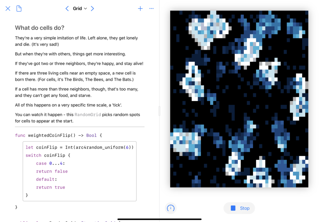
What I made
I wanted to bring back a concept I’ve played with before: cellular automata. A few days before the competition was announced, I’d seen a video that really caught my interest.
Well hey, I thought, I’ve got some code for running cellular automata. I want to learn Swift Playgrounds. And I’ve been having fun with SwiftUI. Let’s combine those things, shall we?
The first big change was a visual history; when a cell dies, I don’t want it to just go out, I want it to fade slowly, leaving behind a trail of where the automata have spread.
The second was rewriting all the visuals in SwiftUI, which was a fun project. Animation timings took me a bit to get right, as did figuring out how to do an automated ‘update n times a second’ in Combine. The biggest issue I had, actually, was performance – I had to do some fun little tricks to get it to run smoothly. (Note the .drawingGroup()here – that made a big difference.)
And third, I didn’t want it to just be “here’s some code, look how pretty,” I wanted to actually use the Playground format to show some cool stuff. This turned out to be the most frustrating part of the whole thing – the Swift Playgrounds app doesn’t actually support creating a PlaygroundBook, and the Xcode template wasn’t supported in the then-current version of Xcode.
But the end result? Oh, I’m quite happy with it. PlaygroundBooks are cool once you get past how un-documented they are. You can, to borrow a Jupyter turn of phrase, mix code and prose in a lovely, interactive way.
Don’t worry, the real version (and some videos) are below.
Doing the actual writing was pretty fun. This is a concept I’ve spent a lot of time learning about, just because it captured my interest, and I wanted to share that in a fun way.
Spring quarter consisted of two things: beginning the internship, and an “intro to programming” course. Which, at first glance, seems like it would’ve been a “coast to an easy A” kind of thing for me, but that wasn’t my goal. And, to quote the Dean of UCI’s Graduate Division, “grad school is for you.”
So, at the start of the quarter, I sat down to figure out what my goals for this class would be, and came up with two things. The first, which I won’t be writing about, was to get a bit more teaching experience – in the vein of “guiding people to asking the right questions,” rather than just showing them the answers.
Second, and the topic of this post, was that I wanted to learn Vapor. The professor was kind enough to let me do this – instead of doing the course project (an online game of Reversi) in Node, I did it in Vapor.
As a learning exercise, I’d say it was… okay.
What Went Well
I love Swift as a language. The type system just fits in my head, it aligns incredibly well with how I think.
In this case, that meant representing all the events to the server, and the responses from the server, as enums.
It also meant that I could have a solid Game class that represented the whole game board, with some neat logic, like getters that calculate the current score and if the game has ended. Pair those with a custom Codable implementation, and you’ve moved the majority of the logic to the server.
… and What Didn’t
The fact that I’m representing events to and from the server as enums, instead of using Vapor’s routing system, was a result of tacking on another thing I wanted to learn about, and trying to loosely hew to the nominal course objectives. The official version of the project used WebSockets for all the communication. Vapor supports WebSockets. Great combo, right?
Well, sure, but it meant I did almost nothing with the actual routing. Instead I re-implemented a lot of it by hand, and not in a very clean way. Vapor doesn’t scope things the way I expected – based on some experimentation, it instantiates a single copy of your controller class and reuses it, rather than having one per connection. So instead of having nice class-level storage of variables, and splitting everything up into functions with the main one handling routing, it all wound up crammed into the main function. Just so I could maintain the proper scope on variables. I’m still not happy about it.
What’s Next
I’d like to keep tinkering with Vapor. When I’ve got the time, I have a project in mind where it seems like a good fit.
In the meantime, I hope their documentation improves a lot. The docs they have are good tutorials, and cover their material well; they also, it feels like, leave out the lion’s share of the actual framework. By the end of the project, I’d given up on the docs and was just skimming through the source code on GitHub, trying to find the implementation of whatever I was trying to work with. (This, by the way, doesn’t work with Leaf, the templating engine – the docs are basically nonexistent, and the code is abstracted enough that you can’t really skim it, either.)
Complaints aside, I still like Vapor. I picked up a book on the framework, which seems like a pretty good reference on the topic.
And hey, it was a neat little project. (The JavaScript is a disorganized mess, but it’s also aggressively vanilla – while the rest of the class was learning about NPM, I decided to see how far I could get with no JS dependencies whatsoever. Answer: very.) Check it out, if you’d like:
This is… a work in progress. I got this phone in September, and while it’s been on my mind to do a full reorganization, I haven’t had time to do a full “tear it all down and start from scratch” process. The top two rows, especially, are very temporary — for the first time since iOS 7 came out, I’ve disabled Reduce Motion, and the parallax makes the fake invisible icons trick look terrible. So rather than go through things in top-to-bottom, right-to-left order, I’m just going to talk about them in whatever order strikes my fancy.
Things remains my task management app of choice. I love it across all platforms, and happily recommend it to anyone who’s looking for something more robust than Reminders or a list in Notes. For me, it strikes the right balance of features without getting too heavy, and while I’ve got one or two things I’d like to see added, I have no great complaints.1
FoodNoms has been a very nice addition – it replaced Calory, which had replaced MyFitnessPal, which had replaced Lose It!. I’ve got a long history of tracking food, and while I quite liked Calory, FoodNoms is the first time I’ve gone “ah, never mind, don’t need this” and tossed out my notes on how I would build a food-tracking app. I haven’t yet gone for the subscription, because it just doesn’t have any features that interest me, but based on the rate of development, I’m expecting to make that change within the next few months.’
Timery is another stellar addition. It’s in that same category as FoodNoms — I had some sketches started of how I’d make an app in this category, and Timery made them completely irrelevant. The last two updates have added some truly excellent Shortcuts integrations — the last one added conversational shortcuts, so I can now just say “Hey Siri, Toggl” and talk through starting a timer with a specific project and description, or kick off a few frequently-used ones with a short phrase. The newest updated added some more programmatic stuff, and I’m planning to take some time over Christmas weekend to rebuild my old Toggl shortcuts, based on Federico Viticci’s examples, with Timery instead of custom web API calls.
Toolbox Pro – speaking of Shortcuts, Toolbox Pro is a neat little collection of Shortcuts actions. I’m most excited about the Variables feature, which I’m hoping I can use to improve some of my daily automation stuff.
Mail has replaced Airmail. I’d been vaguely looking for a replacement for Airmail, because it had a nasty habit of crashing all the time, and then they did a terrible job of switching to a new business model, and I threw my hands up in the air and decided to try the system default. It’s been working perfectly on iOS; on macOS, I’ve got a cobbled-together system using BetterTouchTool that sorta gives it real keyboard shortcuts,2 and a launchd script that relaunches it when it crashes.3
Day One remains my stalwart for journaling, but I’ve been slowly increasing the things I use it for. It’s my archive of Instagram, where I store my sketches, and the app I used to record some interviews I did for class.4
Ulysses is where I’m writing this article! It’s still my go-to for any long-form writing, and I love it. I haven’t yet made much use of their recent ability to store Ulysses files in Dropbox (or other arbitrary locations on disk), but I do have a collection of plain-old-markdown files that I edit in Ulysses on my Mac and Sublime Text on Windows.5
Reeder is a continuation and an addition all at once — I’ve been using it on my Mac for a while, but didn’t have it on iOS. I hit the maximum number of feeds on the free level of Feedly, and was extremely unimpressed with their paid offerings; I considered making a second account to keep syncing, but decided that was sorta rude to them, and instead opted to not have sync at all. That worked for a while, and then I got a Synology, and after setting it up as a Plex server, spent some time looking into RSS server options. At the moment, I’m using TT-RSS with a plugin for Fever support, but if anyone knows of something that’s easy to set up and has Google Reader API support, I’d appreciate it.6
Dark Sky’s recent redesign has me pretty happy. If they let me reorder the types of information, I’d be happier, but the clarity of the “when is it going to rain” charts is still excellent.
Overcast remains my podcast app of choice. Podcasts have been a great way to help me establish a gym habit — I established a podcast habit, and then decided that podcasts are things I can only listen to while driving, cleaning, or working out. (If you want podcast recommendations: Cortex, Do By Friday, ATP, 99PI, and MBMBAM are my mainstays.)
Strong, speaking of a gym habit, is the driving force of my time at the gym. A couple of my friends have been helping me out with designing actual workout programs to do, but Strong is where I put those in. It’s easy to use, remembers all the numbers so I don’t have to, and has instructions, often accompanied by images or GIFs, on a lot of exercises.
Streaks is where I track all my habits, from “did you remember to take your meds” to “do some writing for your blog” to “have you gone to the gym enough times this week?” It’s very good at what it does, and I’m still a fan.
Fluidics is a bit self-serving to include here, but I use it all the time. I’m planning to update it eventually — I’d like proper Dark Mode support, at the very least — but it’s hard to find the time.
Wallet has gotten more and more important over time, though not as fast as I’d like it to. Let me put my driver’s license in there, already. Apple Card is slowly taking over as my main credit card, Apple Cash is even more handy with the cash back in there, and it’s not too hard to make your own pass of your gym membership.
Sleep Cycle is possibly on it’s way out; I’m strongly considering getting a beddit, although I need to do more research — does it have the ‘smart alarm’ feature? How accurate is it? Is Apple going to kill the app soon? Lots of questions.
Dark Noise is a new addition in the past few days; I’ve been switching from a ‘sleep’ playlist to white noise in an effort to get Apple Music’s recommendations to not be entirely useless.7 I tried to use Sleep Cycle’s white noise feature for a while, but it assumes that I want the white noise to stop after a while, which is absolutely not the case. Dark Noise’s actual noise is a bit less interesting overall, which is possibly the point, and the app itself is delightfully well-made.
I was, admittedly, tempted by OmniFocus, because OmniFocus for Web means I could have a single unified system across my Mac, iOS devices, and work PC, but it’s still just too much for my needs. And expensive. ↩
Listen, Apple: you can either comp me the cost of getting a new keyboard that’s got the Inverted T arrangement for the arrow keys, or you can let me go from message to message using j/k. (And even if they did give me a free keyboard, I’d still complain; I’ve been using j/k to get around for two decades now, and it’s just easier.) ↩
And on Windows, both Outlook and Windows Mail crash frequently, too; apparently IMAP, despite being 30-something-years-old, is still an unsolved problem? ↩
In typing this, I’ve just realized that I think I’m using Day One the way Evernote wants to be used. Huh. ↩
The Fever API neglected any form of subscription management, and needing to pull up the TT-RSS frontend in a web browser whenever I want to add or remove a subscription just feels silly. ↩
Fun fact: the “use listening history” setting that all Apple Music clients have? Doesn’t appear to do anything. Neither does “stop recommending music like this.” ↩
I mentioned in my post about scripting with Swift that I’d been working on something that inspired this. Well, here’s what it was: a rewrite of my automated playlist backup AppleScript in Swift. That version ran every hour… ish. Partly that scheduling issue is because launchd doesn’t actually guarantee scheduling, just ‘roughly every n seconds’, and partly it’s because the AppleScript was slow.1
Then I found the iTunesLibrary API docs, such as it is, and thought “well, that’d be a much nicer way to do it.”
And then I remembered that Swift can be used as a scripting language, cracked my knuckles, and got to work. (I also had some lovely reference: I wrote up my very basic intro post, but this post goes further in depth on some of the concepts I touched on.)
Not the best API I’ve ever written, but not bad for something I threw together in a few hours. And I had fun doing it, more so than I did with the AppleScript one.
Oh, and it’s much faster than the AppleScript equivalent: this runs through my ~100 playlists in under a minute. So now I have it run every 15 minutes.2
(The configuration for launchd is about the same, you just replace the /usr/bin/osascript with the path to the Swift file, and make the second argument the full path to the directory where you want your backups going. See the original post for the details.)
I’m a bit tempted to turn this into a macOS app, just so I can play around with SwiftUI on macOS, and make it a bit easier to use. Of course, by ‘a bit tempted’ I mean ‘I already started tinkering,’ but I doubt I’ll have anything to show for a while — near as I can tell, SwiftUI has no equivalent to NSOutlineView as of yet, which makes properly showing the list a challenge. Still, it’s been fun to play with.
I was going to cite this lovely resource, but since that website was built by someone who doesn’t understand the concept of a URL, I can’t link to the relevant section. Click ‘Configuration,’ then the ‘Content’ thing that’s inexplicably sideways on the left side of the screen, and ‘StartInterval’ under ‘When to Start’. ↩
I’m also looking at the FSEvents API to see how hard it would be to set it up to run whenever Music (née iTunes) updates a playlist, but that… probably won’t happen anytime soon. ↩
I’m a bit of a fan of Swift, though I don’t get to tinker with it nearly as much as I’d like. Recently, though, I did some tinkering with Swift as a scripting language, and thought it was pretty fun! (I’m planning another blog post about what, exactly, I was trying to do later, but for now just take it as a given.)
The most important step is to have Swift installed on your machine. As a Mac user, the easiest way is probably just to install Xcode, but if you’re looking for a lighter-weight solution, you can install just the Swift toolchain. Swift is also available for Ubuntu, which, again, takes some doing. If you want Swift on Windows… well, it’s an ongoing project. Personally, I’d say you’ll probably have better luck running it in Ubuntu on the WSL.
Alright, got your Swift installation working? Let’s go.
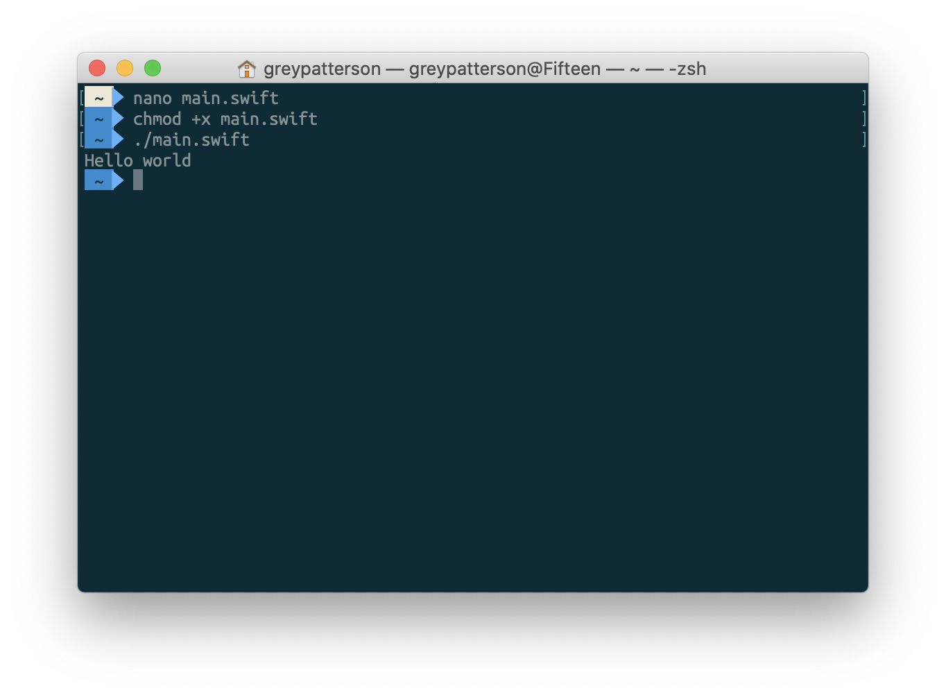
Step 1: Make your Swift file. We’ll call it main.swift, and in true Tech Tutorial fashion, we’ll keep it simple:
Step 3: In your shell of choice, make it executable:
$ chmod +x ./main.swift
Step 4: Run!
$ ./main.swift
> Hello world!
No, really, it’s that simple. The magic comment there tells your interpreter ‘run this using Swift’, and then Swift just… executes your code from top to bottom. And it doesn’t have to be just function calls — you can define classes, structs, enums, whatever. Which is the real benefit to using Swift instead of just writing your script in Bash; object-oriented programming and type safety are lovely, lovely things.
My next post is going to go into some of the more interesting stuff you can do, with a lovely worked example, but for now I’ll add a couple other things:
By default, execution ends when it gets to the end of the file; at that point, it will exit with code 0, so Bash (or whatever) will assume it worked correctly. If you want to exit earlier, call exit(_:) with the code you want. exit(0) means “done successfully,” while any other integer in there will be treated as an error.1
print(_:) outputs to stdout, which can be piped using |. If you want to output an error (to be piped with 2>, or similar) you need to import Foundation, and then call FileHandle.standardError.write(_:).2
To explicitly write to stdout, it’s FileHandle.standardOutput.write(_:).
Which is useful if your script is going to be called programmatically. ./main.swift && echo "It worked!" will print “Hello world” and then “It worked!” with exit(0), but just “Hello world” if you add exit(1) to the end of the file. ↩
And note the types here – this expects Data, not String, so to write a string, you need to convert it by adding .data(using: .utf8)!↩