(Image credit: @morningbrew, Unsplash)
Following my recent post on form design, I thought it might be interesting to take a look at what is, in the US, one of the most universal forms: the ballot.
This sits at the intersection of my interests in design and civic engagement. It’s also a much more controversial topic than I’d normally touch with a ten-foot pole, but here I am.
(‘Pole/poll’ pun? Absolutely intended.)
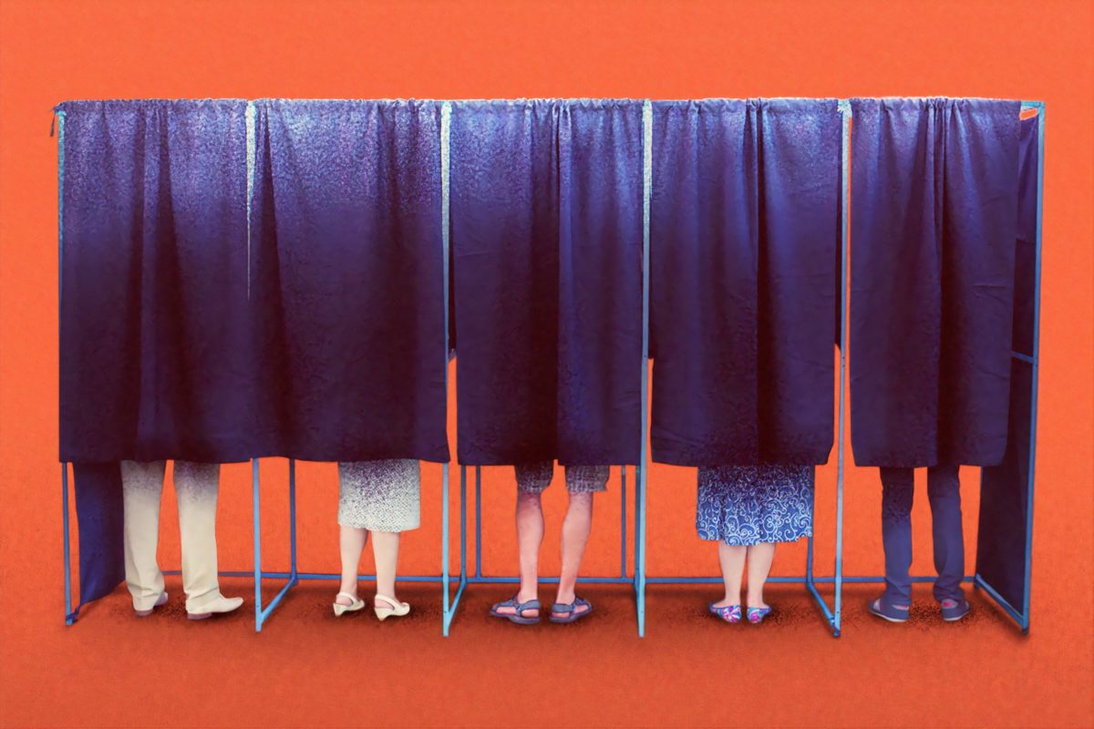
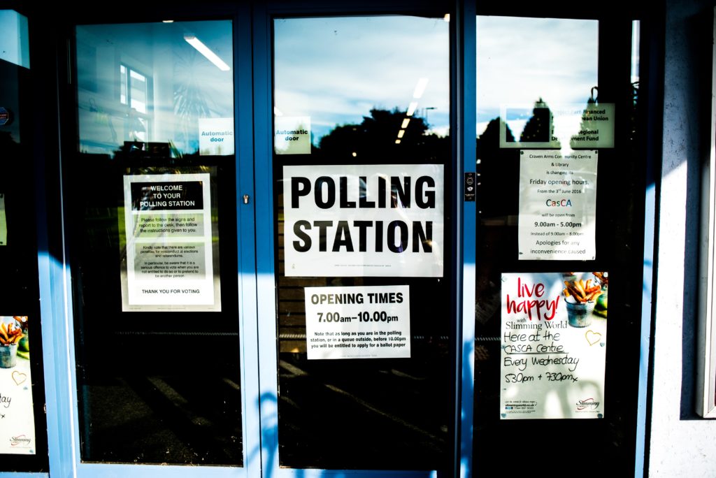
And first, an admission: that image up top, of people at a polling station? That’s an utterly alien concept to me. I’ve never been to a polling station; I live in Oregon, a state that finished moving to universal vote-by-mail when I was in elementary school.
Now, vote-by-mail is a very controversial topic these days, but as someone who grew up with it, I thought it would be interesting to do a case study of how it works in Oregon.
Vote by Mail: A Case Study
Overall, the user experience of voting in an election in Oregon is, to my eye, already a ways ahead of most of the rest of the country. There’s still room for improvement, though.
So, what is Oregon doing right, and what are we doing wrong?
Ease of Registration
I take a great amount of civic pride in the lengths my state goes to for voting rights: you can register to vote online, or be automatically registered when you get your driver’s license. I registered to vote at 17, after being handed a registration card by the Oregon Secretary of State at a voter registration drive; you can, in fact, register on your 16th birthday, if you so desire.
(Image credit: @element5digital, Unsplash)
In doing the research for this article, I found out that “register when you get your driver’s license” went from “… if you fill out this extra piece of paper while you’re at the DMV” to being an automatic process, thanks to the amusingly-titled “Motor-Voter Law.”
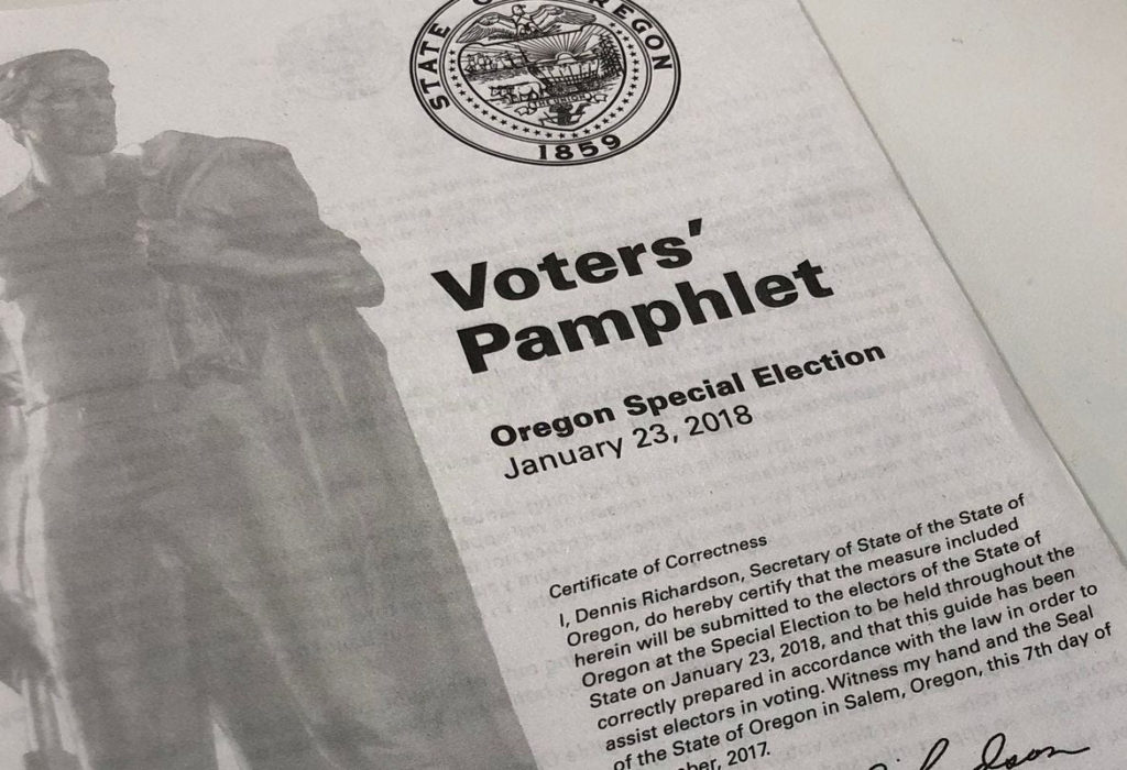
Ease of Information
While I can’t say we don’t have our share of crappy political ads, the state has a standard way of providing information on everyone running: the voting pamphlet, sent to every household prior to the election. (They are also available online.)
(Image credit: Statesman Journal)
These pamphlets, nice as they are, aren’t perfect. The actual process for putting information in them is a touch convoluted, and surprisingly unregulated. While each entry mentions where the information comes from, and plagiarism or misquoting are banned, there is nothing enshrined in law (or policy) to prevent misleading entries.
Let’s take a look at the information architecture of the section on a single ballot measure.
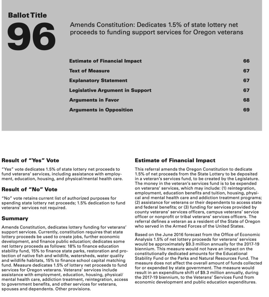
At the top, the easily-memorable measure number takes precedence, followed by the shortest-form summary, the title.
Each measure has a very clear summary section, as well as the “Result of ‘Yes’ Vote” and “Result of ‘No’ Vote” area, which state, very explicitly, what each bubble on the accompanying ballot will do.
The estimate of financial impact is prepared by an eminently qualified committee; the text of the measure is resolute in itself.
But then things break down, with “Arguments in Favor” and “Arguments in Opposition.” This is an official state document; everything about this measure, so far, has been as factual and rigorous as one could hope. These arguments, though, are unregulated beyond “no plagiarism, no misquoting people.” If you want to write a 350 words of “why you should vote against this,” pay the fee to have it entered in, and file it as an “Argument in Favor” there’s nothing to stop you.
And that’s a problem. This is an official state document; it’s got the seal on the cover, and a lot of very solid information in it, giving it credence. Unverified information in the Arguments gains legitimacy by association.
(Screenshot taken from the 2016 Oregon Voter’s Pamphlet.)
For comparison, let’s take a look at a different state.
California’s voter pamphlets are laid out very differently. The first thing that caught my eye – and made assembling this comparison in a visually-pleasing way rather difficult – was that the ballot measure doesn’t have a table of contents.
To save you a great deal of scrolling, I’ve pulled together the section headings from the 2020 Voter’s Pamphlet, Proposition 20, and summarizing somewhat:
- Official Title and Summary
- Summary of Legislative Analyst’s Estimate of Net State and Local Government Fiscal Impact
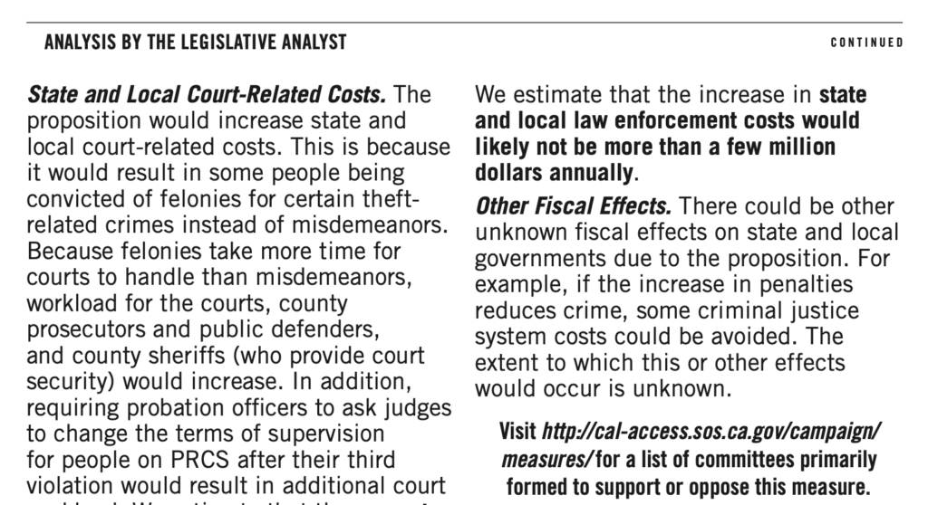
- Analysis by the Legislative Analyst
- Overview
- (Specific Proposal Title)
- Background
- Proposal
- Fiscal Effects
- Argument in Favor of Proposition
- Rebuttal to Argument in Favor of Proposition
- Argument Against Proposition
- Rebuttal to Argument Against Proposition
Distinctly more words to it, but notice some key differences:
- There’s an actual analysis of the legislation, expanding beyond the fiscal impact to the actual outcomes of the bill. This is provided by the Legislative Analyst’s Office, who are explicitly nonpartisan.
- Arguments in favor and against are paired with rebuttals, allowing for more of a dialog between sides.
Note, however, that there’s still no legal requirement for an “argument in favor” to actually be in favor. There is a strong precedent for judicial intervention, which is something of an improvement, at least. And the typography makes a statement, too.
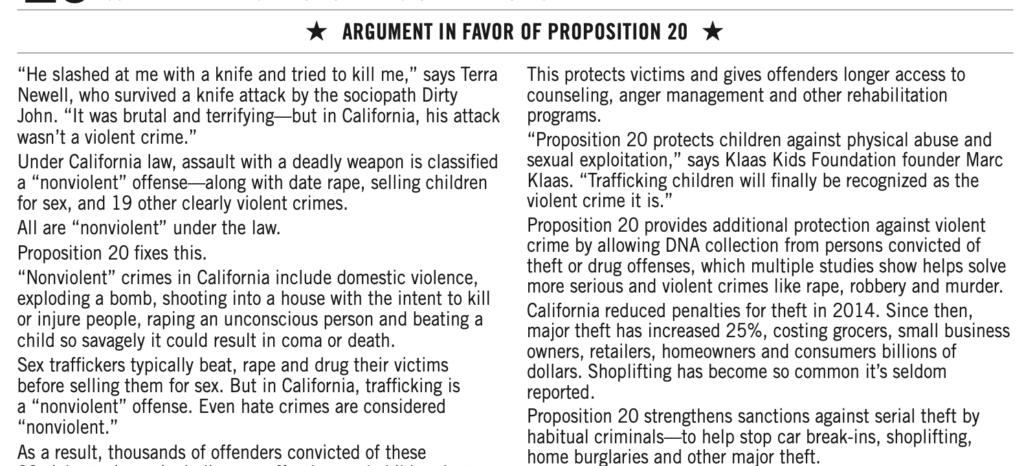
On the left, the Analysis by the Legislative Analyst. It’s rich text – there’s use of bold to highlight key points, and various levels of headings to organize it. On the right, the Arguments, sans formatting. They’re also in a smaller font size, and have their own unique style of heading. In short, the Arguments look different, providing a subtle reminder that this section is not the product of the nonpartisan election officers.
And now, back to the other aspects of the election. But first, a reminder to find other sources of information on the candidates and ballot measures. As a good starting point, I recommend Vote411, from the League of Women Voters, and Ballotpedia.
Ease of Voting
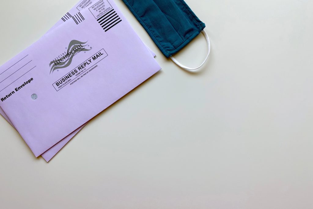
A few weeks before the election, the Oregon Department of State mails out ballots to all registered voters. The package includes the ballot, a return envelope, and a second ‘privacy’ envelope that you can use if you’re worried somebody might be able to see the contents of your ballot through the outer envelope.
(Image credit: @element5digital, Unsplash)
As of 2019, the return envelopes are postage-paid; if you’d rather drop it off in person, you can take it to drop box – most public libraries have one, as well as various other locations.
Ease of Marking
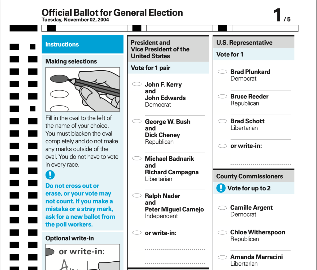
One of the inspirations for this post was the American Institute for Graphic Arts’ “Design for Democracy” program. They did a larger-scale version of my research on form design, investigating and determining best practices for ballot design.
AIGA produced a hand-filled ballot design (pictured, right), as well as a ballot design for touch screen voting machines, and a full set of resources for election design. I’ll be focusing on the hand-filled ballot, though, as that’s what we use in Oregon.
Let’s take a look at a (reasonably) representative sample of an Oregon ballot. This comes from the 2020 primaries, courtesy of Lincoln County:
It’s actually pretty good. The visual design follows most of the guidelines, although the “Write-in” lines and text need a bit more space. The main issue I see is the instructions – they’re fairly clearly written, but they are written. Pairing them with a visual explanation – the cartoons, in AIGA’s example – makes them even easier to follow.
The UX of Elections
Elections in the US, being controlled at the state level, rather than federally designed, are something of an ongoing A/B test. We can see different electoral systems in use across the country, and use opinion polls after the fact to judge how well-represented people feel by the results.
Were I polled right now, I’d feel fairly happy with how my state handles things.
So, what are the key action items for, say, another state, looking to implement some of Oregon’s best practices?
- Reduce the friction of voting. Make it easy to register, easy to get your ballot, easy to fill out your ballot, and easy to turn it in.
That’s it, that’s the list, the whole idea. Make it easier to vote, by whatever means possible. I’m an advocate for doing so by enabling universal mail-in-voting, thanks to some of the inherent benefits:
- No standing in line, or going into cramped polling places – an excellent benefit during a pandemic!
- Voting on your own time, rather than needing to take half a day off to wait in line. (‘On your own time’ within reasonable limits – there’s still a deadline to get it turned in on time.)
But, of course, I’m not done. I have some recommendations for Oregon, as well:
- Validate the voting pamphlet materials. Don’t just trust what people submit, make sure it’s actually espousing the viewpoint it claims. Do some fact checking, while you’re at it.
- Visually distinguish public submissions. Use some gestalt principles – things that are close together, and look similar, look like they’re part of a group. Move the public submissions a little further away, and make them look different, to remind people that they aren’t from the same source as the rest of the material.
- Demonstrate how to fill out the ballot. The instructions are fairly well-written, but “comfortable reading English” should not be a requirement to vote.
Postscript: while I’m advocating for improving voting, I am absolutely not advocating digital voting. No. No, no, no.