Categories
App

Fluidics 1.2: the Settings Update

I’m happy to announce the release of Fluidics 1.2! This update focused on the settings of the app and customizability; the quickest summary I can give is to include one of the new App Store images:

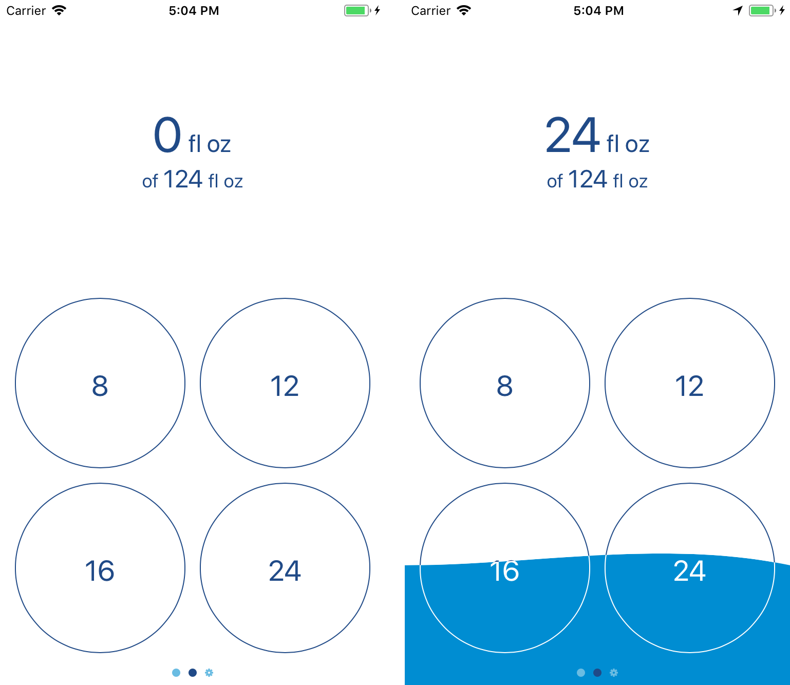
The first thing to notice is the new cards; they come up from the bottom of the screen, which is a much nicer experience on really tall devices like the iPhone X, and offer a more customizable interface than iOS built-in popup stuff.1
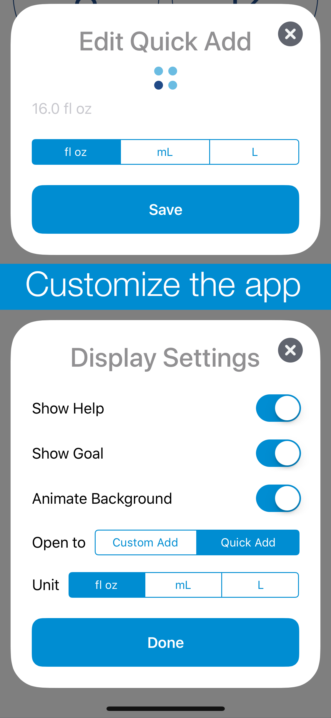
There’s some uses of the cards that I’m not showing here — I rebuilt the onboarding process, that initial setup you go through the first time you open the app, using this card style, and the result looks a lot nicer. There’s also some informational stuff — a new ‘about’ card, the weight/Health connection stuff, and so on — but the biggest things are the two cards in that screenshot. The first is, in my opinion, the more interesting: each Quick Add now has its own unit. If you’re content with the old system, all of them using the same unit, nothing’s changed; the text of the buttons is a bit bigger, but there’s no additional use of space. If you, like me, use a mix of units,2 you’ve now got the option to do that in one place, without needing to go over to the Settings page to switch back and forth all the time. These mixed-unit quick adds, as always, work both from within the app and from the widget.3
Next up is the new Display Settings card; this brings in features I’ve been wanting to have for a while now. Some of the original settings are still there — you can, as before, show or hide the help as you need it, and the ability to select the global display unit has been expanded to include liters as well as mililiters.4 There’s some new settings in there, too: you can choose which page of the app will come up when you first open it — useful if you’ve got your Quick Add values set just right to always work with the widget, and you only need to get into the app to add the occasional weird amount via the Custom Add page. You’ve also got the option to hide the goal display — you’ll still get the nice filling-up of the background, but without the actual number right there, it’s a lower-pressure environment.5 Finally, you can disable the animation of the background; though I spent quite a while making sure it’d work, I know that some people don’t actually want lots of animations going on.6
I also put a bit of polish on the way the Health connection works, so now it’s a single button in Settings that opens up a different card depending on the context — if you haven’t done all the connecting to Health, it’ll give you the option to do that, or leave things as they are; if it is connected to Health, but you haven’t got your weight logged there, you can continue using Fluidics’ built-in weight handling stuff. That’s been improved, as well, and now lets you pick units yourself, instead of going with the default for your region.7
Not mentioned in the release notes, but something I feel like mentioning here, is that I’ve done a bit more groundwork to prepare the app for eventual internationalization. There’s still a lot more ground to cover in that regard, though, so probably I won’t be adding additional languages for another couple versions.8
All that said, I’m pretty happy with where this version is, and I’m also excited to start work on the next big update; the feature list I’m aiming for is pretty neat. Fluidics remains free on the App Store, so please, give it a download.


  1. The specific implementation I’m using is this open-source project; I liked the way the API worked, though the documentation is a bit out of date. 
  2. Because ‘Murica. 
  3. Unfortunately, I had to reset the quick add settings as a result of this transition; the new way they’re stored is thoroughly incompatible with the old way. If you were just using the default ones, you won’t notice any change, but I wasn’t able to come up with a good way to transfer over customized settings. The issue is people like me, who used fluid ounces sometimes and milliliters other times; there’s no good way to combine eight possible options into four spaces without messing something up for someone. 
  4. I also tweaked the way amounts are displayed, so using mixed unit stuff doesn’t result in a downright stupid amount of decimal digits; I don’t think it really matters to anyone that you’ve had 101.327 fluid ounces to drink today, probably you’re alright with just 101.3. 
  5. There’s probably a joke in there about hydraulic pressure, but I’m too lazy to come up with it. 
  6. By default, it’s on, unless you have ‘reduce motion’ enabled on your phone, in which case it’ll default to having the animation disabled. That said, if you’re like me and have ‘reduce motion’ on just to get rid of the somewhat-nauseating parallax effect on iOS’ home screen, you can turn Fluidics’ animation back on while still leaving the global ‘reduce motion’ setting on. Nitpicky details, woo! 
  7. Shoutout to the UK, who can now use pounds, kilograms, or stone for weights; I may mock the US for our weird use of mixed units, but I think the UK is even worse about that. 
  8. At that point, it’ll probably be Spanish and German, since those are the ones I can manage without hiring a translator, but if anyone really vehemently wants a different language, feel free to leave a comment and I’ll see what I can do. 
Categories
App

Meditime

I’m quite happy to announce that I now have another app available on the App Store!1 Before you click, I’ll warn you, this one isn’t free, but the App Store has always encouraged trying a variety of business models, and “paid up front” was next on my list;2 $0.99 seemed a fair asking price for a lightweight utility.

The core concept of Meditime came from a podcast I was listening to.3 The idea is this: why do all the meditation apps have to be guided meditation, or come with ten million different settings, or decide what you should be listening to while you meditate? The point of the whole thing is to clear your mind, after all, and personally I’ve never had any luck with doing that while somebody is talking at me, and the lovely sound of water in a creek mostly just makes me feel like I need to use the restroom.

So, as with my previous app, having found nothing that I actually liked, I muttered “fine, I’ll do it myself” and opened Xcode.

The result is what I honestly believe I can call the simplest meditation app out there; swipe up or down to adjust the timer, double-tap to start. Adjust the time while it’s running if you like, or double-tap to stop; and if you don’t want a timer at all, drag it all the way down to zero, and it’ll run as a stopwatch, instead. At the end, the app will automatically log the session to the Health app, so you can keep track of it all nicely.4

As I said, the app is $0.99, but there’s no ads, no in-app purchases to ‘upgrade’ anything, and that one purchase will work on iPhone, iPad, and the iPod Touch, assuming Apple still makes those.5 And I’m already planning to update it to work well on iOS 12, including a little bit of support for the fancy new Siri Automation things. So, hopefully you can see the value, and if you’ve got a buck to spare, I’d quite appreciate it if you’d give it a try.

  1. In case you missed why that says “another,” have a look here.
  2. Still to go: free with in-app-purchases and subscription-based; I’ll be skipping the ‘free with consumable in-app purchases’ because apps made that way are generally terrible and at least a little bit immoral.
  3. And no, that isn’t a direct link to the episode, because I’m not certain which episode it was, although a reasonable guess would be this one, although there’s also a chance it was this one; either way, Do By Friday is a great podcast and I recommend it. Although not, I should add, to children, everyone involved does enjoy swearing.
  4. It’ll work without doing that, though, too; if you don’t want it saving to the Health app, just don’t give it permission to do so, and it won’t bug you about it.
  5. It requires iOS 11.4 to run, so hopefully you’re all up-to-date, as you should be.

    And saving to the Health app will only work on devices that have it, so the iPad won’t do that, but if Apple does decide to add the Health app to iPads, it’ll start working there, too. (I can’t comment on whether or not the iPod Touch can do that, because I genuinely have no idea if they support Health or not. Seriously, does Apple even make those anymore?)

Categories
App Portfolio Technology

Fluidics

I made an app! I’m quite excited about it; this is, after all, the sort of thing I want to spend my career doing.

The app is called Fluidics, and it’s for tracking the amount of water you drink. As I mentioned a while back, I like to do a lot of tracking of what I’m eating and how much I’m drinking. That first part wasn’t too hard; there’s a variety of apps on the App Store for logging food, and after a while I was able to find one that wasn’t too bad.1 For water, though, nothing quite worked – Workflow came closest, but using it to do the sort of goal calculations I wanted was on the line between clunky and painful, and it’s such a general-purpose app that it felt visually lacking.
Eventually I remembered that I’m a computer science major, and why am I sitting around complaining about the dearth of options when I’ve basically got a degree in making the dang thing. Months of sketching, programming, swearing, and repeating the whole thing eventually lead to this: what I hope is the easiest water-tracking app on the App Store to use.
It’s been a fascinating process. (Here, by the way, is where I’m going to take advantage of the fact that this is my blog for rambling and start talking about what it was like making it; if you’d like to get more information on the app, I’ve put together a rudimentary website, or you can skip straight to the ‘it’s free on the App Store’ part and give it a whirl.) As it turns out, there’s a whole lot of work involved in making an app; my original sketch was the widget and two screens. Those came together pretty quickly, but I realized that probably nobody would feel comfortable using an app if the first time they opened it it just threw up a message saying “trust me!” and then asked for a bunch of health information, so I wrote up a privacy policy and started building an onboarding flow. Which then ballooned in complexity; looking at the design files, more than half of the app is screens for dealing with something having gone wrong.2
One of the most interesting debates I had with myself during the whole process was deciding what business model to use.3 The App Store has had an unfortunate tendency to be a race to the bottom; while there’s a bit of a market for pro apps, a minimalistic water-tracking app doesn’t fit into that category. There’s also no argument to be made for a subscription, so I’d narrowed it down to ‘free, because I’m turning it in as the capstone project for my computer science major’, ‘free with ads’, or ‘paid up-front’. The first one was the one I was most comfortable with; sure, ‘paid up-front’ would be nice, but I’d also get approximately zero people to download it what with all the free competitors out there. ‘Free with ads’ feels deeply gross, both because I hate online advertising in general, and because I’m doing a lot with health data, and I really don’t want to have any chance of that getting stolen. For a while, I thought it was going to be ‘free forever’, and I’d be justifying it as ‘building a portfolio’.
That wasn’t what I actually settled on, however; instead, I’m going with ‘free with in-app purchase.’ Instead of building in a paywall and locking some features behind it, though, I decided I’d go simpler; the app and all of its features are free. Starting in version 1.1, there’ll be a button in the Settings; a little tip jar.4 I probably won’t make much, but I’ll feel better about it overall, and what’s the harm?
Beyond that debate, most of the challenge of the project as a whole was just building it. I knew going in what I wanted it to look like; what I didn’t know was how to go about doing that. The way the background overlaps the text? That alone took a week of trying different things to get working right.5 A few things I wanted to include in the first version didn’t make it – the widget was originally going to be entirely different, but the way Apple has done the security on health data makes the original design significantly more difficult to do, so I switched it to the current design.6
It was definitely a learning experience, too – I’d done some iOS application design for classes before, but never gone all-in on making something that would be both functional and enjoyable for the end user. If you’re releasing something on the App Store, you can’t just include a note that says “on first run, it’ll ask for a bunch of permissions; just say yes” because nobody will read that. And getting something uploaded to the App Store is itself a whole process – the App Store page doesn’t fill itself out, after all, and copywriting definitely isn’t my strongest suit.7
But it’s done; I’ve made an app and released it to the world. 8 By the time you’re reading this, it should be available on the App Store; as I mentioned, it’s free to download, and I’d love it if you’d give it a try.


  1. That said, I’m also doing some design sketches for my own entry into the field; don’t get your hopes up, I make no promises. 
  2. I’m not talking “my code is full of bugs and something crashed” went wrong, either; it’s all “the user originally gave permission to do something, but then changed their mind and used the Health app to take it away” and other such nonsense. Computers may be finite-state machines, but “eleventy hojillion” is still a finite number. 
  3. I also talked about this a lot with my friend Chase, without whom I would’ve long ago given up on technology and disappeared into the woods to be a Bigfoot impersonator.. 
  4. Yes, I know, I’m just now releasing version 1.0, and I’m already mentioning plans for 1.1. Don’t worry, I’ve got versions 1.2 and 1.3 mapped out, feature-wise, as well, and have some rough ideas for 1.4. 
  5. For a while I thought I was going to have to write code to draw the numbers ‘by hand’; fortunately, I was able to get the drawing to work by taking advantage of layer masks, but good lord are the Interface Builder files a mess as a result. Behind The Scenes, everybody! 
  6. I do still want to get the original design working, probably as an option in the Settings page of the app; a future version is going to add watchOS support, and I believe that a lot of the work I’ll have to do for that will also apply to making the widget work like I intended, so those two will either be the same or subsequent updates. 
  7. Another shoutout to Chase, who wrote the App Store description and turned my pile of 100 disjointed screenshots into the four that’re currently on display. 
  8. Well, “done”; it’s functional and available to the public, but software, as the saying goes, is never finished, only abandoned. I’ve no plans to abandon this project anytime soon; I use it myself several times a day, so I’m pretty invested in keeping it working and making it better.