Categories
Playlist Portfolio Travel

Data Visualization

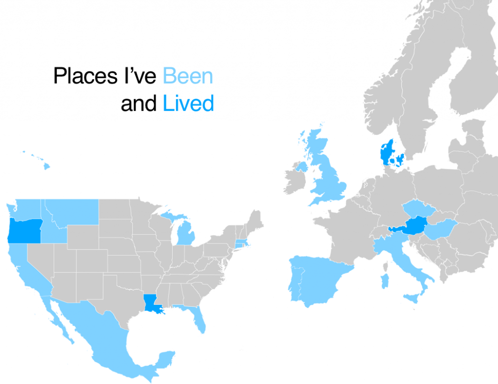
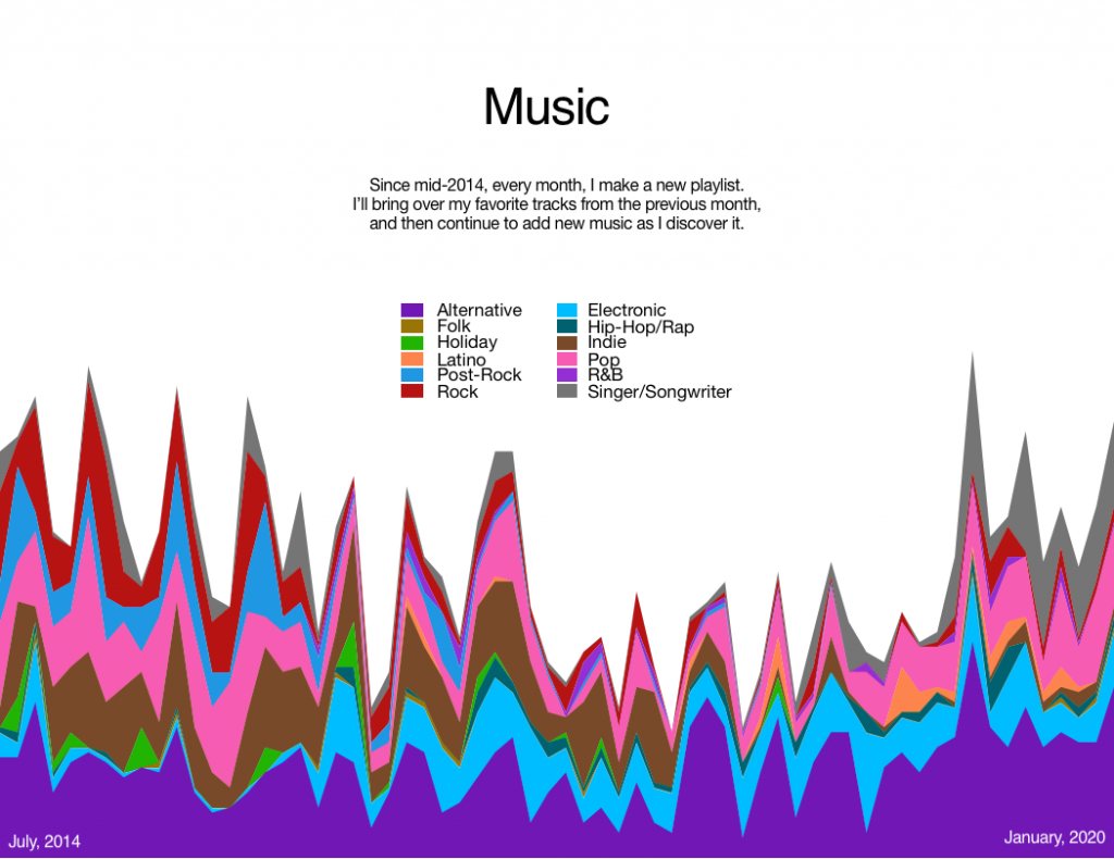
A quick post of a class assignment we did a while back – tinkering with data visualization. I went with my travels and my playlists as the data sources.

(Obviously it’s low-resolution data, for the most part, but you try showing more granular data on a map of the world.)
This was compiled through a lot of tinkering in Numbers. I’d try to write a script to do it, but given that I am, presumably, the only person on the planet who could actually make use of it, I’m going to not.

Leave a Reply

Your email address will not be published. Required fields are marked *

This site uses Akismet to reduce spam. Learn how your comment data is processed.