At long last, I am quite happy to share that Fluidics 2.0 is now available on the App Store. If you’d like to see the full feature list, check out the release post over on the new Fluidics website; this is going to be more of a ‘making of’ sort of post.
So, what’s new in Fluidics 2.0 that warrants it being Two Point Oh?
To start with, I rewrote it from the ground up. Which is widely considered to be a bad idea, but I stand by the decision. I built Fluidics as a project in undergrad; while that wasn’t all that long ago, I’ve learned a great deal since then.
And beyond that, the iOS world has changed. Fluidics 1.0 was built on storyboards and imperative programming; Fluidics 2.0 is entirely SwiftUI. (The only storyboards present are in the widgets, which… cannot be built without storyboards. Maybe in SwiftUI 2.0?)
And while I wanted the core of the application to stay the same – I love the visual of the screen filling up, and the way the colors transition from the ‘above water’ to ‘under water’ areas never fails to make me smile – I also wanted some of the more idiosyncratic stuff to… fit in better.
That iOS-y Feeling
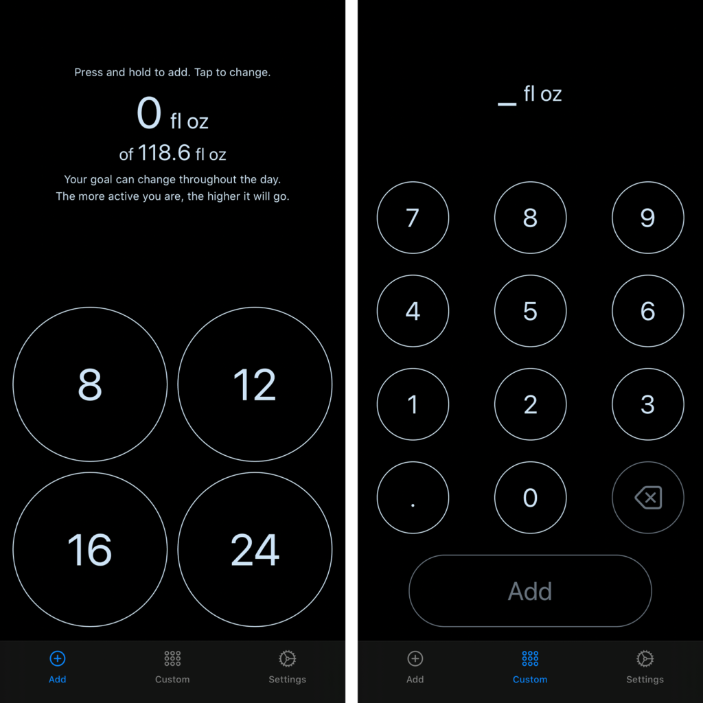
Gone are the cards.
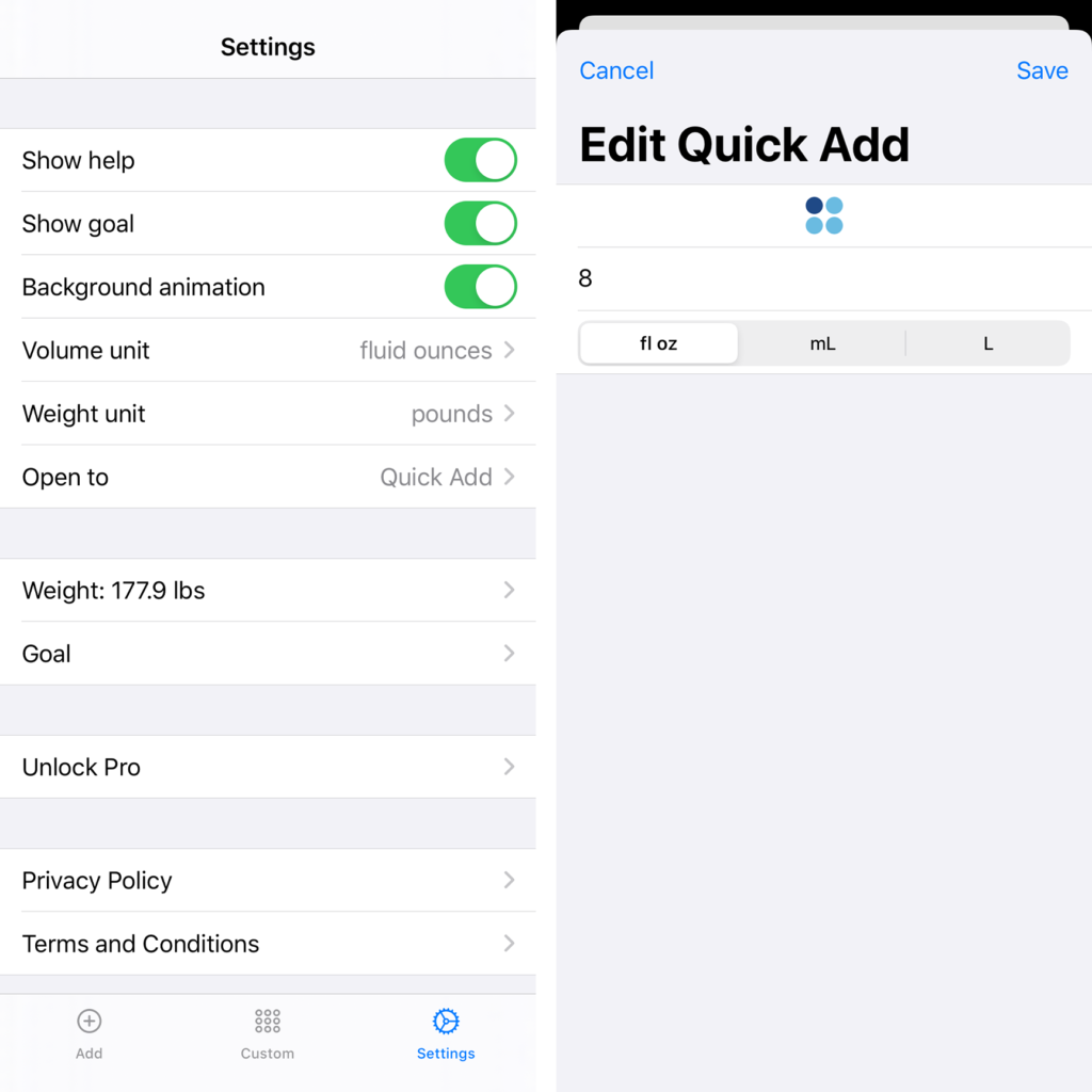
Settings is now a full-screen experience, and that extra room to breathe makes for a lot easier navigation.
For the Quick Add, I went with the new style of cards in iOS 13, which are just as easy to dismiss thanks to the universal swipe-down gesture, and have fewer… weird bugs.
One of the key ideas of the design program I’m doing right now is that “you are not your user.”
Which, in this case, meant I had to buckle down and accept what my actual users kept telling me. Cool as I think it is to swipe from screen to screen, other people mostly just found it confusing. Tabs? Tabs are standard for apps, which makes them easy to understand; they’re also very well-integrated with VoiceOver, which is something the swiping always struggled with.
Dark Mode
SwiftUI also comes with effectively free Dark Mode support. Most of the actual work, for me, was in finding slight variations on the colors that looked as good in Dark Mode as the originals did in Light Mode. (Day Mode?)
Finally, this new version of Fluidics is something like a tenth the size-on-disk of the previous. This comes from a few places: some actual clean-up work I did helped, but the biggest gains were from updating to the latest version of Swift; that means that, instead of including Swift itself in the app, I can just use the system-level one. So it’s iOS’ problem to keep track of that whopping couple of megabytes of code, and not Fluidics’. Nice.
Similarly, switching to iOS-standard cards instead of the custom ones saves some room. While I was working on dependencies, I switched from a weird, all-local, very-unstable implementation of StoreKit to RevenueCat, which is much easier to work with and saved me a great deal of tearing out my hair.
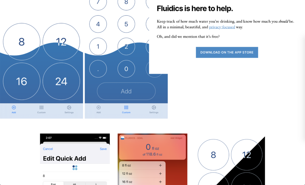
The final big change was a bit of a side project itself: a new website for Fluidics. The old one was… fine, I suppose. It gave me a chance to try out static site generation with Jenkins (on GitHub Pages), but… hand-coding HTML and CSS, while something I can do, isn’t something I really enjoy doing.
WordPress
In the interim, however, WordPress has had some excellent updates, the Twenty Twenty theme is easy enough to tweak, and Gutenberg with some plugins makes for a very good editing experience, so here we go.
The new site looks better, and makes it a lot easier for me to do things like, say, having a blog where I can do visually-interesting update notes for each release.
One reply on “Fluidics 2.0”
[…] the last update, this wasn’t a ground-up rewrite. I briefly considered tearing out the App/SceneDelegate […]