We’re currently wrapping up the spring quarter, and this seemed like an opportune moment to pause, catch my breath, and go back over some of the work that we’ve done so far.
And I will, first, pause to say that my use of ‘we’ there is very deliberate. I am part of a wonderful team of designers and researchers, working on the file system in JupyterLab:
- Justin Lischak Earley, project manager
- Jana Abumeri, research lead
- Nick Straughn, researcher
- Emily Fan, design lead
And myself, in a design role.
After years of being a developer, my first serious involvement in the world of open-source is as a designer. How about that?
So, what have we done so far?
Heuristic Evaluation
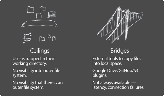
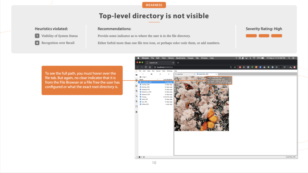
We began with a heuristic evaluation of JupyterLab, going through the process of setting up and using the file browser, and identifying key pain points.
We used Nielsen’s ten heuristics, and assigned a severity rating, from low to high, to problems. And, not to be all negative, we also highlighted some key strengths.
Why do a heuristic evaluation?
A heuristic evaluation is a great starting point. It’s a low-cost way to go through an entire interface and identify usability problems, and it’s quick, too.
Working asynchronously, have each of your panel members — and, in this case, the panel consisted of the five of us on the design team — individually go through the interface, making a note of any usability issues they see. Once everyone is done, combine the lists, merging similar/identical items.
Research shows that this technique works, even if the people doing the evaluation aren’t subject matter experts.
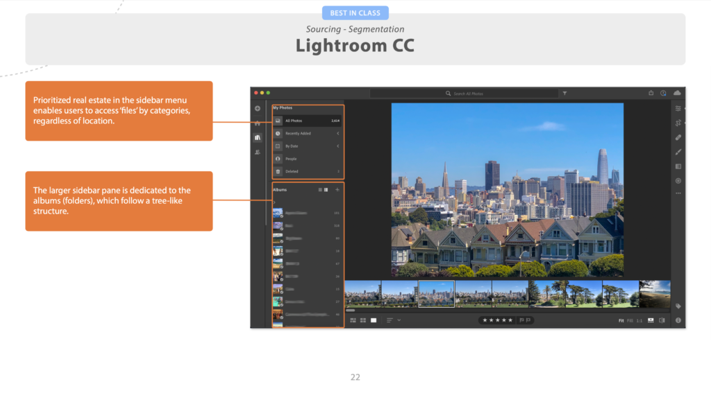
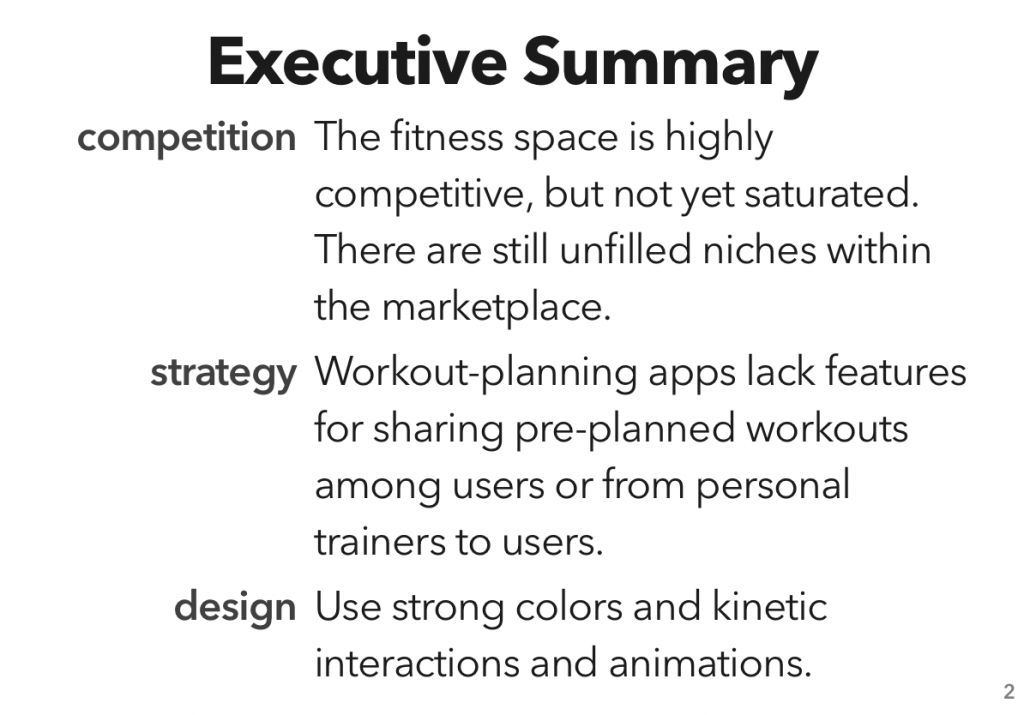
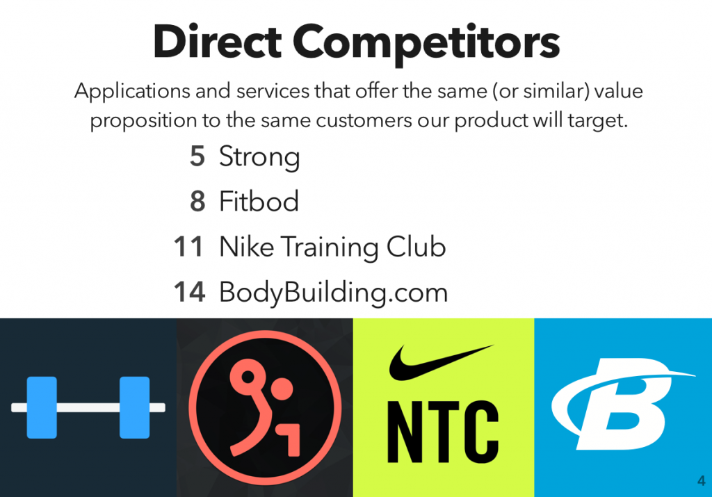
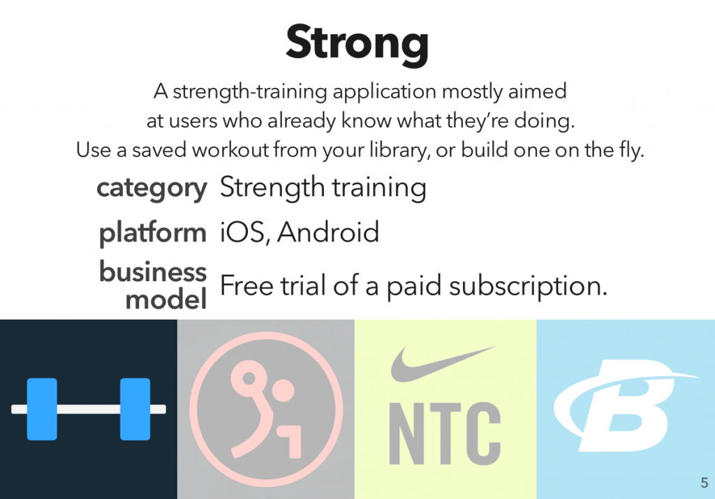
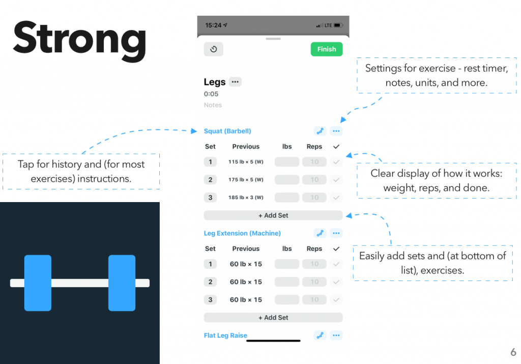
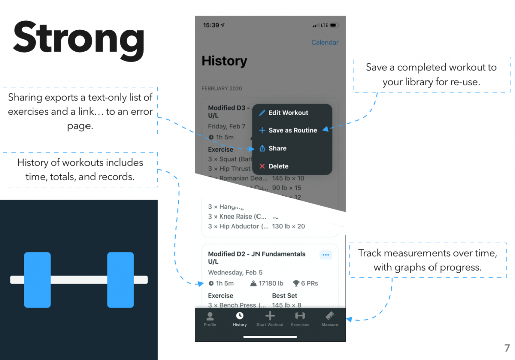
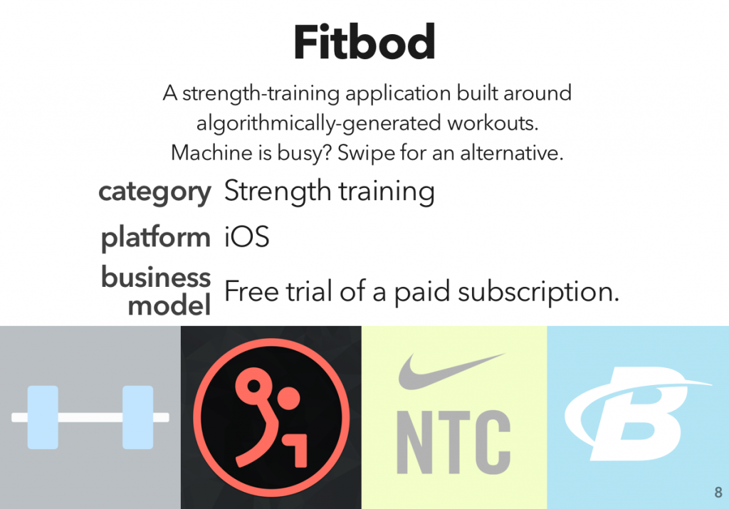
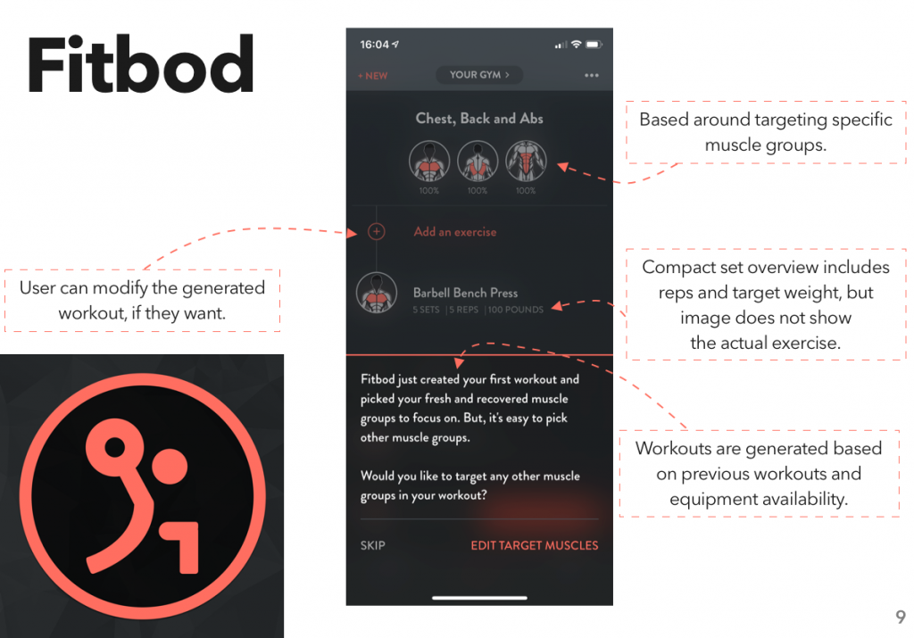
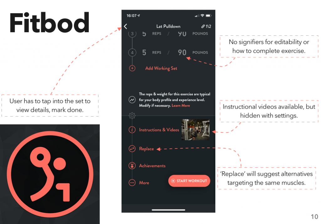
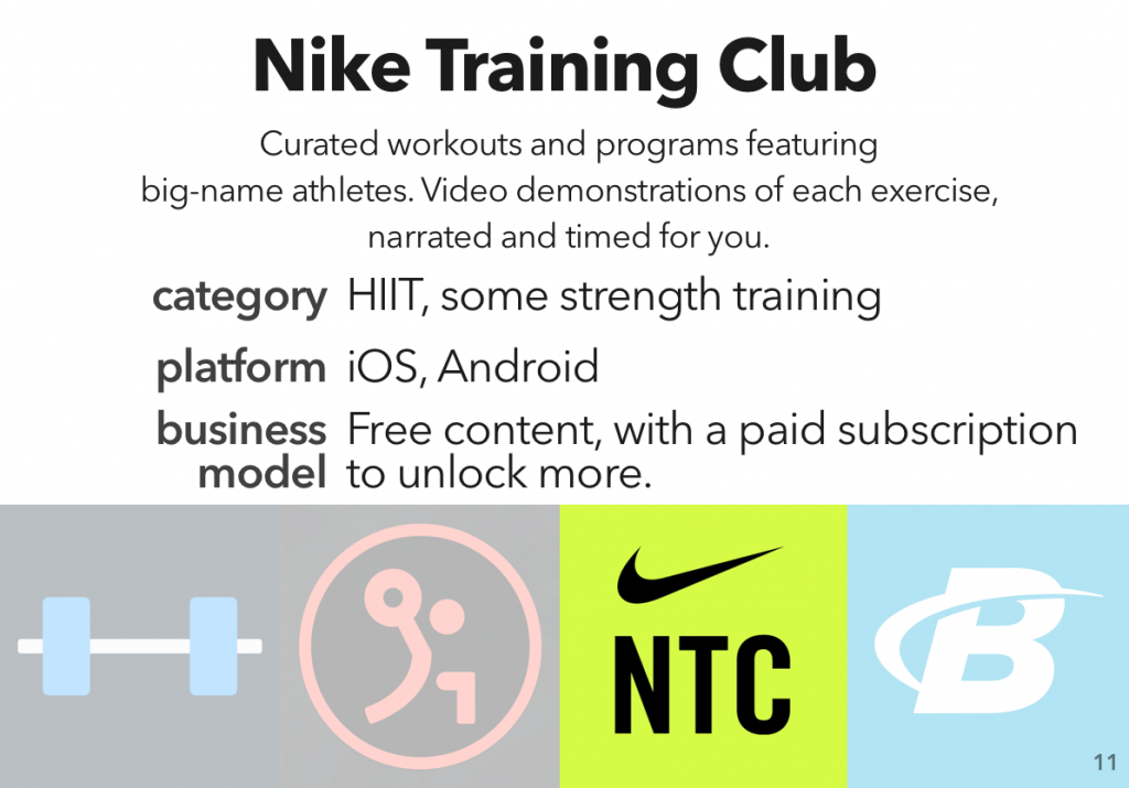
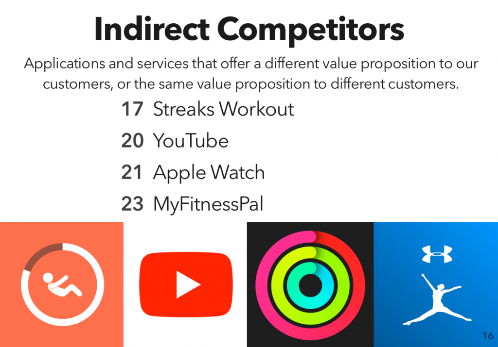
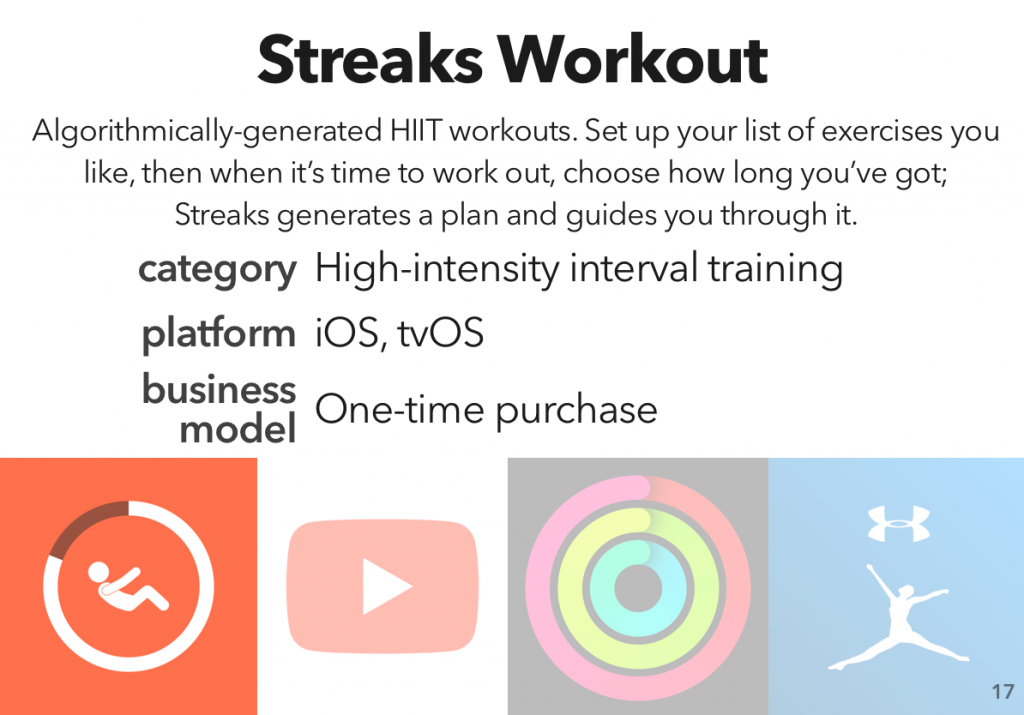
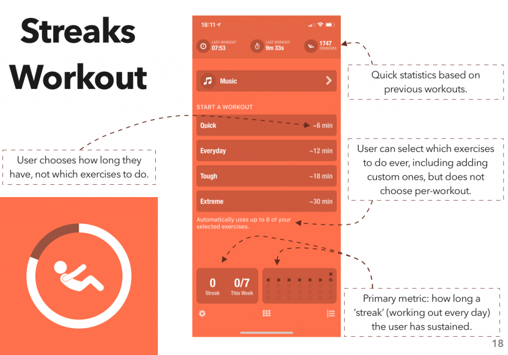
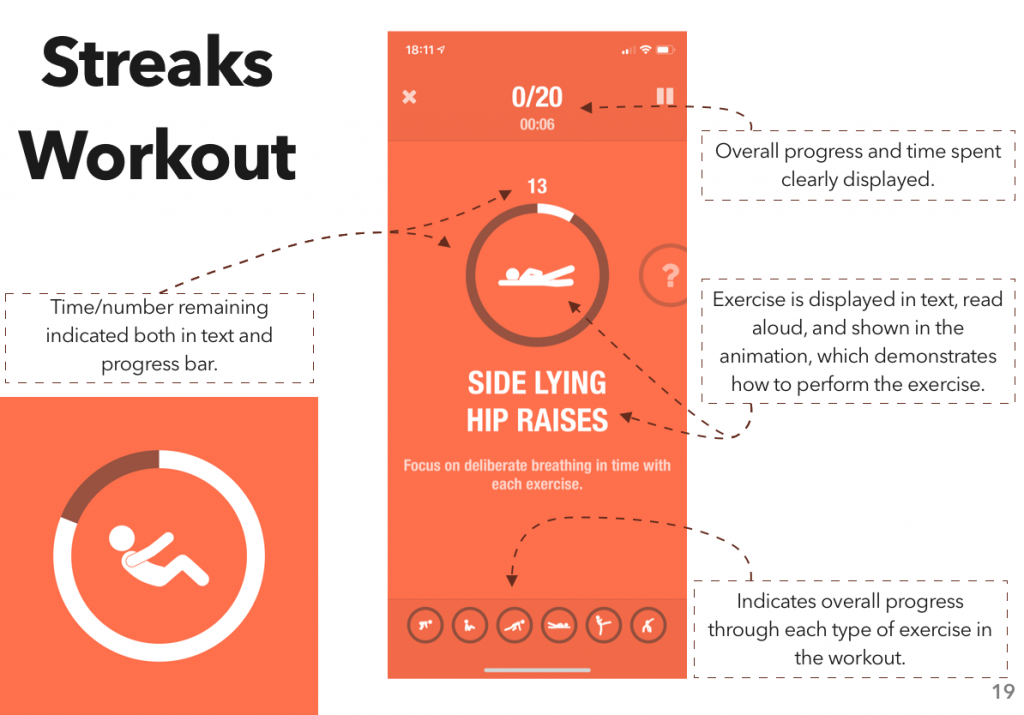
Competitive Analysis
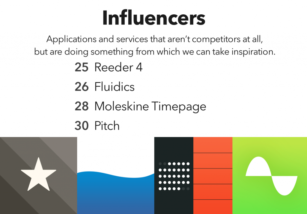
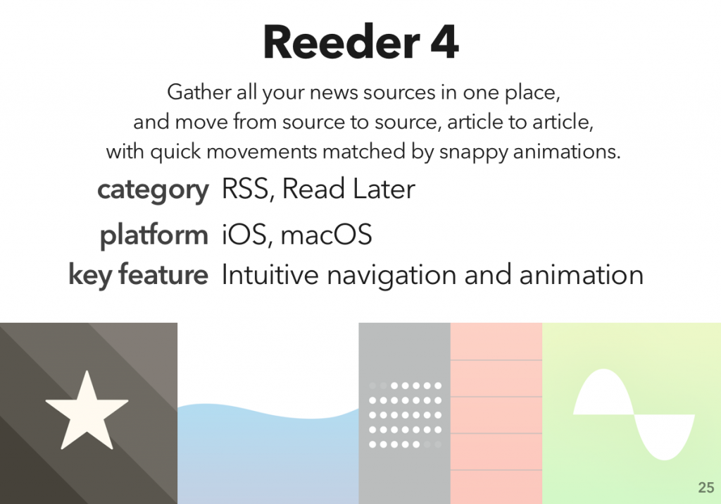
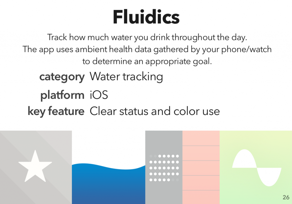
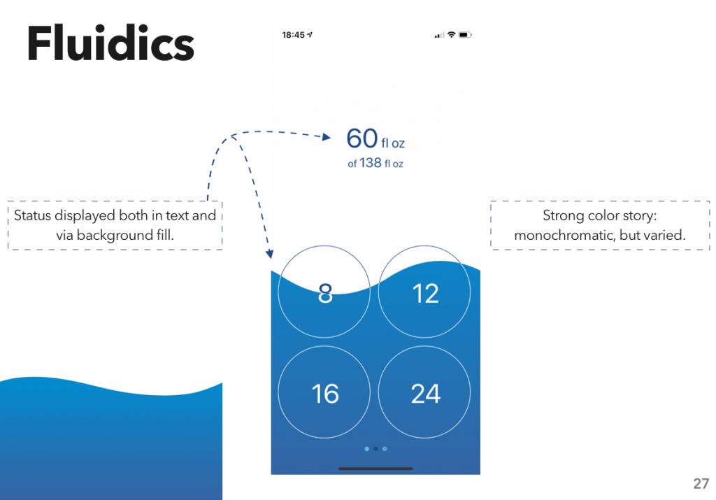
Next, we identified several competitors to JupyterLab, direct and indirect, and some influencers — products that aren’t competing with JupyterLab, but could offer some design inspiration.
Why do a competitive analysis?
In short, because it’s really helpful to know what your competition is up to. Are there features they have that your users need? That’s a problem. Do you have something cool that your competitors don’t come close to? That’s a marketing opportunity.
It’s a chance to see what the state of the art is, and what market niches are un-filled. (Like, for example, the lack of good sharing features I highlighted in my last competitive analysis.)
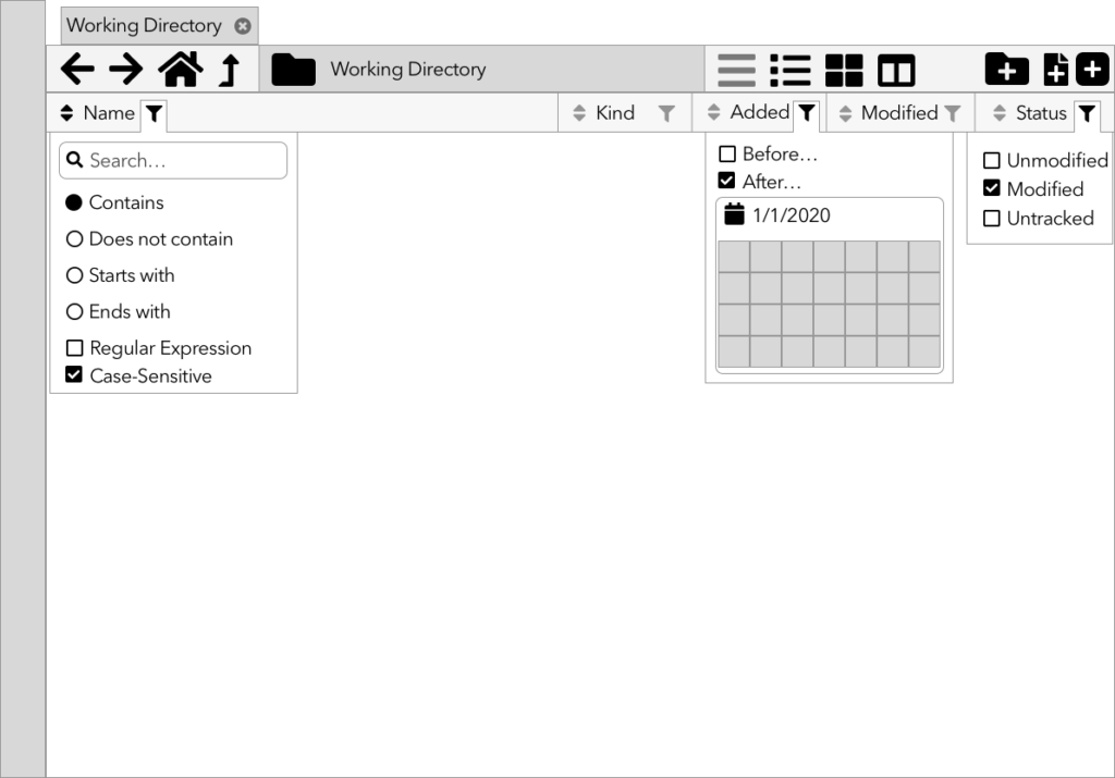
Sketches & Wireframes
While the research team continues with interviews and surveys, Emily and I started in on sketches and wireframes of the new file browser.
Why sketch/wireframe?
Because it’s too early to be pushing pixels.
Design is an iterative process: research feeds design feeds research feeds design. The initial research gave us our starting point; now, we make sketches, wireframes, and low-fidelity prototypes. The research team will take those and test them. What they learn will feed the next set of prototypes, and the cycle continues.
Especially early on in the process, you want to go low-fidelity; not only because it’s easier, but because it looks easier. If you make something pixel-perfect and beautiful, it looks like a finished project; the people testing it feel bad for pointing out what’s wrong with it, and stay silent, and those flaws work their way into the final product. Nobody’s happy.
What’s next?
We’ve got some more research deliverables that we’re in the process of wrapping up, which I will (eventually) post about here. And then, prototyping and testing!