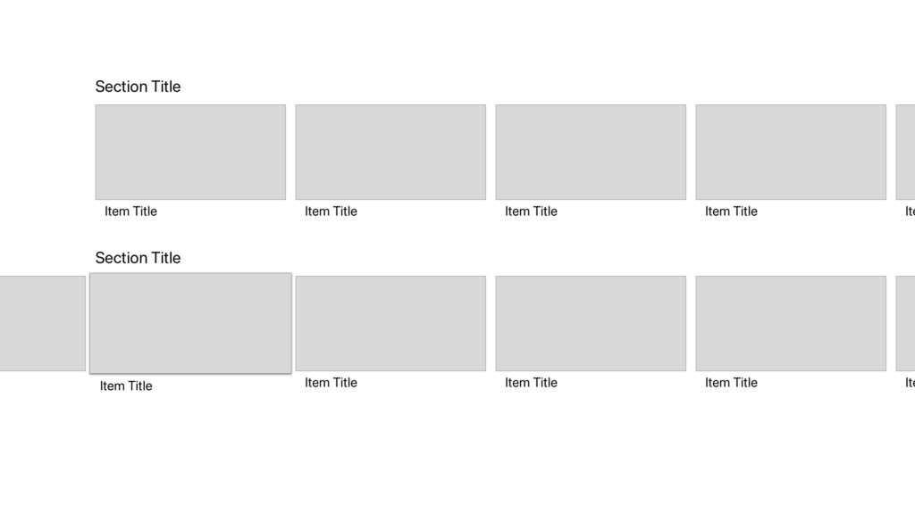
It’s a fairly common pattern in tvOS apps to have a carousel of items that scrolls off screen in either direction – something vaguely like this:

Actually implementing this in SwiftUI seems like it’d be easy to do at first:
VStack {
	Text("Section Title")
	ScrollView(.horizontal) {
		HStack {
			ForEach(items) {
				ItemCell(item: $0)
			}
		}
	}
}
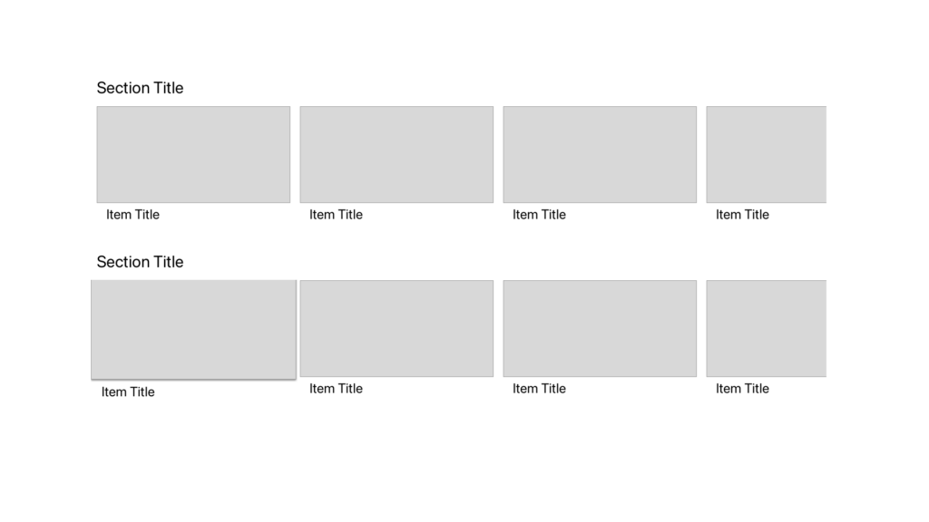
Which gets you… a reasonable amount of the way there, but misses something: ScrollView clips the contents, and you wind up looking like this:

Not ideal. So, what’s the fix? Padding! Padding, and ignoring safe areas.
VStack {
	Text("Section Title").padding(.horizontal, 64)
	ScrollView(.horizontal) {
		HStack {
			ForEach(items) {
				ItemCell(item: $0)
			}
		}
			.padding(64) // allows space for 'hover' effect
			.padding(.horizontal, 128)
	}
		.padding(-64)
}
	.edgesIgnoringSafeArea(.horizontal)
The edgesIgnoringSafeArea allows the ScrollView to expand out to the actual edges of the screen, instead of staying within the (generous) safe areas of tvOS.1
That done, we put the horizontal padding back in on the contents themselves, so that land roughly where we want them. (I’m using 128 as a guess; your numbers may vary, based on the design spec; if you want it to look like The Default, you can read pull the safe area insets off UIWindow.)
Finally, we balance padding on the HStack with negative padding on the ScrollView; this provides enough space for the ‘lift’ (and drop shadow, if you’re using it) within the ScrollView, while keeping everything at the same visual size.