Categories
Development

Forms & Lists

If there’s one area where SwiftUI really shines, it’s forms and lists. I have one area of the app that’s meant as, at most, a fallback option for managing some data, and putting together that management interface took, oh, an hour? It was a breeze. Admittedly, it’s not the prettiest list I’ve ever made, but like I said: fallback option.
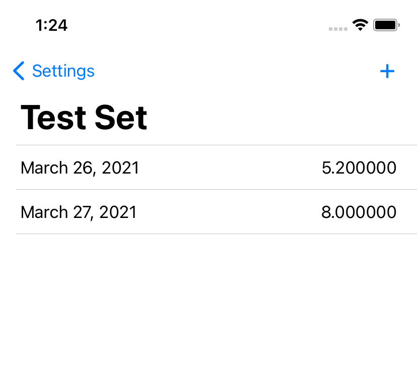
Screenshot of a list with a title, two items showing a date and value each, and an 'add' button.
Managing data points in a data set. Unpolished? Sure. Functional? Absolutely.
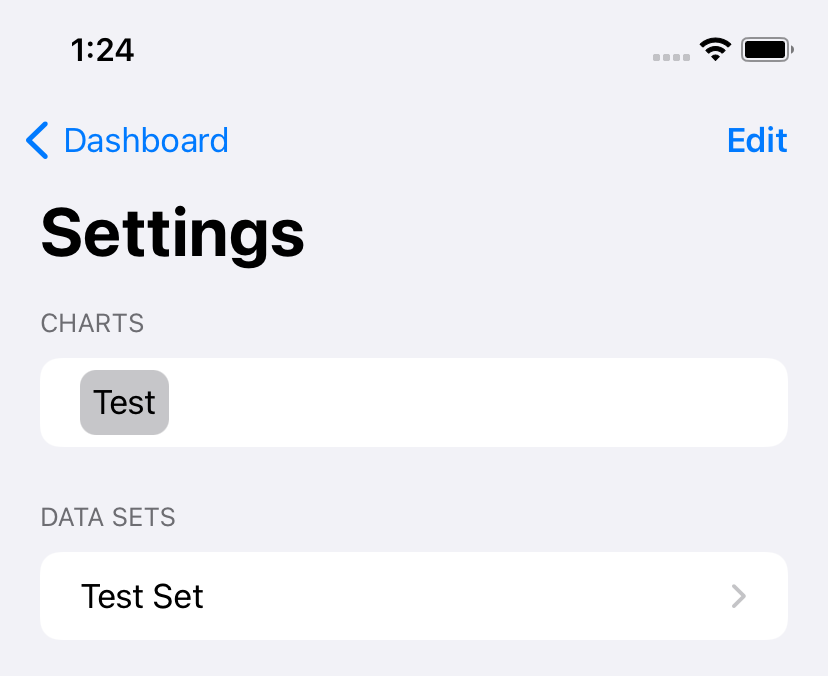
Screenshot of a Settings screen showing two lists, with an 'edit' button.

I was delighted to find that the automagic ‘edit’ button function handles multiple editable lists within the same View. As this is part of the ‘Settings’ screen, one of the three core screens in the app, it has received a bit more polish.

And I’ve continued to have fun building custom versions of the Picker control, with an expansion on my previous custom picker to support inline management of the above Data Sets and the addition of another one for picking a type of graph:
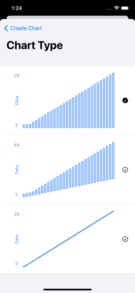
Screenshot of a picker showing three types of graphs.

At the moment, I’m showing a pretty basic dataset for these, but at some point I think I may create something a bit more visually interesting. The trick being, of course, that I can’t just random-number-generate the data, because I want all three to show the same data points, and since the user can also control the color, I want it to stay consistent if you leave, change the color, and come back.

(The solution here is probably to hard-code a data set, but where’s the fun in that?)
Categories
Development

File > New > Project…

I recently started working on a new development project. Or rather, a project I’ve been thinking about for a while, but just recently started developing – the first draft of the design is from almost a year ago, now, something that I worked on as a class project. But, mostly on a whim, I signed up for SwiftUI Jam, and took it as an excuse to start actually building the thing.

Now, normally my approach to projects is very Apple – refuse to admit I’m even working on something new until it’s complete, ready to present to the world. This time, though, the vague rules of the jam meant it had to be done at least somewhat in the open, and I figured I may as well do some proper write-ups as I go. Could be interesting.

I’m starting with… not the first thing I built, but the one that was the most fun so far. I’m doing the whole app in SwiftUI, and it really shines for building forms.

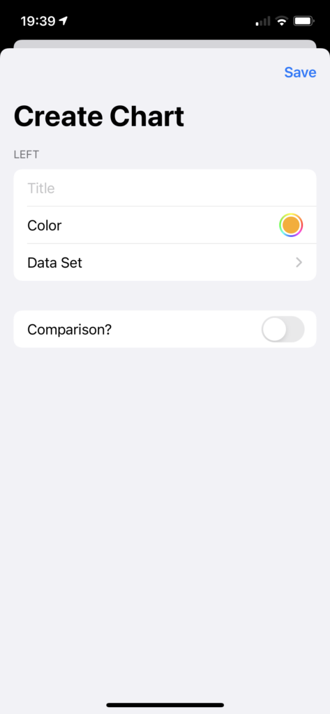
Screenshot of an iOS application showing a form: Title, Color, and Data Set; Comparison? is set to false.
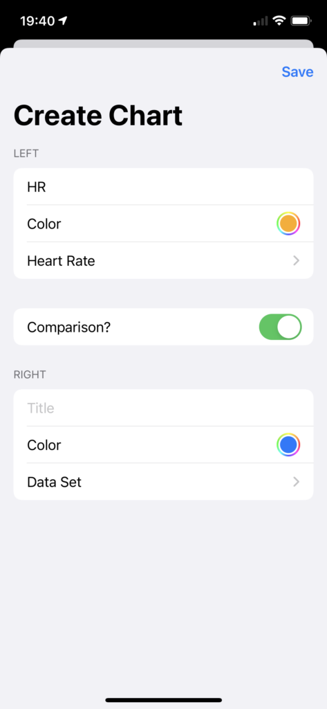
Screenshot of an iOS application showing a form: Title, Color, and Data Set; Comparison? is set to true. The first three questions are repeated.
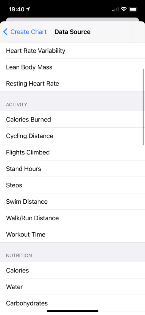
Screenshot of an iOS application showing a list to choose from, with groupings such as Activity featuring items like Calories Burned and Cycling Distance.

As I said, a fairly simple form – Title, Color, and Data Set, with the option to add a second of the same three items. The Data Set picker is a custom version of a Picker, because I wanted to give the options in a grouped list rather than just alphabetical order.

I suspect I’m going to be building a second custom Picker implementation sometime soon – this time, choosing from more visual options. Should be fun to put together.