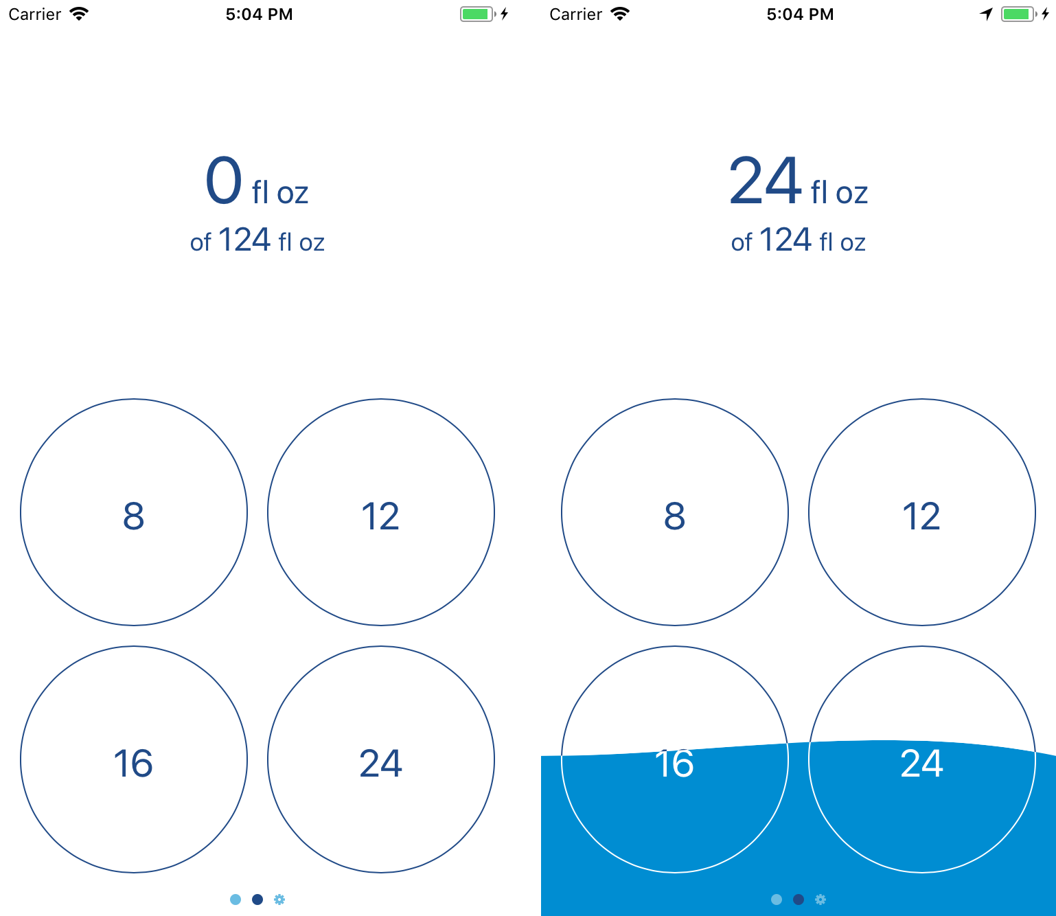
I made an app! I’m quite excited about it; this is, after all, the sort of thing I want to spend my career doing.

The app is called Fluidics, and it’s for tracking the amount of water you drink. As I mentioned a while back, I like to do a lot of tracking of what I’m eating and how much I’m drinking. That first part wasn’t too hard; there’s a variety of apps on the App Store for logging food, and after a while I was able to find one that wasn’t too bad.1 For water, though, nothing quite worked – Workflow came closest, but using it to do the sort of goal calculations I wanted was on the line between clunky and painful, and it’s such a general-purpose app that it felt visually lacking.
Eventually I remembered that I’m a computer science major, and why am I sitting around complaining about the dearth of options when I’ve basically got a degree in making the dang thing. Months of sketching, programming, swearing, and repeating the whole thing eventually lead to this: what I hope is the easiest water-tracking app on the App Store to use.
It’s been a fascinating process. (Here, by the way, is where I’m going to take advantage of the fact that this is my blog for rambling and start talking about what it was like making it; if you’d like to get more information on the app, I’ve put together a rudimentary website, or you can skip straight to the ‘it’s free on the App Store’ part and give it a whirl.) As it turns out, there’s a whole lot of work involved in making an app; my original sketch was the widget and two screens. Those came together pretty quickly, but I realized that probably nobody would feel comfortable using an app if the first time they opened it it just threw up a message saying “trust me!” and then asked for a bunch of health information, so I wrote up a privacy policy and started building an onboarding flow. Which then ballooned in complexity; looking at the design files, more than half of the app is screens for dealing with something having gone wrong.2
One of the most interesting debates I had with myself during the whole process was deciding what business model to use.3 The App Store has had an unfortunate tendency to be a race to the bottom; while there’s a bit of a market for pro apps, a minimalistic water-tracking app doesn’t fit into that category. There’s also no argument to be made for a subscription, so I’d narrowed it down to ‘free, because I’m turning it in as the capstone project for my computer science major’, ‘free with ads’, or ‘paid up-front’. The first one was the one I was most comfortable with; sure, ‘paid up-front’ would be nice, but I’d also get approximately zero people to download it what with all the free competitors out there. ‘Free with ads’ feels deeply gross, both because I hate online advertising in general, and because I’m doing a lot with health data, and I really don’t want to have any chance of that getting stolen. For a while, I thought it was going to be ‘free forever’, and I’d be justifying it as ‘building a portfolio’.
That wasn’t what I actually settled on, however; instead, I’m going with ‘free with in-app purchase.’ Instead of building in a paywall and locking some features behind it, though, I decided I’d go simpler; the app and all of its features are free. Starting in version 1.1, there’ll be a button in the Settings; a little tip jar.4 I probably won’t make much, but I’ll feel better about it overall, and what’s the harm?
Beyond that debate, most of the challenge of the project as a whole was just building it. I knew going in what I wanted it to look like; what I didn’t know was how to go about doing that. The way the background overlaps the text? That alone took a week of trying different things to get working right.5 A few things I wanted to include in the first version didn’t make it – the widget was originally going to be entirely different, but the way Apple has done the security on health data makes the original design significantly more difficult to do, so I switched it to the current design.6
It was definitely a learning experience, too – I’d done some iOS application design for classes before, but never gone all-in on making something that would be both functional and enjoyable for the end user. If you’re releasing something on the App Store, you can’t just include a note that says “on first run, it’ll ask for a bunch of permissions; just say yes” because nobody will read that. And getting something uploaded to the App Store is itself a whole process – the App Store page doesn’t fill itself out, after all, and copywriting definitely isn’t my strongest suit.7
But it’s done; I’ve made an app and released it to the world. 8 By the time you’re reading this, it should be available on the App Store; as I mentioned, it’s free to download, and I’d love it if you’d give it a try.
- That said, I’m also doing some design sketches for my own entry into the field; don’t get your hopes up, I make no promises. ↩
- I’m not talking “my code is full of bugs and something crashed” went wrong, either; it’s all “the user originally gave permission to do something, but then changed their mind and used the Health app to take it away” and other such nonsense. Computers may be finite-state machines, but “eleventy hojillion” is still a finite number. ↩
- I also talked about this a lot with my friend Chase, without whom I would’ve long ago given up on technology and disappeared into the woods to be a Bigfoot impersonator.. ↩
- Yes, I know, I’m just now releasing version 1.0, and I’m already mentioning plans for 1.1. Don’t worry, I’ve got versions 1.2 and 1.3 mapped out, feature-wise, as well, and have some rough ideas for 1.4. ↩
- For a while I thought I was going to have to write code to draw the numbers ‘by hand’; fortunately, I was able to get the drawing to work by taking advantage of layer masks, but good lord are the Interface Builder files a mess as a result. Behind The Scenes, everybody! ↩
- I do still want to get the original design working, probably as an option in the Settings page of the app; a future version is going to add watchOS support, and I believe that a lot of the work I’ll have to do for that will also apply to making the widget work like I intended, so those two will either be the same or subsequent updates. ↩
- Another shoutout to Chase, who wrote the App Store description and turned my pile of 100 disjointed screenshots into the four that’re currently on display. ↩
- Well, “done”; it’s functional and available to the public, but software, as the saying goes, is never finished, only abandoned. I’ve no plans to abandon this project anytime soon; I use it myself several times a day, so I’m pretty invested in keeping it working and making it better. ↩
