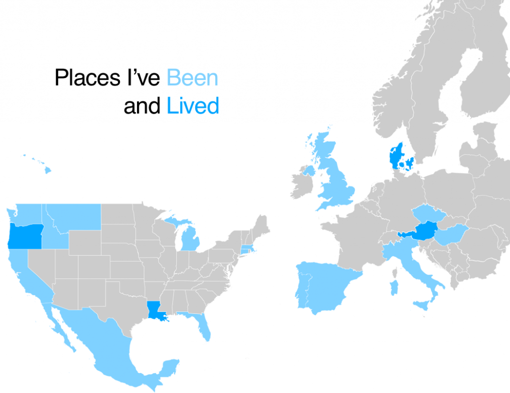
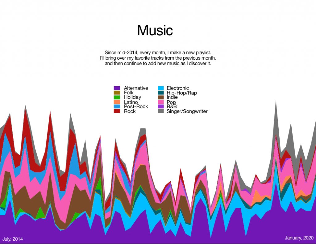
A quick post of a class assignment we did a while back – tinkering with data visualization. I went with my travels and my playlists as the data sources.


A quick post of a class assignment we did a while back – tinkering with data visualization. I went with my travels and my playlists as the data sources.

