Categories
Technology

How to get a sysdiagnose on iOS 14

Every time I go to file a bug report Feedback with Apple, I have to remember how to gather a sysdiagnose; on macOS, the whole diagnostic process is automatic in the Feedback app, and if you have Feedback installed on iOS, it is there too. I, however, make things difficult on myself, and use Feedback on macOS to submit my iOS bugs.

A sysdiagnose, for those wondering, is a big bundle of diagnostic information that Apple (or the developer of an iOS app) can use to figure out what exactly went wrong when something didn’t work right on your device.

Since Apple’s documentation on how to gather a sysdiagnose leaves out a few key steps (FB8739343, if anyone at Apple is paying attention to this), I figured I’d write up the process for myself for future reference.

Without further ado, here’s how to gather a sysdiagnose on an iPhone X-class device. (Read: ‘no home button’)

  1. Press the volume up, volume down, and lock buttons all at once, and hold them for ~1 second. You’ll feel a little haptic buzz; your phone might also take a screenshot.
  2. Wait. Apple recommends about 10 minutes for iOS to gather everything.
  3. Open Settings and go to Privacy > Analytics & Improvements > Analytics Data
  4. Scroll through the list until you see a file whose name starts with “sysdiagnose_” and then the current date. (Protip: this list is super long, so once you’ve started scrolling, you can tap and drag on the little scroll blob on the right side of the screen to zoom through hit much faster.)
  5. Tap on the file, hit share, and AirDrop it to your Mac. (Or save it to iCloud, but I heartily do not recommend trying to email or send it via iMessage – it’s probably like a quarter of a gigabyte.)

Hopefully this helps you, and as someone who has to try to figure out why software isn’t working right, thank you for taking the time to get all the diagnostic information – it’s very helpful.
Categories
App

Fluidics 2.1

I’ve just released Fluidics 2.1 on the App Store, only five months after the last update, so I’m speeding up a bit on my release cycle, apparently. If you’d like to see the whole “what’s new” list, check out the release post over on the Fluidics site; this post is more of a “making of” kind of thing.

Unlike the last update, this wasn’t a ground-up rewrite. I briefly considered tearing out the App/SceneDelegate stuff and rewriting it to use the new SwiftUI-style App setup, but because there were some visual bugs with the release of iOS 14, I wanted to get the update out sooner rather than later.

This version requires iOS 14 – the previous version has no issues on iOS 13, and just about everything new in 2.1 requires iOS 14, so I went ahead and bumped the minimum version.

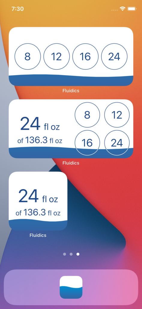
Screenshot showing all three of the new widget styles in Fluidics 2.1

The main addition in Fluidics 2.1 is the new widgets, available with three variants.

From the top:

  • The ‘add’ widget, which displays the four Quick Adds, and allows one-tap logging from the home screen.
  • The ‘status’ widget, in wide form – my personal favorite – which displays the goal, not only in the fill state of the widget background, but also in text form, as well as the four quick adds.
  • The ‘status’ widget, in small form, displaying just the goal in text form.

All of the widgets allow launching the app, and use deep links to interact with it in specific ways.

The linking format is technically open, so I can drop a link into this post that would open the app and log water. It accepts a handful of URLs:

  • fluidics://fluidics.app/quickAdd
  • fluidics://fluidics.app/customAdd
  • fluidics://fluidics.app/add/:unit/:amount, where :unit is one of “flOz“, “l“, or “ml“, and :amount is a parsable number.

(Creating that linking framework was the spot where I was most tempted to drop SceneDelegate entirely – the Scene class’ onOpenURL(perform:) modifier was looking real nice compared to the tangle I wound up with in the SceneDelegate. Oh well, maybe for next update.)

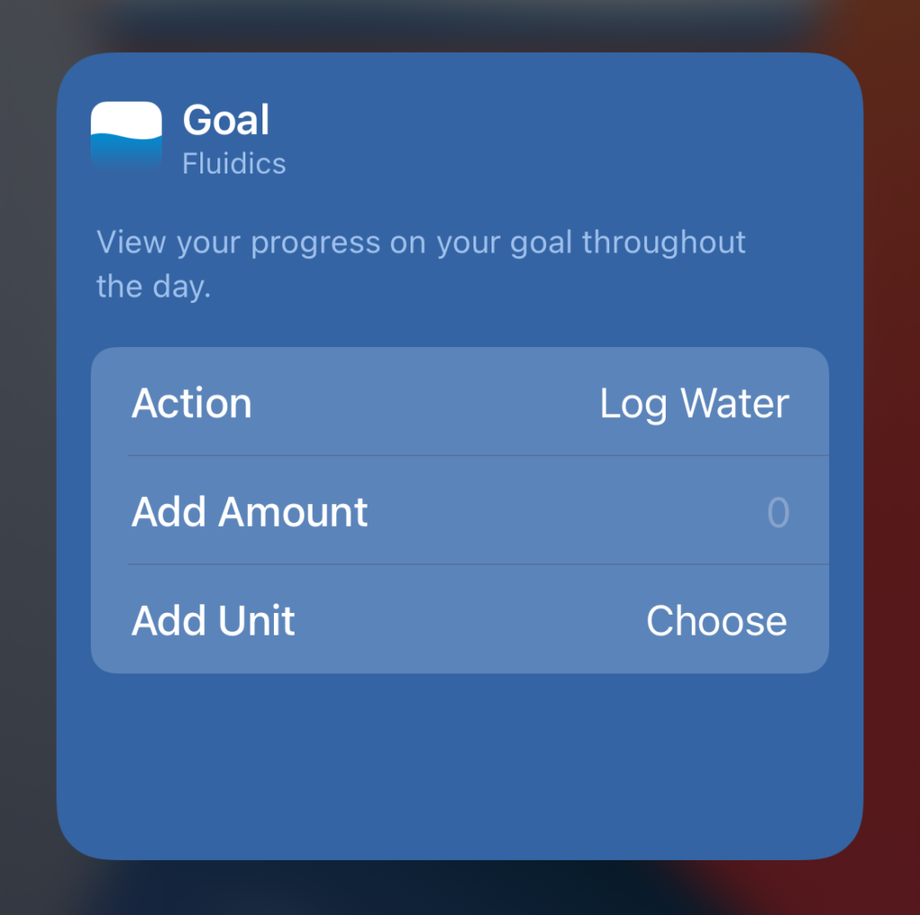
One of the fun things to set up was the customizability of the widgets. I’ve bounced off the IntentKit framework in the past, but never got very far due to time constraints. With widgets being driven off Intents as well, though, it was time to sit down and actually write it up.

Screenshot of the widget editor.

Honestly, the Intent definition editor is cool. I could go off on a whole mini-essay about the usefulness of constraints in design, and how perfectly it expresses the constraints of valid inputs and configurations, but I digress.

Having done that bit of setup, I’m definitely going to look more at this in the future. I’m still trying to figure out what, exactly, a SiriKit integration for Fluidics should look like; once I’ve done that design work, though, the coding aspect is seeming much more manageable now.

The last little feature I added was the ability for Pro users to switch the icon. It felt like the right kind of thing to lock behind the Pro subscription – a purely cosmetic tweak, and an additive change. Actually implementing it in SwiftUI was fun – it’s a Picker, attached to a custom Binding. I should probably refactor it a bit for readability, but the actual implementation is pretty solid, and I’m happy about it. It also allows for further expansion in the future – I can add new icon choices pretty easily, going forward, and may do so if I have any fun ideas for what to offer there. And yes, I’m open to suggestions.

So, the new release is live on the App Store, and I encourage you to check it out. The app remains free to use. If you’d like a more marketing-speak-y overview of what’s new, you can check out the release post.