Categories
Technology

WWDC21

I’m writing this a bit after WWDC has ended, and publishing it a bit further after that, so pardon the tardiness as I share my thoughts, in no particular order:

  • As a user, I am quite excited by the new functionality in FaceTime, and the new Focus system for managing notifications. The system of tiered notifications looks great, and I’m excited for the, oh, 15 minutes most people will have between ‘installing iOS 15’ and ‘an app first abusing the notification level to send them spam.’1 In iOS 16, can we get a “report notification as spam” button that immediately flags the app for App Review to yell at?
  • As both a developer and user, I was immensely excited to see the ManagedSettings and ManagedSettingsUI frameworks – I really like the concept of Screen Time for externalized self-control, and being able to use custom implementations or build my own seemed like a dream.2 Unfortunately, all those dreams were immediately crushed by the reveal that this all requires FamilyControls, so not only can I not do anything interesting with it as a developer, I can’t even use it myself. Because, as we all know, the only use case for “my phone won’t let me use it to waste time” is “parents managing their children.”
  • Swift’s implementation of async/await looks great, and the stuff Apple’s doing with @MainActor seems to have met the goal of “the language eliminates an entire class of error” that initially gave us optionals, so I’m quite happy about that. I hope Vapor updates to async/await soon, I’d love to untangle some of my flatMap chains.
  • The new Human Interface Guidelines section on Inclusion is very well-written and hits on some important points.
  • I am incredibly excited about the virtual KVM thing coming to macOS and iPadOS – my desk setup features two monitors for macOS, and an iPad perpetually on the side, and the idea of being able to control the iPad without taking my hands off the main keyboard and mouse is very exciting.3
  • Safari on iOS got support for web extensions, which is neat. I also like that they’re pulling things down toward the bottom of the screen, should be more reachable.
  • Safari on macOS might finally do something that Mozilla never managed to do: convince me to switch to Firefox. I sincerely hope this is the peak of “aesthetics over functionality” in Apple’s design, and that it gets better from here, because this is a mess: lower contrast text, the core UI element moves around all the time so you can’t have any muscle memory, and they’ve buried every single button behind a ‘more’ menu.
  • SwiftUI got lots of little updates, but the thing that I may be most excited about is the simple quality of life improvements as a result of SE-299.listStyle(.insetGrouped) is much easier to type than .listStyle(InsetGroupedListStyle()), especially considering that Xcode can actually suggest .insetGrouped.
  1. In my case, it’ll probably be a couple days, and then Apple Music will punch through a Focus mode to notify me that Billie Eilish has a new single or something.
  2. I already have a name for the app I want to build using these API. My first feature would just be “the existing Screen Time system, but it actually knows how time works.” Something like 90% of the time that I hit ‘one more minute’ I’m instead given a couple seconds. Apple, I know that time is hard, but it isn’t that hard.
  3. Why the iPad? Because iPadOS is sandboxed, which limits the sort of bugs that Teams can introduce and evil that Zoom can. Sure, they both have macOS apps – but you shouldn’t install either of them.
Categories
Review

“Becoming Steve Jobs”

Brent Schlender, Rick Tetzeli

Moving backwards, there were three things about this book that really captured my attention.

Lastly, the discussion of what Steve Jobs was like when he wasn’t being… what everyone thinks of when they think of Steve Jobs. The authors reiterate, many times, that the image of Jobs as alternating between ‘a genius’ and ‘an asshole’ was formed when he was very young, skyrocketing to fame at the helm of Apple. Later in life, he’d softened, become better able to have constructive discussions with people instead of just tearing into them – but, to the detriment of his public image, he’d also gotten very good at keeping out of the public eye when he wasn’t being Steve Jobs On Stage. Nobody was really afforded the chance to publicize that newer version of Steve Jobs.

Secondly, I’d never realized how integral to Pixar he was. At most, I knew he’d been involved in the company, led it for a while at some point; I hadn’t realized that he was the owner, one of the original people who built the company out of an immense talent pool bought wholesale from LucasArts. My mental timeline of Steve Jobs, betraying my tech industry bias, went Apple-NeXT-Apple. Pixar was an immense thing to miss out on, and realizing how much he’d shaped both Pixar and, eventually, Disney has me even more respecting the impact Jobs has had on our society.

And firstly, I found myself, over and over, contemplating the scale of technological change that happened within the lifetime of the company he and Wozniak founded. I think about these comparisons a lot, so here’s some of my favorites:

  • A single AirPod has more onboard processing power than any given Apollo launch.
  • Every Apple Watch, even the glacially slow Series 0, has had more processing power than a Cray-2.1
  • You can fit the entirety of the original version of MS-DOS in the L1 cache of a single core of a modern i9.2
  • I’d have to do a lot more math than I feel like doing to confirm this, but it’s not unreasonable to say that the iPad Pro I’m writing this on probably packs more computing power than every Apple II ever sold, combined.

And, even more than all those “ooh, it can do lots of math even faster” comparisons, the thing that kept striking me – reading this, as I was, on an iPad Pro – was just the staggering technological capacity of everything I do with this device. It’s a multitouch touch screen, with a battery of onboard radios, enough storage space for every book ever written; it’s got a lovely keyboard and stylus, both of which attach using only magnets. This device is a miracle of modern technology, and I’ve gotten very used to it. Reading about the Altair 8800, with its toggle switches and LEDs, gave me just enough decontextualization to look at this magical slab of glass and think, wow. Wow.

After reading this book, I think that sort of moment is something Steve Jobs would’ve loved to see.

All in all, I really enjoyed the book, and I highly recommend it. It was nice to see a more balanced look into Jobs’ life, a more human side of the man who so indelibly shaped the modern world. Give it a read.

  1. Surprisingly difficult to validate this comparison to my own satisfaction – the Cray-2 was in the era of “here’s how many FLOPS this baby can do,” but these days it’s just “what’s the GeekBench score?” and there’s no direct comparison between the two.
  2. I couldn’t find the actual size-on-disk of the original MS-DOS release, but based on the limitations of the file system, I can reasonably assume it’d fit.
Categories
Technology

How to get a sysdiagnose on iOS 14

Every time I go to file a bug report Feedback with Apple, I have to remember how to gather a sysdiagnose; on macOS, the whole diagnostic process is automatic in the Feedback app, and if you have Feedback installed on iOS, it is there too. I, however, make things difficult on myself, and use Feedback on macOS to submit my iOS bugs.

A sysdiagnose, for those wondering, is a big bundle of diagnostic information that Apple (or the developer of an iOS app) can use to figure out what exactly went wrong when something didn’t work right on your device.

Since Apple’s documentation on how to gather a sysdiagnose leaves out a few key steps (FB8739343, if anyone at Apple is paying attention to this), I figured I’d write up the process for myself for future reference.

Without further ado, here’s how to gather a sysdiagnose on an iPhone X-class device. (Read: ‘no home button’)

  1. Press the volume up, volume down, and lock buttons all at once, and hold them for ~1 second. You’ll feel a little haptic buzz; your phone might also take a screenshot.
  2. Wait. Apple recommends about 10 minutes for iOS to gather everything.
  3. Open Settings and go to Privacy > Analytics & Improvements > Analytics Data
  4. Scroll through the list until you see a file whose name starts with “sysdiagnose_” and then the current date. (Protip: this list is super long, so once you’ve started scrolling, you can tap and drag on the little scroll blob on the right side of the screen to zoom through hit much faster.)
  5. Tap on the file, hit share, and AirDrop it to your Mac. (Or save it to iCloud, but I heartily do not recommend trying to email or send it via iMessage – it’s probably like a quarter of a gigabyte.)

Hopefully this helps you, and as someone who has to try to figure out why software isn’t working right, thank you for taking the time to get all the diagnostic information – it’s very helpful.

Categories
Education Portfolio Technology

Swift Student Challenge

A few days ago, Apple announced the winners of their Swift Student Challenge. I had applied and used my “taking a test” tactic, which was to hit ‘submit’ and then promptly erase the whole thing from my brain. (What’s done is done, and I feel silly worrying about something I have no control over.)

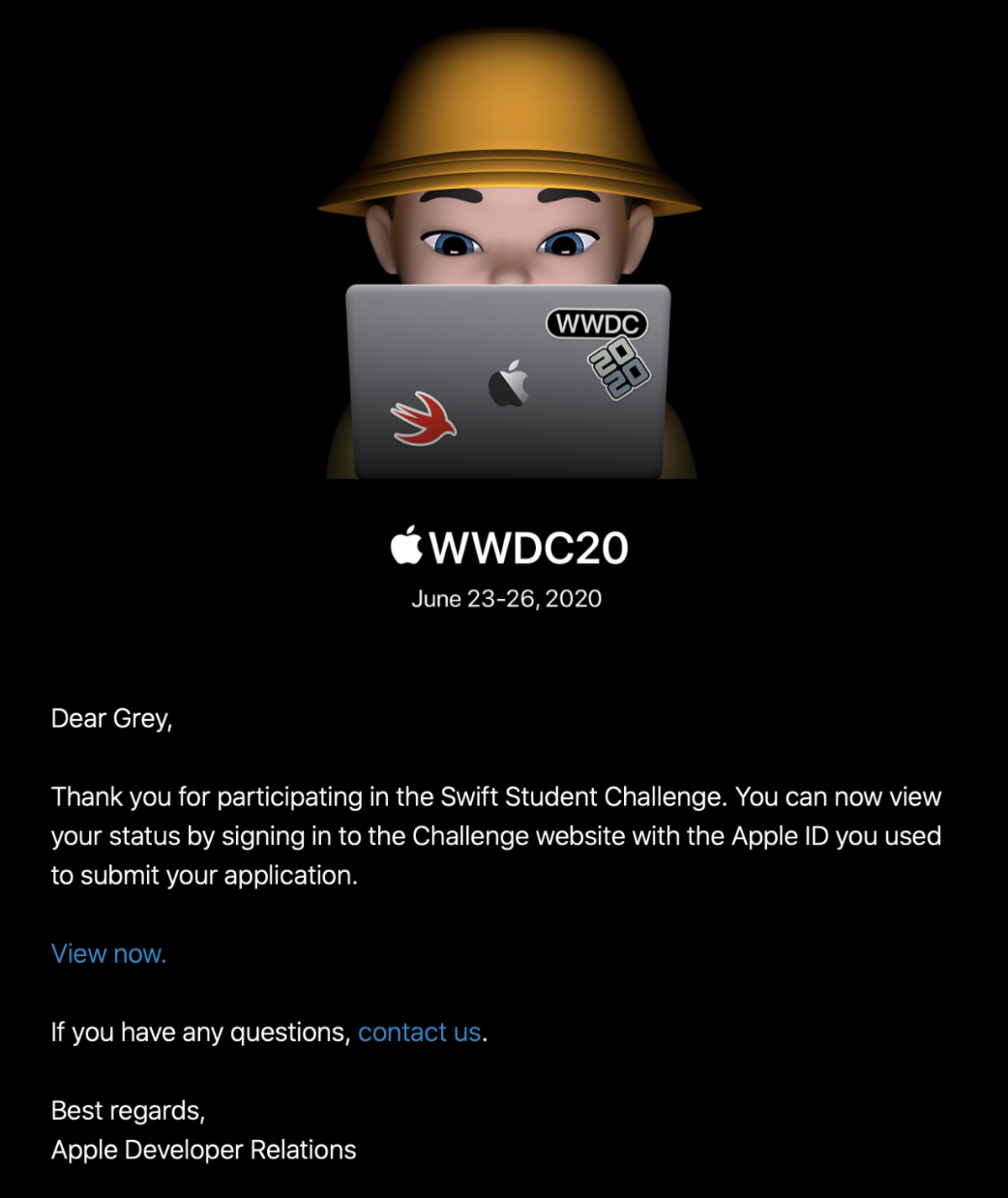
So when I got the email that “my status was updated” it was a bit of a surprise.

And when I clicked through the link (because, of course, they can’t just say in the email, you have to sign in) I was in for more of a surprise.

My submission had been accepted. I’m one of 350 students around the world whose work sufficiently impressed the judges at Apple.

Screenshot from Apple Developer website. It reads: Congratulations! Your submission has been selected for a WWDC20 Swift Student Challenge award. You'll receive an exclusive WWDC20 jacket and pin set at the mailing address you provided on your submission form. You'll also be able to download pre-release software, request lab appointments, and connect with Apple engineers over WWDC20 content on the forums. In addition, one year of individual membership in the Apple Developer Program will be assigned free of charge to eligible accounts of recipients who have reached the age of majority in their region. For details, see the WWDC20 Swift Student Challenge Terms and Conditions.
Neat!

Now, throughout the whole process of applying, I was my usual secretive self. I think two people knew that I was applying at all, much less what I was working on. Since it’s over with, though, it’s time for the unveiling.

What I made

I wanted to bring back a concept I’ve played with before: cellular automata. A few days before the competition was announced, I’d seen a video that really caught my interest.

Well hey, I thought, I’ve got some code for running cellular automata. I want to learn Swift Playgrounds. And I’ve been having fun with SwiftUI. Let’s combine those things, shall we?

The first big change was a visual history; when a cell dies, I don’t want it to just go out, I want it to fade slowly, leaving behind a trail of where the automata have spread.

The second was rewriting all the visuals in SwiftUI, which was a fun project. Animation timings took me a bit to get right, as did figuring out how to do an automated ‘update n times a second’ in Combine. The biggest issue I had, actually, was performance – I had to do some fun little tricks to get it to run smoothly. (Note the .drawingGroup() here – that made a big difference.)

And third, I didn’t want it to just be “here’s some code, look how pretty,” I wanted to actually use the Playground format to show some cool stuff. This turned out to be the most frustrating part of the whole thing – the Swift Playgrounds app doesn’t actually support creating a PlaygroundBook, and the Xcode template wasn’t supported in the then-current version of Xcode.

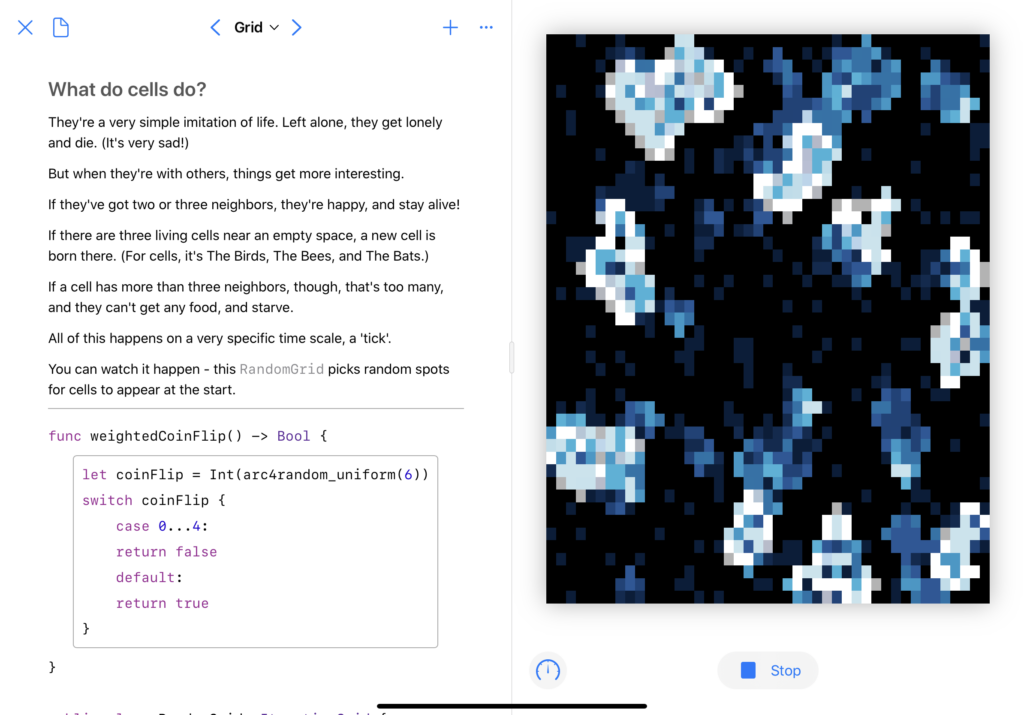
But the end result? Oh, I’m quite happy with it. PlaygroundBooks are cool once you get past how un-documented they are. You can, to borrow a Jupyter turn of phrase, mix code and prose in a lovely, interactive way.

Screenshot of the 'Grid' page of the playground book.  The full text is at https://github.com/grey280/SwiftLife/blob/master/Swift%20Student%20Submission.playgroundbook/Contents/Chapters/Chapter1.playgroundchapter/Pages/Grid.playgroundpage/main.swift
Don’t worry, the real version (and some videos) are below.

Doing the actual writing was pretty fun. This is a concept I’ve spent a lot of time learning about, just because it captured my interest, and I wanted to share that in a fun way.

Overall, I’m quite happy with the result. If you’d like to see more, I’ve made recordings of the ‘randomized grid’ and ‘Wolfram rule’ pages running, and the actual playground is available on GitHub.

Categories
Review

“The One Device,” or, “I’m amazed this man didn’t get arrested”

Brian Merchant
It’s rather fitting that I’m writing this review on my iPhone. Parts of the book were written on an iPhone, I suspect, and the author mentioned that a good deal of the interview recordings and photos were made on his iPhone.
Structurally, the book is interesting — there are two through lines, and they’ve got the same writing style but different feels. The more story-like one is the historical aspect, going from the beginning of the project through to the keynote where Steve Jobs introduced the world to the iPhone. And it’s a story, for sure: there’s a narrative to it, characters being introduced, politics and inventions, failures and triumphs. It’s the best telling of the story I’ve read so far, though admittedly I don’t think I’ve actually sat down to read the full story before.1
The other part is more of the ‘now’ aspect, which explores the impact of the iPhone as a product, focusing on the manufacturing process. The author tells how he… made his way into the Foxconn plant where iPhones are assembled; predictably gets hacked immediately after arriving at a hacker convention; goes on a claustrophobic tour of a tin mine; under-details an agoraphobic tour of the salt flats that produce most of the lithium used in the iPhone’s battery; and a few other stops along the way.
All told, it’s an interesting read. Some of the historical context was new to me—the history of ARM was inspiring, for example—and while I already knew a lot of things—photos of those lithium flats are pretty striking—I’m glad I took the time to read it. If you’re at all interested in the history, I can recommend the book.


  1. Creative Selection is on my list to read, so I’ll get there eventually. 
Categories
Programming

SwiftUI’s Picker

I’m very excited about SwiftUI, and have been using what little free time I have to do some tinkering with it. I started during the beta period, which was fun in between being very frustrating; a lovely side effect was that some of the knowledge I picked up is… entirely wrong. One that caught me was the implementation details for the Picker type.
Based on the rather rough state of the SwiftUI documentation for Picker and ForEach,1 I’d assumed that combining the right binding with a .tag(_:) on the items would work:

Form {
    Picker(selection: $selectedItemID, label: Text("Choose Something") {
        ForEach(items){
            Text($0.label).tag($0.value)
        }
    }
    Text("You've selected item \(selectedItemID)!")
}

For reference, the models I’m referring to throughout are pretty simple:

struct CustomModel {
    let value: Int
    let label: String
}

Now this looks like it’s working in simple cases. However, I was trying to interact with a web API, so that items array looked something like this:

var items: CustomModel[] = [
    CustomModel(value: 7, label: "First"),
    CustomModel(value: 3, label: "Second"),
    CustomModel(value: 1, label: "Third")
]

If you tapped “Second” in the picker that SwiftUI generated, however, the text wouldn’t read “You’ve selected item 3!” like it should; it would be “You’ve selected item 1!”
A bit more tinkering revealed that, instead of pulling the value from the .tag(_:) on there, it was just using… the index in the ForEach.2
After some frustrated Googling, utterly despairing of Apple’s documentation, and a lot of StackOverflow searches, I finally figured out the solution:

Form {
    Picker(selection: $selectedItemID, label: Text("Choose Something") {
        ForEach(items, id: \.value){
            Text($0.label).tag($0.value)
        }
    }
    Text("You've selected item \(selectedItemID)!")
}

Quite frankly, I don’t have a good explanation of what’s going on here; last time I was tinkering with Pickers, the .tag(_:) provided SwiftUI with the information it needed to do the binding. (When I’ve got more time, I’d like to do another test — now that I’ve got the id keypath, do I even need the tag?)
I’d love a good explanation of what all the id keypath gets used for, and where else it might be necessary, but alas:


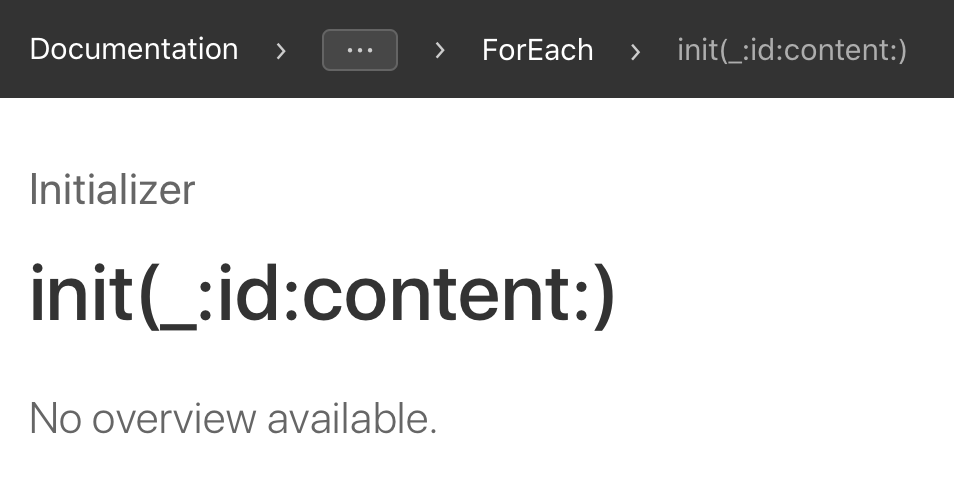
  1. It’s a bit unfair for me to link to No Overview Available when referring to SwiftUI; the coverage is low, but the problem isn’t so much that as the fact that ‘documentation coverage’ just doesn’t work as a metric for something like SwiftUI. The tutorials are a start, and a good sign that Apple was at least trying to rethink their approach to documentation, but they’re not nearly complete enough. 
  2. Zero-based index, of course, which seemed obvious to me, but got me a “???” response when I was complaining about this issue to a non-programmer friend. 
Categories
Technology

iOS Notification Routing

The other day I was thinking about the way iOS handles notifications; the new Do Not Disturb stuff in iOS 12 is a good start, but it’s still rather lacking. It’s a fun thought exercise: say you’re Jony Ive or whoever, and you’re setting out to redesign the way that notifications work, from a user standpoint.1 How do you make something that offers advanced users more power… but doesn’t confuse the heck out of the majority of your user base?
After a while dancing around the problem, I came to the conclusion that you don’t.23
Instead, imagine something more along the lines of Safari Content Blockers. By default, the existing system stays in place, but create an API that developers can use to implement notification routing, and allow users to download and install those applications as they so desire.4
Obviously, this would have some serious privacy implications — an app that can see all your notifications? But hey, we’re Jony Ive, and Apple has absolute control over the App Store. New policy: Notification routing apps can’t touch the network.5 And, to prevent any conflict of interest stuff, let’s just say that the routing apps aren’t allowed to post notifications at all.
Alright, we’ve hand-waved our way past deciding to do this, so let’s take a look at how to do it, shall we?
Let’s start with the way notifications currently work. From UNNotificationContent we can grab the properties of a notification:
[gist https://gist.github.com/grey280/f12f2abe57826f2b3efdc30cebc3d834 /]
For proper routing, we’ll probably want to know the app sending the notification, so let’s add the Bundle ID in there, and we’ll also give ourself a way to see if it’s a remote notification or local.
[gist https://gist.github.com/grey280/d60ea7481dd312bd6f4e7d6ad3e4ae4a /]
Alright, seems nice enough.6
Next up, what options do we want to have available?
1. Should the notification make a sound?7
2. Should the notification vibrate the phone?
3. Should the notification pop up an alert, banner, or not at all?
4. If the user has an Apple Watch, should the notification go to the Watch, or just the phone?
5. Should the notifications show up on the lock screen, or just notification center?
6. Finally, a new addition, borrowing a bit from Android: which group of notifications should the notification go into?8

Alright, that should be enough to work with, let’s write some code.
[gist https://gist.github.com/grey280/8dac8866a736c886a66079ff58b9d34b /]
Not a complex object, really, and still communicating a lot of information. I decided to make the ‘group’ aspect an optional string — define your own groupings as you’d like, and the system would put notifications together when the string matches; the string itself could be the notification heading.9
And with that designed, the actual routing could just be handled by a single function that an application provides:
[gist https://gist.github.com/grey280/309a5f459dc207542c4f98c27bcd0c2c /]
And with that, I’d be free to make my horrifying spaghetti-graph system for routing notifications, and the rest of the world could make actually sensible systems for it.
Thoughts? There’s a comment box below, I’d love feedback.


  1. I haven’t done much work with the UserNotification framework, so I’m not going to be commenting on that at all. 
  2. I spent a while mentally sketching out a graph-based system, somewhere between Shortcuts and the pseudo-cable-routing stuff out of Max/MSP, but realized pretty quickly that that’d be incredibly confusing to anyone other than me, and would also look very out of place in the Settings app. 
  3. As a side concept, imagine that but implemented in ARKit. “Now where did I put the input from Messages? Oh, shoot, it’s in the other room.” 
  4. Unlike Safari Content Blockers, though, I think this system would work best as a “select one” system, instead of “as many as you like, they work together!” thing. Mostly because the logistics of multiple routing engines put you back in the original mess of trying to design data-flow diagrams, and users don’t want to do that. Usually. 
  5. I’d call this less of an ‘App Store’ policy and more of a specific entitlement type; if you use the ‘NotificationRouting’ entitlement in your app, any attempt to access the network immediately kills the application. 
  6. Of course, those last two additions wouldn’t be things that you’d be able to set while building a UNNotificationContent object yourself, so perhaps we should be writing this as our own class; UNUserNotification perhaps? 
  7. We’ll assume that setting notification sounds is handled somewhere else in the system, not by our new routing setup. 
  8. This would be at a higher level than iOS 12’s new grouped notifications (the stacks), more like the notification channels in Android: categories like ‘Work’, ‘Family’, ‘Health’, and so on. 
  9. Since we’re Jony Ive, and everything has to be beautiful, we’re presumably running it through some sort of text normalization filter so people don’t have stuff going under the heading “WOrk” 
Categories
Collection

“Personalized Hey Siri”

Apple Machine Learning Journal:

In addition to the speaker vectors, we also store on the phone the “Hey Siri” portion of their corresponding utterance waveforms. When improved transforms are deployed via an over-the-air update, each user profile can then be rebuilt using the stored audio.

The most Apple-like way to continuously improve that I can think of. More interesting, though, is this bit later on:

The network is trained using the speech vector as an input and the corresponding 1-hot vector for each speaker as a target.

To date, ‘personalized Hey Siri’ has meant “the system is trained to recognize only one voice.” That quote, though, sounds like they’re working on multiple-user support; which, with the HomePod, they really should be.

Categories
Technology

Tidbits from Apple’s Machine Learning Journal

A short while ago, Apple launched a journal on machine learning; the general consensus on why they did it is that AI researchers want their work to be public, although as some have pointed out, the articles don’t have a byline. Still, getting the work out at all, even if unattributed, is an improvement over their normal secrecy.
They’ve recently published a few new articles, and I figured I’d grab some interesting tidbits to share.
In one, they talked about their use of deep neural networks to power the speech recognition used by Siri; in expanding to new languages, they’ve been able to decrease training time by transferring over the trained networks from existing language recognition systems to new languages.1 Probably my favorite part, though, is this throwaway line:

While we wondered about the role of the linguistic relationship between the source language and the target language, we were unable to draw conclusions.

I’d love to see an entire paper exploring that; hopefully that’ll show up eventually. You can read the full article here.
Another discusses the reverse – the use of machine learning technology for audio synthesis, specifically the voices of Siri. Google has done something similar,2 but as Apple mentions, it’s pretty computationally expensive to do it that way, and they can’t exactly roll out a version of Siri that burns through 2% of your iPhone’s battery every time it has to talk. So, rather than generate the entirety of the audio on-device, the Apple team went with a hybrid approach – traditional speech synthesis, based on playing back chunks of audio recordings, but using machine learning techniques to better select which chunks to play based, basically, on how good they’ll sound when they’re stitched together. The end of the article includes a table of audio samples comparing the Siri voices in iOS 9, 10, and 11, it’s a cool little example to play with.
The last of the three new articles discusses the method by which Siri (or the dictation system) knows to change “twenty seventeen” into “2017,” and the various other differences between spoken and written forms of languages. It’s an interesting look under the hood of some of iOS’ technology, but mostly it just made me wonder about the labelling system that powers the ‘tap a date in a text message to create a calendar event’ type stuff – that part, specifically, is fairly easy pattern recognition, but the system also does a remarkable job of tagging artist names3 and other things. The names of musical groups is a bigger problem, but the one that I wonder about the workings of is map lookups – I noticed recently that the names of local restaurants were being linked to their Maps info sheet, and that has to be doing some kind of on-device search, because I doubt Apple has a master list of every restaurant in the world that’s getting loaded onto every iOS device.
As a whole, it’s very cool to see Apple publishing some of their internal research, especially considering that all three of these were about technologies they’re actually using.


  1. The part in question was specific to narrowband audio, what you get via bluetooth rather than from the device’s onboard microphones, but as they mention, it’s harder to get sample data for bluetooth microphones than for iPhone microphones. 
  2. Entertainingly, the Google post is much better designed than the Apple one; Apple’s is good-looking for a scientific journal article, but Google’s includes some nice animated demonstrations of what they’re talking about that makes it more accessible to the general public. 
  3. Which it opens, oh-so-helpfully, in Apple Music, rather than iTunes these days. 
Categories
Collection

WWDC Wishlists

Six Colors pretty well covered what I’d like to see in the next version of macOS:1

I’d like to see an entirely new and simplified version of iTunes for Mac, perhaps multiple apps. iTunes can become the hub for Apple’s media sales, as it is on iOS. A new Music app will need to support Apple Music as well as local music files. And as for syncing, updating and configuring iOS devices, let’s move all of that to a new iOS Sync app that’s completely separate. Break up the iTunes monopoly—it’s way past time.


  1. I’m still not sure if I like ‘macOS’ or ‘MacOS’ better, but ‘OS X’ just doesn’t feel right anymore. It’s been around as a brand for too long. Plus, now that Windows 10 is out, there’s room for verbal confusion- did they mean ‘OS X’ or ‘O.S. 10’?