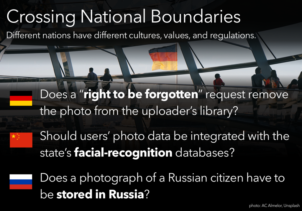
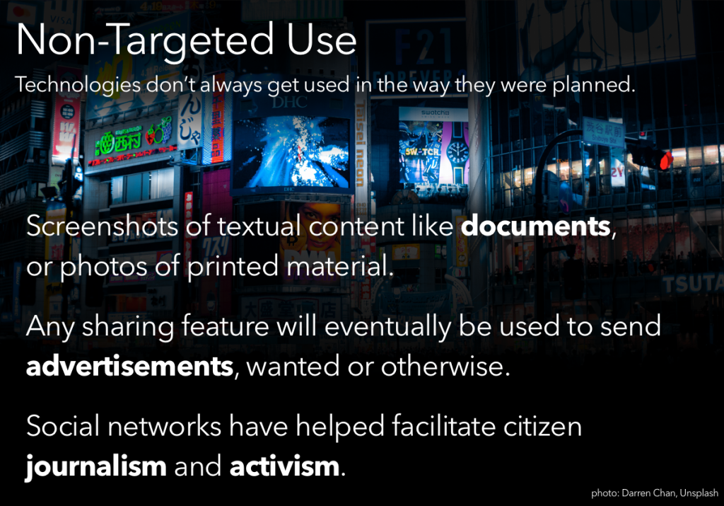
Based on a reading from User Friendly.

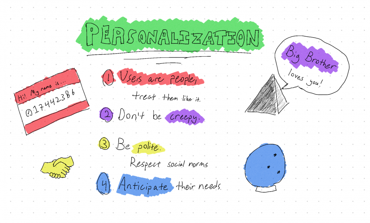
Based on a reading from User Friendly.


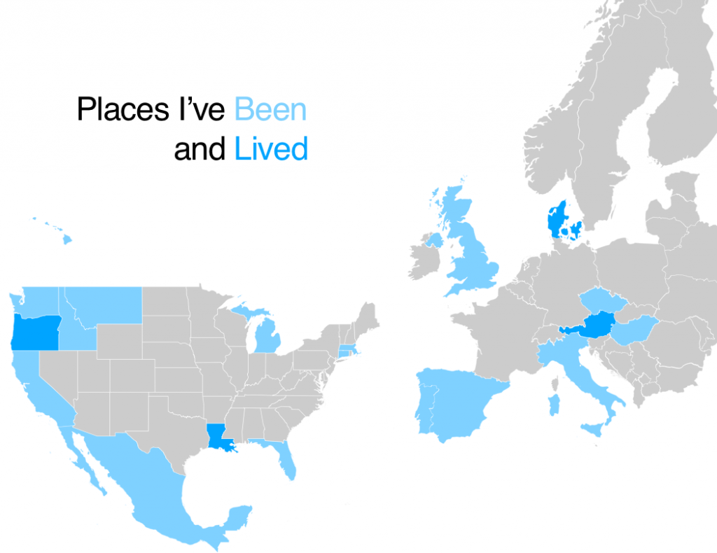
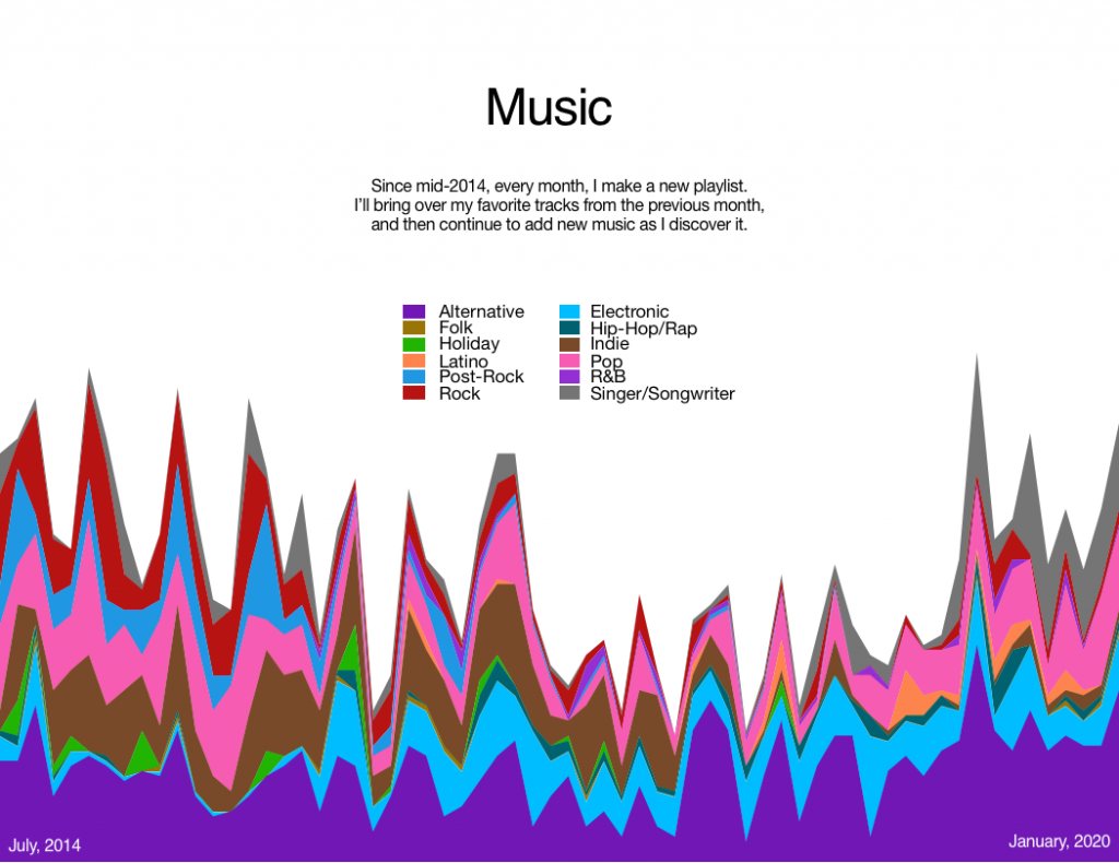
A quick post of a class assignment we did a while back – tinkering with data visualization. I went with my travels and my playlists as the data sources.

Dark Patterns are tricks used in websites and apps that make you do things that you didn’t mean to, like buying or signing up for something.
Dark Patterns
For a recent class assignment, we had to choose three dark patterns, find a site or service using each one, and then propose an alternative version that didn’t use that dark pattern.
You may notice that I’ve actually done four here – the last one was an interesting variant on some of the example dark patterns, and I wanted to explore that a bit.
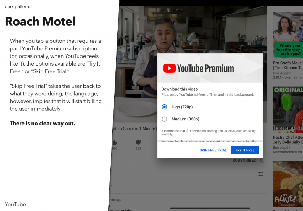
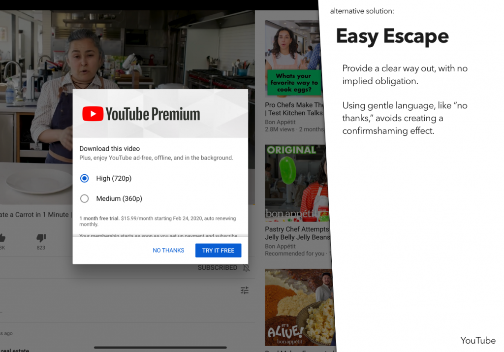
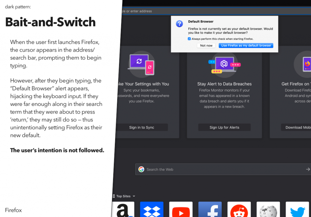
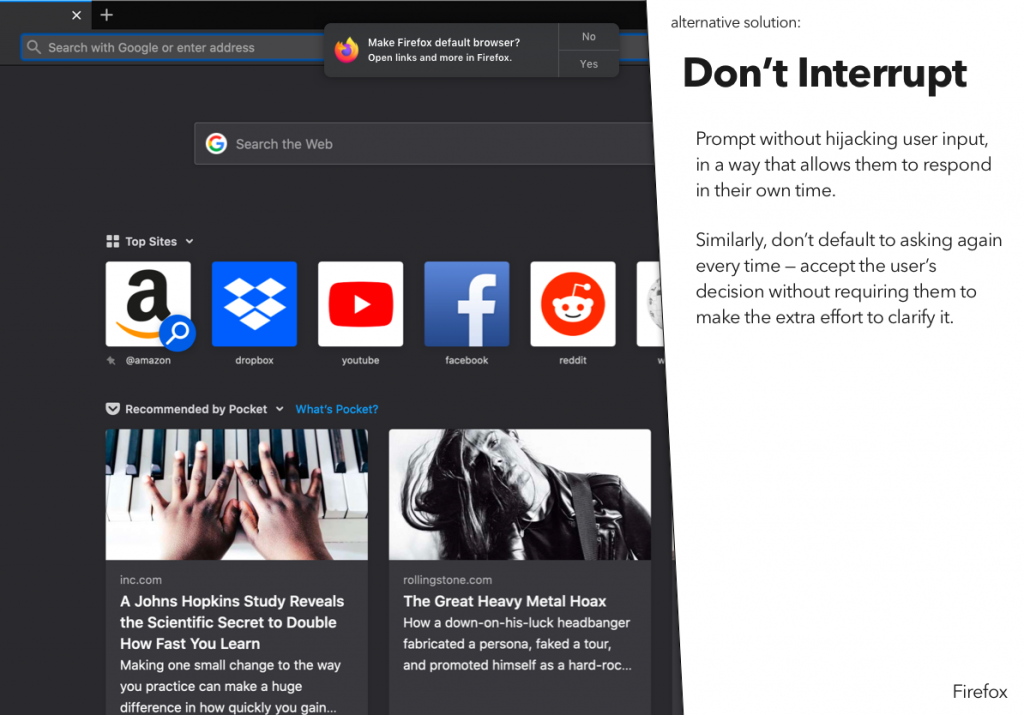
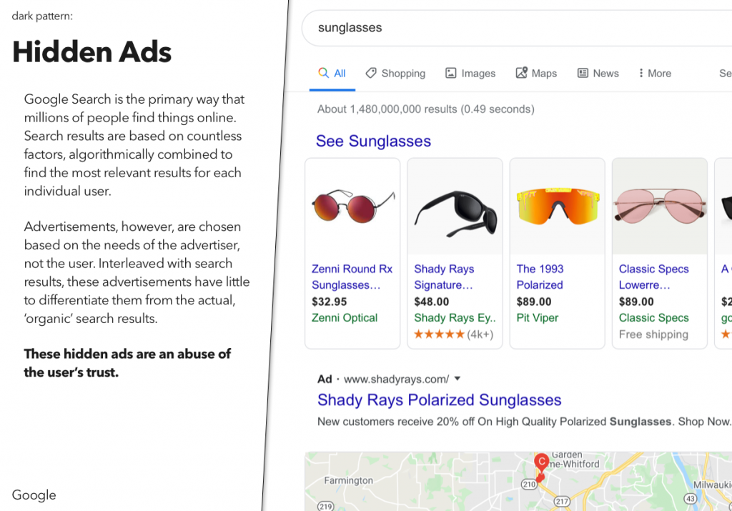
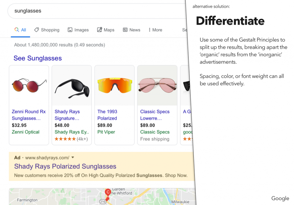
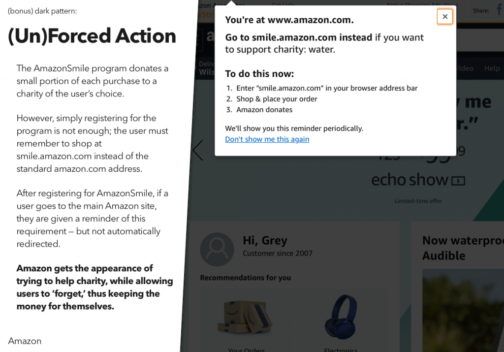
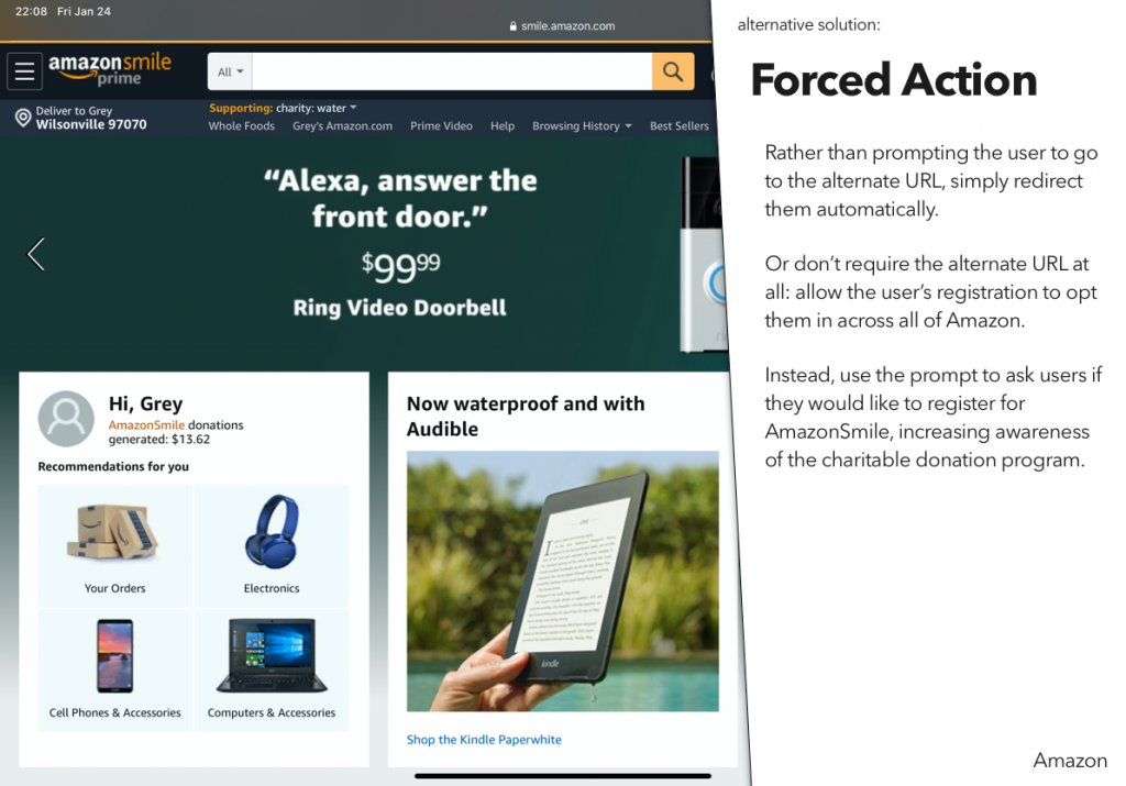
You can also download a PDF of the presentation – it will work better in screen readers:

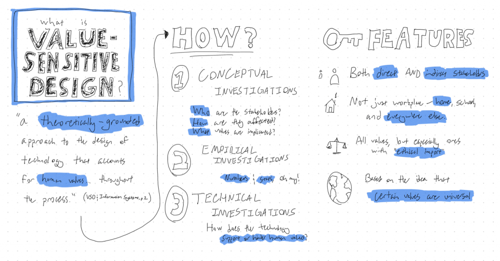
The first unit in our course on Advanced Design and Prototyping focused on Value-Sensitive Design, and a couple of the assignments we did as part of it were pretty fun.
The first was to do a sketchnote on the concept itself. I’ll admit, I was a bit skeptical of the concept of sketchnoting – I thought it would be fun, but I didn’t think it would actually be all that useful. In doing it, however, I found that it helped me to coalesce my thoughts a bit – though, admittedly, that may have more to do with the fact that it forced me to go through my typed notes again than the sketchnoting itself. Still, it was a fun way to do that bit of studying, so I think I’ll try to add it to my workflow in the future.
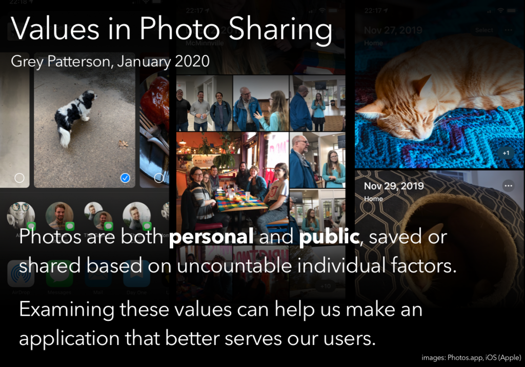
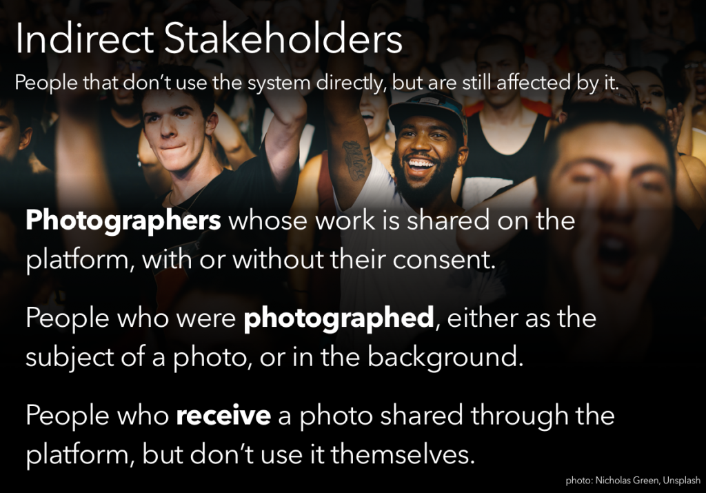
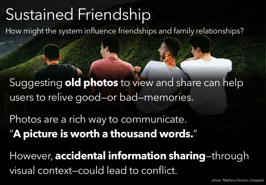
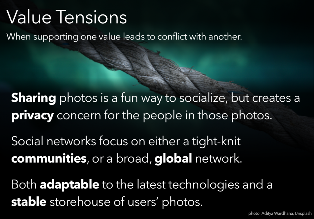
Another activity was to put together a presentation, going through some value-sensitive design processes and presenting our ‘findings.’ Of the available prompts, I chose the one that boiled down to “your team has just been hired to design a photo-sharing application; you’re in charge of the VSD portion. Go.”
