Categories
Programming

Network Caching With Combine

I’m going to lead in to this post by saying that this isn’t a Definitively Correct way to do this; it works for my use case, but has some definitive issues. Still, in the interest of transparency—and not running out of content for this blog—I’m going to share it anyways.

Last week, I shared a fun little enum-based way of representing API endpoints in a type-safe manner. It’s also pretty easy to expand on to use as the key for an in-memory cache of endpoint results.

(This, by the by, is Caveat 1: it’s a purely in-memory cache, with nothing being persisted to disk. User quits out of your app? Cache is gone. For what I’m working on, though, this is the behavior we want, so it works well.)

Let’s get started with the actual API surface we want:

class ApiClient {
	func get<T: Decodable>(endpoint: Endpoint, reset: Bool = false) -> T? {
		...
	}
}

Now, the funky thing about how I’ve got this implemented is that this get method is idempotent – if you call it 10,000 times for the same Endpoint, it’s only going to spit out one network request, and will just continue returning nil until something is actually present. (Well, unless you’re setting reset to true – that’s really in there for debug purposes more than anything else. Give the API I’m using on this project, it’s almost never necessary.)

And, for use with SwiftUI, we want it to be called again when the network request finishes, so we’ll make it an ObservableObject.

Next, let’s work out how to store things to achieve that. The main thing we need is somewhere to store the network requests, and somewhere to store the results – the aforementioned in-memory cache. And, to get that “call the method again when the cache changes” behavior, we can make it @Published:

class ApiClient: ObservableObject {
	private var loaders: [Endpoint:AnyCancellable] = [:]
	@Published private var cache: [Endpoint:Decodable] = [:]
}

Now, to make Endpoint we need it to be viable dictionary key, which is pretty easy to accomplish:

extension Endpoint: Hashable { }

Finally, we need to implement the actual method. Without further ado:

class ApiClient: ObservableObject {
	private var loaders: [Endpoint:AnyCancellable] = [:]
	@Published private var cache: [Endpoint:Decodable] = [:]
	
	func get<T: Decodable>(endpoint: Endpoint, reset: Bool = false) -> T? {
		if reset {
			cache[endpoint] = nil
			loaders[endpoint] = nil // which implicitly calls loaders[endpoint]?.cancel(), via the deinit
		}
		if let _item = cache[endpoint], let item = _item as? T {
			print("\(endpoint): cache hit")
			return item
		}
		if loaders[endpoint] == nil {
			print("\(endpoint): cache miss; beginning load")
			loaders[endpoint] = URLSession.shared.dataTaskPublisher(for: endpoint.url) // 1
				.map(\.data)
				.decode(type: T.self, decoder: JSONDecoder()) // 2
				.receive(on: DispatchQueue.main)
				.sink(receiveCompletion: { (completion) in 
					print(completion)
				}, receiveValue: { (item) in 
					self.cache[endpoint] = item
				})
		}
		print("\(endpoint): cache miss; loading already in progress")
		return nil
	}
}

Two notes in there:

  1. You may want to swap out the use of URLSession.shared here for a parameter into the class’ constructor – it’ll make your testing a bit easier.
  2. Even more so than (1), you probably want to swap out JSONDecoder() here for something stored on the class – that decoder isn’t free to initialize!

Now, as I mentioned, this has some limitations. The first one I already went over – it’s a purely in-memory cache. The second is at the call site – since this is generic across Decodable, you have to annotate at the call site what the expected return type is, which isn’t the most ergonomic.

My actual thought on fixing that was very TypeScript-inspired – creating overloads that specify T based on the given endpoint. In Swift, this isn’t too difficult, just adding something like:

extension ApiClient {
	func getCategory(_ id: Category.ID, reset: Bool = false) -> Category? {
		get<Category>(endpoint: .category(id), reset: reset)
	}
}

Which, of course, can get a bit repetitive depending on the number of endpoints you have. But hey, it works for my use case, and it may be helpful to someone else, so: blog post!

As a post-credits scene of sort, the TypeScript version is a bit silly, and takes advantage of the absolutely bonkers way method overloads work in TypeScript. I’ll throw out some pseudocode:

class ApiClient{
	func get(endpoint: Endpoint.Category, reset: bool): Category?
	func get<T>(endpoint: Endpoint, reset: bool: T? {
		...
	}
}

Yes, method overloads like this are just declaring the method multiple times before the actual body. And yes, you can specify an individual enum case as a type.

Categories
Programming

FocusedValue on tvOS

Alright, let’s set the scene with a mildly contrived example: you’ve got a list of things, and you want the surrounding View to match them. For a tvOS app, this could be swapping out the background and some title text to match the selected episode; since I don’t feel like coming up with some fake episode titles, however, we’re going to go with colors:

At first thought, you’d probably reach for @State, something akin to:

struct ColorsView: View {
	@State var selectedColor: Color
	let colors: [Color]

	var body: some View {
		VStack {
			Text(colorName(selectedColor))
			HStack {
				ForEach(colors) { color in 
					Rectangle().fill(color).focusable()
				}
			}
		}
			.background(WaveyShape().fill(selectedColor)
	}
}

Not too bad; attach on onFocus to the Rectangle() and it should work!

But… what if there’s more layers in between? Instead of a Rectangle(), you’ve got some other View in there, maybe doing some other logic and stuff.

Oof, now we’re going to need a @Binding, and – oh, what happens if the user swipes out of the rectangles and to our nav bar, can selectedColor be nil?

Happily, SwiftUI has something built out to handle basically this exact scenario: @FocusedValue. There’s some great tutorials out there on how to do this for a macOS app, which allows you to wire up the menu bar to respond to your selection, but it works just as well on tvOS.

Let’s get started:

struct FocusedColorKey: FocusedValueKey {
	typealias Value = Color
}

extension FocusedValues {
	var color: FocusedColorKey.Value? {
		get { self[FocusedColorKey.self] }
		set { self[FocusedSeriesKey.self] = newValue }
	}
}

Now we’ve got our new FocusedValue available, so let’s use it:

struct ColorsView: View {
	@FocusedValue(\.color) var selectedColor: Color?
	
	var body: some View {
		VStack {
			Text(colorName(selectedColor ?? Color.clear))
			HStack {
				ForEach(colors) { 
					ColorRectangleView(color: $0)
				}
			}
		}
			.background(WaveyShape().fill(selectedColor ?? Color.clear)
	}
}

The one big change here is that selectedColor can be nil. I’ve gone ahead and defaulted to .clear, but do what fits your use case.

Finally, we need to set the focused item:

struct ColorRectangleView: View {
	let color: Color

	var body: some View {
		Rectangle()
			.fill(color)
			.focusable()
			.focusedValue(\.color, color)
		}
	}
}

Et voila, it works!

Now, this may not seem like a huge change over doing it via @Binding, but keep in mind: @FocusedValue is a singleton. You can have every view in your app respond to this, without passing @Bindings every which way.

Categories
Programming

Position vs Offset

I’ve had reason recently to be doing custom position of things in SwiftUI, and figured I’d share something that I found a bit of a tricky distinction at first: position vs offset.

So, let’s set the scene:

struct DemoView: View {
	var body: some View {
		HStack {
			Rectangle().fill(.gray)
			Rectangle().fill(.blue)
			Rectangle().fill(.gray)
		}
	}
}

And now I’ll add some visuals, for ease of reading. (I made these in Sketch, so the graphics aren’t precisely what you’d get by running this code, but hey, artistic liberties.) Here’s our view:

Three squares in a row.

Now let’s tinker!

struct DemoView: View {
	var body: some View {
		HStack {
			Rectangle().fill(.gray)
			Rectangle().fill(.blue)
				.offset(x: 150, y:150)
			Rectangle().fill(.gray)
		}
	}
}

We’re offsetting the middle square. What does that look like?

Three squares; two are in a row, and there is a space in the middle where the third could fit, but it is below and to the right of that space.

I’ve left in a little ghost image to show where it was, because it’s an important distinction! As far as the HStack is concerned, that space is still occupied. Think of it like throwing your voice – you don’t move, just the perception of where you are.

Let’s try something else, now:

struct DemoView: View {
	var body: some View {
		HStack {
			Rectangle().fill(.gray)
			Rectangle().fill(.blue)
				.position(x: 150, y:150)
			Rectangle().fill(.gray)
		}
	}
}

Looks pretty similar in code, right? We’ve just swapped out ‘offset’ for ‘position’. What do we get on screen?

Three squares; two are in a row, while the third is out of alignment and slightly overlapping.

Ooh, very different! No more ghost, because now it’s actually in a different place – not holding that spot in the HStack. It’s also in a different spot than the previous one, what gives?

It’s in the name: ‘offset’ offsets the view from where it normally would’ve been. Our starting position was where the ghost stayed:

Three squares; two are in a row, and there is a space in the middle where the third could fit, but it is below and to the right of that space. The distance from the space to the square is labeled, with 150 in the top distance and 150 in the left distance.

‘Position,’ on the other hand, skips the whole question of where it would go and instead just puts it in an exact spot, using the top left corner of the screen as the point (0,0):

Three squares; two are in a row, while the third is out of alignment and slightly overlapping. The distance from the misaligned square to the top and left of the image are labeled with '150' on each.

The other approach that worked for my brain, coming from doing a lot of web dev, is to think about ‘offset’ as being CSS’ ‘position: relative’, while ‘position’ is equivalent to ‘position: absolute’.

Hopefully this helps the whole thing make sense!

Categories
Programming

Transitions in ZStacks

The other day, I found a fun little SwiftUI edge case: using a .transition() modifier in a ZStack doesn’t work. As a basic demo, let’s do something like this:

struct DemoView: View {
	@State var showing = true
	
	var body: some View {
		ZStack {
			Rectangle().fill(Color.red)
				.onTap {
					showing.toggle()
				}
			if (showing) {
				Text("Hello, world!")
					.transition(.opacity)
			}
		}
	}
}

Pretty simple example, yeah? Seems like it’d Just Work(TM) out of the box. It doesn’t, though; instead of a lovely opacity animation, it just pops in and out. Hmm.

Worry not, though, as I have a fix:

struct DemoView: View {
	@State var showing = true
	
	var body: some View {
		ZStack {
			Rectangle().fill(Color.red)
				.onTap {
					showing.toggle()
				}
				.zIndex(1)
			if (showing) {
				Text("Hello, world!")
					.transition(.opacity)
					.zIndex(2)
			}
		}
	}
}

Et voila, your transition works!

Now, I haven’t exactly done rigorous experimentation to figure out why, exactly, this works, but I do have a theory: when SwiftUI removes the Text, it loses its place in the ZStack, and gets assigned to “behind everything else.” By manually specifying the order, the slot stays reserved, and it can stay there while it fades in and out.

Categories
Programming

Playing Videos in SwiftUI

As of WWDC 2020, we have a way to play videos in SwiftUI without bailing out to UIKit with UIViewRepresentable. At first glance, it’s pretty simple, as well:

import SwiftUI
import AVKit

struct VideoPlayerView: View {
	let videoURL: URL

	var body: some View {
		let player = AVPlayer(url: videoURL)
		VideoPlayer(player: player)
	}
}

Et voila, you’re playing a video! You can overlay content on top of the video player pretty easily:

import SwiftUI
import AVKit

struct VideoPlayerView: View {
	let videoURL: URL

	var body: some View {
		let player = AVPlayer(url: videoURL)
		VideoPlayer(player: player) {
			Text("Watermark")
		}
	}
}

Seems like we’re good to go, no?

Well, not quite. Let’s talk memory management.

VideoPlayerView is a struct – it’s immutable. SwiftUI allows us to mutate the state of our views with user interaction using things like @State, thanks to some Compiler Magic.

Every time some aspect of the state changes, SwiftUI calls the body getter again.

Spotted the catch yet?

We’re declaring the AVPlayer instance inside the body getter. That means it gets reinitalized every time body gets called. Not the best for something that’s streaming a video file over a network.

But wait, we’ve already mentioned the Compiler Magic we can use to persist state: @State! Let’s try:

import SwiftUI
import AVKit

struct VideoPlayerView: View {
	let videoURL: URL
	@State var player = AVPlayer(url: videoURL)

	var body: some View {
		VideoPlayer(player: player)
	}
}

Whoops. We’ve got a problem – self isn’t available during initialization, so we can’t initialize the AVPlayer like that. Alright, we’ll write our own init:

import SwiftUI
import AVKit

struct VideoPlayerView: View {
	let videoURL: URL
	@State var player: AVPlayer

	init(videoURL: URL) {
		self.videoURL = videoURL
		self._player = State(initialValue: AVPlayer(url: videoURL))
	}

	var body: some View {
		VideoPlayer(player: player)
	}
}

(I suppose we could drop the let videoURL: URL there, since we’re using it immediately instead of needing to store it, but for consistency’s sake I’m leaving it in.)

Okay, sounds good – except, hang on, @State is only intended for use with structs, and if we peek at AVPlayer it’s a class.

Okay, no worries, that’s what @StateObject is for, one more tweak:

import SwiftUI
import AVKit

struct VideoPlayerView: View {
	let videoURL: URL
	@StateObject var player: AVPlayer

	init(videoURL: URL) {
		self.videoURL = videoURL
		self._player = StateObject(wrappedValue: AVPlayer(url: videoURL))
	}

	var body: some View {
		VideoPlayer(player: player)
	}
}

There, we should be good to go now, right? Right?

Alas, the compiler says no. AVPlayer doesn’t conform to ObservableObject, so we’re out of luck.

Fortunately, ObservableObject is pretty easy to conform to, and we can make our own wrapper.

import SwiftUI
import AVKit
import Combine

class PlayerHolder: ObservableObject {
	let player: AVPlayer
	init(videoURL: URL) {
		player = AVPlayer(url: videoURL)
	}
}

struct VideoPlayerView: View {
	let videoURL: URL
	@StateObject var playerHolder: PlayerHolder

	init(videoURL: URL) {
		self.videoURL = videoURL
		self._player = StateObject(wrappedValue: PlayerHolder(videoURL: videoURL))
	}

	var body: some View {
		VideoPlayer(player: playerHolder.player)
	}
}

Phew. At long last, we’ve got a stable way to hold onto a single AVPlayer instance. And, as a bonus, we can do stuff with that reference:

import SwiftUI
import AVKit
import Combine

class PlayerHolder: ObservableObject {
	let player: AVPlayer
	init(videoURL: URL) {
		player = AVPlayer(url: videoURL)
	}
}

struct VideoPlayerView: View {
	let videoURL: URL
	@StateObject var playerHolder: PlayerHolder

	init(videoURL: URL) {
		self.videoURL = videoURL
		self._player = StateObject(wrappedValue: PlayerHolder(videoURL: videoURL))
	}

	var body: some View {
		VideoPlayer(player: playerHolder.player)
			.onAppear {
				playerHolder.player.play()
			}
	}
}

Will start playing the video as soon as the view opens. Similarly, you could add some Buttons, build your own UI on top of the video player, all sorts of fun.

And, from the other end, you can put more logic in the PlayerHolder, as well. Say you need some additional logic to get from a video ID to the actual URL that the AVPlayer can handle? Try something like this:

class PlayerHolder: ObservableObject {
	@Published var player: AVPlayer? = nil
	init(videoID: Video.ID) {
		NetworkLayer.shared.lookupVideoInformation(videoID) { result in 
			self.player = AVPlayer(url: result.url)
		}
	}
}

(Now, that’s not the nice, Combine-y way to do it, but I’ll leave that as an exercise for the reader. Or possibly another post.)

Categories
Programming

tvOS Carousels in SwiftUI

It’s a fairly common pattern in tvOS apps to have a carousel of items that scrolls off screen in either direction – something vaguely like this:

Image a tvOS wireframe, showing two horizontally-scrolling carousels.

Actually implementing this in SwiftUI seems like it’d be easy to do at first:

VStack {
	Text("Section Title")
	ScrollView(.horizontal) { 
		HStack {
			ForEach(items) { 
				ItemCell(item: $0)
			}
		}
	}
}

Which gets you… a reasonable amount of the way there, but misses something: ScrollView clips the contents, and you wind up looking like this:

A tvOS wireframe, showing two horizontally-scrolling carousels; both have been clipped to the wrong visual size.

Not ideal. So, what’s the fix? Padding! Padding, and ignoring safe areas.

VStack {
	Text("Section Title").padding(.horizontal, 64)
	ScrollView(.horizontal) {
		HStack {
			ForEach(items) { 
				ItemCell(item: $0)
			}
		}
			.padding(64) // allows space for 'hover' effect
			.padding(.horizontal, 128)
	}
		.padding(-64)
}
	.edgesIgnoringSafeArea(.horizontal)

The edgesIgnoringSafeArea allows the ScrollView to expand out to the actual edges of the screen, instead of staying within the (generous) safe areas of tvOS.1

That done, we put the horizontal padding back in on the contents themselves, so that land roughly where we want them. (I’m using 128 as a guess; your numbers may vary, based on the design spec; if you want it to look like The Default, you can read pull the safe area insets off UIWindow.)

Finally, we balance padding on the HStack with negative padding on the ScrollView; this provides enough space for the ‘lift’ (and drop shadow, if you’re using it) within the ScrollView, while keeping everything at the same visual size.

  1. tvOS has large safe areas because TVs are a mess in regards to useable screen area.
Categories
Development

Forms & Lists

If there’s one area where SwiftUI really shines, it’s forms and lists. I have one area of the app that’s meant as, at most, a fallback option for managing some data, and putting together that management interface took, oh, an hour? It was a breeze. Admittedly, it’s not the prettiest list I’ve ever made, but like I said: fallback option.

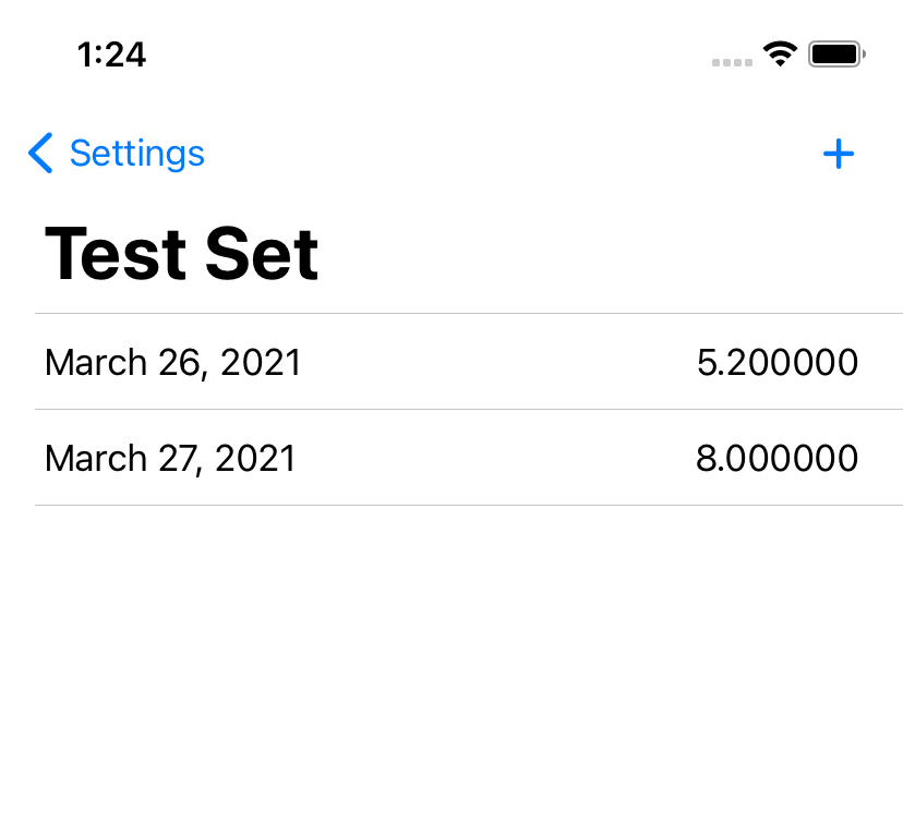
Screenshot of a list with a title, two items showing a date and value each, and an 'add' button.
Managing data points in a data set. Unpolished? Sure. Functional? Absolutely.
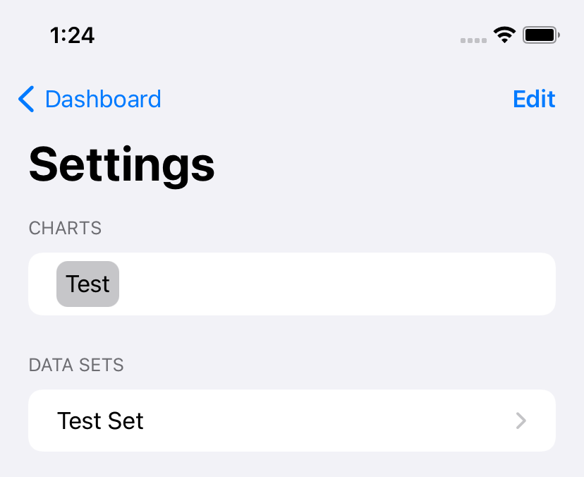
Screenshot of a Settings screen showing two lists, with an 'edit' button.

I was delighted to find that the automagic ‘edit’ button function handles multiple editable lists within the same View. As this is part of the ‘Settings’ screen, one of the three core screens in the app, it has received a bit more polish.

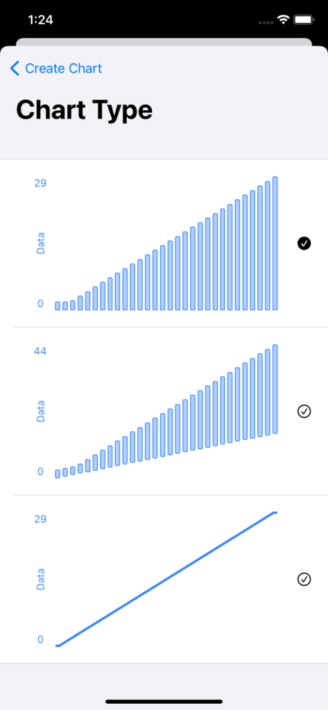
And I’ve continued to have fun building custom versions of the Picker control, with an expansion on my previous custom picker to support inline management of the above Data Sets and the addition of another one for picking a type of graph:

Screenshot of a picker showing three types of graphs.

At the moment, I’m showing a pretty basic dataset for these, but at some point I think I may create something a bit more visually interesting. The trick being, of course, that I can’t just random-number-generate the data, because I want all three to show the same data points, and since the user can also control the color, I want it to stay consistent if you leave, change the color, and come back.

(The solution here is probably to hard-code a data set, but where’s the fun in that?)

Categories
Development

File > New > Project…

I recently started working on a new development project. Or rather, a project I’ve been thinking about for a while, but just recently started developing – the first draft of the design is from almost a year ago, now, something that I worked on as a class project. But, mostly on a whim, I signed up for SwiftUI Jam, and took it as an excuse to start actually building the thing.

Now, normally my approach to projects is very Apple – refuse to admit I’m even working on something new until it’s complete, ready to present to the world. This time, though, the vague rules of the jam meant it had to be done at least somewhat in the open, and I figured I may as well do some proper write-ups as I go. Could be interesting.

I’m starting with… not the first thing I built, but the one that was the most fun so far. I’m doing the whole app in SwiftUI, and it really shines for building forms.

Screenshot of an iOS application showing a form: Title, Color, and Data Set; Comparison? is set to false.
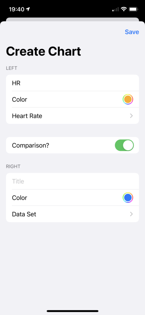
Screenshot of an iOS application showing a form: Title, Color, and Data Set; Comparison? is set to true. The first three questions are repeated.
Screenshot of an iOS application showing a list to choose from, with groupings such as Activity featuring items like Calories Burned and Cycling Distance.

As I said, a fairly simple form – Title, Color, and Data Set, with the option to add a second of the same three items. The Data Set picker is a custom version of a Picker, because I wanted to give the options in a grouped list rather than just alphabetical order.

I suspect I’m going to be building a second custom Picker implementation sometime soon – this time, choosing from more visual options. Should be fun to put together.

Categories
Education Portfolio Technology

Swift Student Challenge

A few days ago, Apple announced the winners of their Swift Student Challenge. I had applied and used my “taking a test” tactic, which was to hit ‘submit’ and then promptly erase the whole thing from my brain. (What’s done is done, and I feel silly worrying about something I have no control over.)

So when I got the email that “my status was updated” it was a bit of a surprise.

And when I clicked through the link (because, of course, they can’t just say in the email, you have to sign in) I was in for more of a surprise.

My submission had been accepted. I’m one of 350 students around the world whose work sufficiently impressed the judges at Apple.

Screenshot from Apple Developer website. It reads: Congratulations! Your submission has been selected for a WWDC20 Swift Student Challenge award. You'll receive an exclusive WWDC20 jacket and pin set at the mailing address you provided on your submission form. You'll also be able to download pre-release software, request lab appointments, and connect with Apple engineers over WWDC20 content on the forums. In addition, one year of individual membership in the Apple Developer Program will be assigned free of charge to eligible accounts of recipients who have reached the age of majority in their region. For details, see the WWDC20 Swift Student Challenge Terms and Conditions.
Neat!

Now, throughout the whole process of applying, I was my usual secretive self. I think two people knew that I was applying at all, much less what I was working on. Since it’s over with, though, it’s time for the unveiling.

What I made

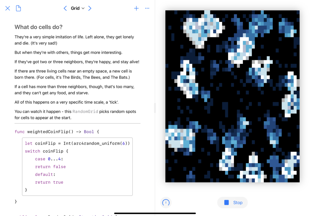
I wanted to bring back a concept I’ve played with before: cellular automata. A few days before the competition was announced, I’d seen a video that really caught my interest.

Well hey, I thought, I’ve got some code for running cellular automata. I want to learn Swift Playgrounds. And I’ve been having fun with SwiftUI. Let’s combine those things, shall we?

The first big change was a visual history; when a cell dies, I don’t want it to just go out, I want it to fade slowly, leaving behind a trail of where the automata have spread.

The second was rewriting all the visuals in SwiftUI, which was a fun project. Animation timings took me a bit to get right, as did figuring out how to do an automated ‘update n times a second’ in Combine. The biggest issue I had, actually, was performance – I had to do some fun little tricks to get it to run smoothly. (Note the .drawingGroup() here – that made a big difference.)

And third, I didn’t want it to just be “here’s some code, look how pretty,” I wanted to actually use the Playground format to show some cool stuff. This turned out to be the most frustrating part of the whole thing – the Swift Playgrounds app doesn’t actually support creating a PlaygroundBook, and the Xcode template wasn’t supported in the then-current version of Xcode.

But the end result? Oh, I’m quite happy with it. PlaygroundBooks are cool once you get past how un-documented they are. You can, to borrow a Jupyter turn of phrase, mix code and prose in a lovely, interactive way.

Screenshot of the 'Grid' page of the playground book.  The full text is at https://github.com/grey280/SwiftLife/blob/master/Swift%20Student%20Submission.playgroundbook/Contents/Chapters/Chapter1.playgroundchapter/Pages/Grid.playgroundpage/main.swift
Don’t worry, the real version (and some videos) are below.

Doing the actual writing was pretty fun. This is a concept I’ve spent a lot of time learning about, just because it captured my interest, and I wanted to share that in a fun way.

Overall, I’m quite happy with the result. If you’d like to see more, I’ve made recordings of the ‘randomized grid’ and ‘Wolfram rule’ pages running, and the actual playground is available on GitHub.

Categories
Programming

SwiftUI’s Picker

I’m very excited about SwiftUI, and have been using what little free time I have to do some tinkering with it. I started during the beta period, which was fun in between being very frustrating; a lovely side effect was that some of the knowledge I picked up is… entirely wrong. One that caught me was the implementation details for the Picker type.
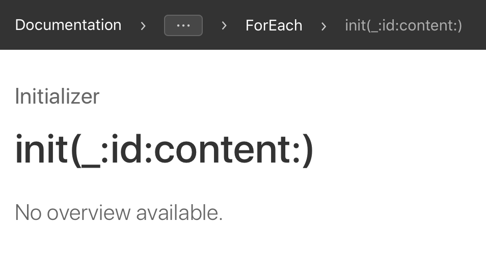
Based on the rather rough state of the SwiftUI documentation for Picker and ForEach,1 I’d assumed that combining the right binding with a .tag(_:) on the items would work:

Form {
    Picker(selection: $selectedItemID, label: Text("Choose Something") {
        ForEach(items){
            Text($0.label).tag($0.value)
        }
    }
    Text("You've selected item \(selectedItemID)!")
}

For reference, the models I’m referring to throughout are pretty simple:

struct CustomModel {
    let value: Int
    let label: String
}

Now this looks like it’s working in simple cases. However, I was trying to interact with a web API, so that items array looked something like this:

var items: CustomModel[] = [
    CustomModel(value: 7, label: "First"),
    CustomModel(value: 3, label: "Second"),
    CustomModel(value: 1, label: "Third")
]

If you tapped “Second” in the picker that SwiftUI generated, however, the text wouldn’t read “You’ve selected item 3!” like it should; it would be “You’ve selected item 1!”
A bit more tinkering revealed that, instead of pulling the value from the .tag(_:) on there, it was just using… the index in the ForEach.2
After some frustrated Googling, utterly despairing of Apple’s documentation, and a lot of StackOverflow searches, I finally figured out the solution:

Form {
    Picker(selection: $selectedItemID, label: Text("Choose Something") {
        ForEach(items, id: \.value){
            Text($0.label).tag($0.value)
        }
    }
    Text("You've selected item \(selectedItemID)!")
}

Quite frankly, I don’t have a good explanation of what’s going on here; last time I was tinkering with Pickers, the .tag(_:) provided SwiftUI with the information it needed to do the binding. (When I’ve got more time, I’d like to do another test — now that I’ve got the id keypath, do I even need the tag?)
I’d love a good explanation of what all the id keypath gets used for, and where else it might be necessary, but alas:


  1. It’s a bit unfair for me to link to No Overview Available when referring to SwiftUI; the coverage is low, but the problem isn’t so much that as the fact that ‘documentation coverage’ just doesn’t work as a metric for something like SwiftUI. The tutorials are a start, and a good sign that Apple was at least trying to rethink their approach to documentation, but they’re not nearly complete enough. 
  2. Zero-based index, of course, which seemed obvious to me, but got me a “???” response when I was complaining about this issue to a non-programmer friend.