I suppose I’m making this a tradition, now, writing up what I have on my phone and what’s changed since last year. And why not? It’s fun, and it helps me a bit with the fact that I’ve let my blog post queue get very near empty.
This year saw the release of iOS 14, and with it, the ability to put widgets directly on your home screen, and to banish apps from your home screen to the App Library. Both of which I have pretty thoroughly taken advantage of – though I’ve only got the one page of apps, I almost certainly have more apps installed this year than I did last year.
Widgets
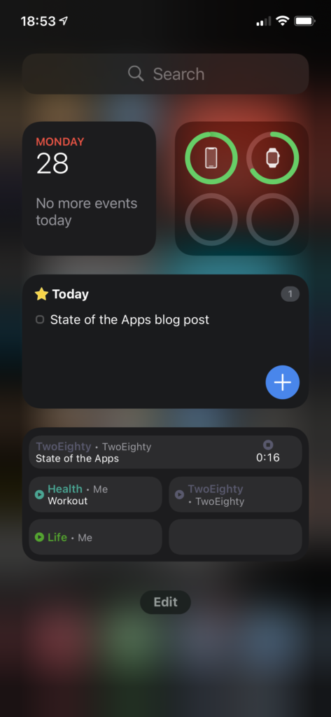
Let’s do a quick look at my ‘widgets’ screen. I believe the official name is ‘Today View,’ but that’s a piece of information that I’m going to estimate seven people outside of Apple know off the top of their head, so we’ll move right along.
The upper half is a dashboard; at top left, we have a Smart Stack, showing Calendar above, and beneath it are a pair of Timery widgets that show me totals I want to keep an eye on throughout the day.
Top right, batteries; I used to think the idea of the bigger battery widget was ridiculous, but if I do everything precisely wrong, I can overwhelm it – think, phone, watch, AirPods with distinct battery levels, and the AirPods case, to boot. Still, I like that at-a-glance view, and I actually like that it doesn’t show percentages, it feels a lot lighter as a result.
Below that, I’ve got another Stack with a pair of Things widgets, showing my Today and Upcoming lists. I originally had a couple of my Areas displaying, as well, but found I wasn’t really using them.
Finally, I’ve got another Stack, this time a pair of the larger-form Timery widgets. The one you’re seeing is my “my projects” collection – including a deliberately-blank bottom-right, so that with a timer running I’ve still got a way to tap into the app without starting or stopping a timer. The other one, which I won’t be showing for “NDA” reasons, is stuff for work.
Home
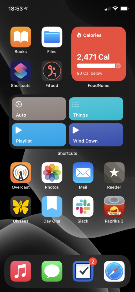
Now the home screen, which my mental model has in five segments.
The four apps at top left are the “aspirational” section – Books, as I’m trying to train myself to reach for a book rather than searching the web for Content to keep myself entertained; fitbod, as part of my ongoing fitness routine/goals; Shortcuts, because I want to be free to automate tasks with ease; and Files… doesn’t particularly fit the theme, but I use it often enough for it to have earned that spot.
Top right is the ‘health’ pile. It is, you guessed it, yet another Smart Stack. Topmost is FoodNoms, which I still heartily recommend to anyone who wants to start calorie counting. Below FoodNoms we have Streaks, which I’m using less than I did last year, but I still find it helpful. Despite the fact that I’ve been taking the same meds every morning for several years now, I still forget at least once a week, and Streaks is what reminds me. Finally, at the bottom, is Activity, which I think you could call one of the canonical widgets of the new style – a glanceable bit of information, always there.
Below these two we have… an unnamed section. It is, once again, a Smart Stack. On top we’ve got my main-use Shortcuts – the bottom two for playing music, ‘Things’ gives me a menu of various Things items/projects that I use semi-often, and ‘Auto’ is a lovely piece of work that does what Siri Suggestions was advertised as doing.
Below Shortcuts is Weather. Apple’s Weather app still feels a little lacking in accuracy compared to Dark Sky, but I’m hoping they’ll rectify that (and get their display of “amount of rain” lining up with my actual expectations for what it means, a la Dark Sky) before they disappear Dark Sky entirely. The widget, though, makes me want to write a chapter for a UI textbook about how well it contextually displays information.
The final item in this stack is Fluidics. It’s not just shameless self-promotion, it’s also dogfooding! (And I really do think the widget is a beautiful piece of design, if I do say so myself.)
The bottom section is Regular Ol’ Apps.
- Overcast is holding steady as my podcast app. I’ve finally gotten below 5 gigs of podcasts downloaded to listen to, so in the next month or so I expect Chase to finish convincing me I need to download the entire back archive of Roderick On The Line.
- Photos has actually grown in how much I’m using it – I decided to go all-in on it this year, and spent some time loading a bunch of the photos from my DSLR archives in, and some more time labeling faces so the ‘people’ album would work. I’ve had mixed results.
- Mail. What do you want me to say? It’s Mail, and I wanted the most boring of email apps.
- Reeder I’ve updated to version 4, and am continuing to drive the actual RSS sync off of TT-RSS/Fever on my Synology. The one addition is RSS-Bridge, which I’m using to scrape a few Twitter feeds into RSS as well. I’ve also finally moved wholesale into Reeder’s Read Later service, leaving Instapaper behind.
- Ulysses still fulfills the same use case for me. I’ve found it to be a… reasonable editor for GitLab Wiki articles, and a much better viewer for them than GitLab itself.
- Day One has continued to expand the list of things I use it for. I think the most interesting is a pair of journals I’ve got – “Inbox” and “Archive.” “Inbox” is in as dark a theme as I can make it, and is the default journal on my phone; any time I’ve got a midnight idea, I jot it down in there, and once a week or so I’ll go through, processing things from “Inbox” into “Archive.” It’s a nice little workflow.
- Slack made its way onto my home screen courtesy of MHCID, and remains there because it’s the main way I communicate with some of the friends I made through the program. It’s a much better UI than Teams.
- Paprika might belong in the ‘aspirational’ category in place of Files. I’ve got more than a thousand recipes in here, and I’ve made, like, twenty of them. One day…
Finally, we have the dock, which is only a visual distinction given that I’ve only got the one page.
- Music remains a very important thing to me, and I’m in and out of it all day. Every time I use it, I miss when Apple allowed you to customize the tabs – they have five tabs in there, and I literally never use three of them. Let me have playlists as a top-level tab, Apple, please. Stop trying to make Radio happen.
- Messages is the only social network I’ve got, these days. It’s nice to see Apple putting effort into it – I am a heavy user of threads and tapbacks.
- Things is a stalwart as my task management app. Outside of drawing apps, it’s the only iPadOS app that does handwriting recognition correctly – you just start writing, anywhere on screen, and it reads it in.
- Safari, because what would an iPhone be without the internet communicator? Admittedly, my Safari is a very different Safari than most peoples’, because I’ve got a mountain of content blocker rules via 1Blocker, and on top of that I have JavaScript disabled.
- You may have noticed that the Timery app icon isn’t present on my home screen – I like this way of getting to it. ↩
- I suppose you could call it part of the Automation subcategory, considering that I’ve got a lot of iCloud Drive -> Hazel stuff going on… ↩
- I absolutely love the stack mechanic; my only complaint is the little bit of animation-delay between when I finish swiping and when I can tap to interact. Yes, Apple, the little ‘settling into place’ animation is lovely… but I’m trying to do things, so get it out of my way and let me do them. ↩
- It’s a beautiful, and very iOS-y piece of work. The food database isn’t as full as MyFitnessPal’s, but that’s honestly a good thing – MFP’s database is full of trash data. FoodNoms starts with the FDA’s database, and has a ‘community-sourced’ database on top of that, where every entry has been manually validated, so it’s solid. If something isn’t in there, tap a button and scan the nutrition label, and the app reads the whole thing in – and then, once you’re done, asks you if you want to submit the resulting data to the community database. It’s an incredibly slick interaction, and I adore it. ↩
- I wasn’t really planning on the naming at all when I started writing this, so it makes sense that I’d run out eventually. ↩
- The tl;dr version is “it checks the time and some other contextual information and automatically picks from a list of other shortcuts to run based on that.” My morning routine is a series of single taps on that button, and it feels downright magical. ↩
- It can identify my grandmother with ease, regardless of if the photo is from this year or a scan of one of her wedding photos; my grandpa, on the other hand, it can’t spot if I give it two of the same photo and manually tag him in one. ↩
- I’ve still got Instapaper connected to Reeder, on the off chance that I have to use the Windows machine my work provided, but I’m something like 99.5% on macOS these days, so that’s exceedingly rare. ↩
- We’ve got a wiki monorepo kind of thing at work, where we’ve got articles on anything that may be useful. GitLab’s wiki can show something like 15 pages at a time in the list, and makes it rather difficult to find that list at all; they really didn’t expect anyone to use it like this. However, you can sync the whole thing, like any other repo, at which point you’ve got a regular ol’ folder full of Markdown files, and Ulysses handles that pretty well. It does have a bad habit of escaping escape characters, and I know I’ve got at least one file somewhere that opens with something like 30 backslashes before a single tilde. Whoops. ↩
- Teams, which we use at work, isn’t on my phone at all. Maintain that work-life balance, folks.
While I’m talking about Teams: the UI, across the board, feels like exactly as many little “oh, nobody thought about how this interaction would go” and “oh, nobody tested this” moments as I expect from any Microsoft product. Unfortunately for my distaste for Microsoft products, it has one notable advantage over Slack – calling support. Slack’s iOS app still doesn’t support video calls, so for actual workplace purposes it’s effectively useless. (And yes, I am hoping someone at Slack will cite this as evidence to give the iOS app the resources it needs to get that feature.) ↩
- This has been a subtweet at Messages, whose support for handwriting recognition consists of “you may write up to two words, and you’ll probably drop the iPad trying to do it.” If iPadOS 15 doesn’t make the entire thread pane a valid handwriting recognition target, I’m going to have to write Tim Cook some very unhappy emails. ↩
- And this is a subtweet at every news site that either entirely fails to render without JavaScript, or doesn’t load images without JavaScript. You are weak, and I scoff at you. ↩


